Poll results
Save to favorites
Add this poll to your saved list for easy reference.
Which of these two game app ads are you most likely to click on?
36 Responses to Option A
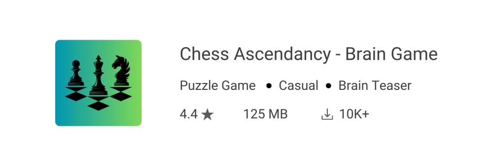
I liked that this option shows the chess pieces more transparently.
I like seeing the pieces in shade. The table in B just looks to small for me.
This seems to have a bit more utility to it in training my brain instead of a casual chess game
As a major fan of chess and avid player I like seeing three separate pieces, the pawn, knight and bishop, each of which has its own set of tactics
I think this title makes it more clear that this is a challenging game that will test your brain.
I prefer option A. I like this title on it because it helps me be in the right mindset to appreciate the offering.
The icon has simple elements and a suitable arrangement of details that accurately represent the app without too much fanciness.
A has a more simplified icon which makes it look more classy and intentional. The design is creative and more relatable. I like the minimalist idea and how well it has been executed, it stands out in a very unique and amazing way.
I would be more likely to click on this app icon because I like how it shows off the chess pieces and it looks more realistic. The black and green compliment each other and it is simple.
This one looks more unique than most chess apps.
I prefer the more simple silhouette design of A.
I like A because I like the look of the icon and how it says Brain Game.
Option A is top because I like the additional description in the name that it is a brain game and is a strategy game to exercise the mind.
The icon is more eye catching and the game name is more intriguing.
I like the icon better and it looks more professional.
"brain game" makes it a little more interesting so I give "A" a slight advantage.
This one has just enough pieces to make me interested in the game. I am interested in chess, but don't need to see the whole set-up.
This one looks a lot more interesting and unique. It sort of looks like the pieces are "ascending".
Simple works, it identifies itself very well
I like the idea of playing a brain game.
I would pick on this option A because I find it aesthetically pleasing, the silhouette background is very admirable. I'd love to see this as an ad more often.
the larger pieces look better and the title explains what it is a little better
I liked the look of the logo for option A more. It just looked more interesting.
Choice A doesnt look as crammed and outdated.
I think the other icon would be hard to see on a phone. It would just look like a blob.
Icon image is more interesting and eye catching in A.
The addition of brain game makes me a little more interested as I don't enjoy chess in general
I would click on A because I like how this one makes me think more about the strategies used in Chess instead of just playing chess for fun. I would feel smarter if I could win games on this app and learn along the way of how to get better so I can beat more people. It does say casual but it seems more strategic casual instead of just casual beginner friendly.
I would be most likely to click on the image in Option A because the image is very attractive and unique - you know the app is related to chess but the visual is different from the traditional chess board. The dark chess figures on the brighter background provide a very good contrast and are appealing - I think this image will appeal to the majority of individuals looking to purchase this type of option. I also like that "Brain Game" was added to the title - it adds a little extra allure.
The chess logo is less overwhelming than showing the whole board.
I CHOSE THIS ONE BECAUSE IT SPECIFIES THAT THE GAME IS A "BRAIN GAME" I WOULD WANT TO KNOW WHAT TYPE OF GAME I AM DOWNLOADING OR CLICKING ON
I like how straight forward A is. You know right at the beginning that it is a brain game.
Option A has a short description in its title, which is helpful for understanding what kind of application it is.
Having brain game tells me there might be something different. I don't understand ascendancy so I just ignore the word.
I'm more interested in seeing the words 'Brain Game' in the title because it it's just "Chess", I'm not interested.
Chess pieces in Option A looks better than the other option.
14 Responses to Option B
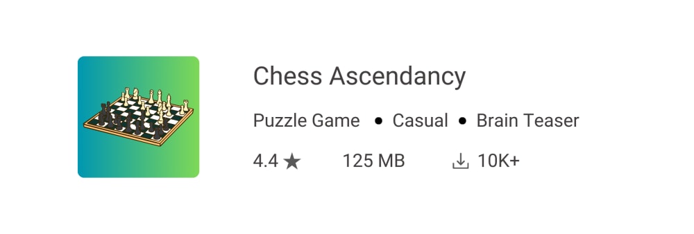
Choice B is better because the image of the chessboard looks better and more appealing to me.
I prefer this on name and image. It fits my style and need.
I chose Option B because I like classic chess games and the image used.
The term "brain game" makes it seem like a trendy cheap game.
I would most likely click on choice B because it looks more like a chess game.
Better icon, cleaner name, looks and sounds higher quality.
I would click on this option because the chess picture looks more appealing than the other option
I most prefer the option B chess game app icon because I like the more colorful chess board and the focus on the game name without the brain game that is repeated as brain teaser below the title text.
I prefer the one where there is more on the board. Very unique and well put together.
I like this one in choice B a bit better. I like the icon of the chess board better than just some chess pieces in choice A. I like the positioning of the board in the center too.
The logo of this one is more attractive
I like seeing the whole board better. It looks better. It makes me feel more competitive. I would definitely click on this
I prefer B because I like the title more, since it is more simple and straight forward. It doesn't seem like it is trying to hard, and it just seems like a good, solid name.
I just like the appearance of the chessboard better there.
Explore who answered your poll
Analyze your results with demographic reports.