Poll results
Save to favorites
Add this poll to your saved list for easy reference.
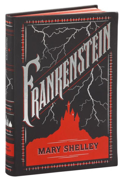
Review this book cover and click on the area that could use the most improvement. What would you improve about it?
Audience:30 U.S.-based respondentsReaders of 4+ books a monthReaders of 1-3 books a month
Private
Answer Attributes
Age range
Audiobook listener
Average monthly book spend
Education level
Favorite book genres
Gender identity
Literary preference
Personal income range
Pet owner
Preferred book format
Racial or ethnic identity
Reading frequency
30 Responses
The spine is very difficult to read and having the orientation of the title and the author be different is very annoying.
#1
Bookmark response
Mark response helpful Mark as helpful
Mark response unhelpful Report bad answer
Ask follow-up question Ask follow-up questionI think a little more detail on the castle could make it more exciting to look at on the cover.
#2
Bookmark response
Mark response helpful Mark as helpful
Mark response unhelpful Report bad answer
Ask follow-up question Ask follow-up questionThe outer lines can be drawn in a better way such as a straight line.
#3
Bookmark response
Mark response helpful Mark as helpful
Mark response unhelpful Report bad answer
Ask follow-up question Ask follow-up questionThe font style seems appropriate for this type of reading material and I admire the color scheme presented as well. No changes would be proposed at this time since the design is rather favorable already.
#4
Bookmark response
Mark response helpful Mark as helpful
Mark response unhelpful Report bad answer
Ask follow-up question Ask follow-up questionI think the color should be green instead of red. This design is more fitting for Dracula. Perhaps a lab would be a better design than Castle Frankenstein, which, lets be honest, most people don't associate Frankenstein's monster with castles.
#5
Bookmark response
Mark response helpful Mark as helpful
Mark response unhelpful Report bad answer
Ask follow-up question Ask follow-up questionI really like this cover! It's super dynamic and conveys the mood well!
#6
Bookmark response
Mark response helpful Mark as helpful
Mark response unhelpful Report bad answer
Ask follow-up question Ask follow-up questionI think there could be larger font for the title and less lightning.
#7
Bookmark response
Mark response helpful Mark as helpful
Mark response unhelpful Report bad answer
Ask follow-up question Ask follow-up questionI think that the F is kind of weird. It almost is on the boarder of an E. I think it just needs a little refining because the rest looks great.
#8
Bookmark response
Mark response helpful Mark as helpful
Mark response unhelpful Report bad answer
Ask follow-up question Ask follow-up questionIt is one red big silhouette, it needs more detail or forum to it. I'd get a comic artist to make an old castle design and highlight it in light and shadow, but you see details like windows broken and worn out bricks.
#9
Bookmark response
Mark response helpful Mark as helpful
Mark response unhelpful Report bad answer
Ask follow-up question Ask follow-up questionThe only thing I would change is the size of the title. I think if it was just a little bit smaller it would be easier to read across the front of the book. The rest of the design of this book is amazing. I would not change anything else, about it.
#10
Bookmark response
Mark response helpful Mark as helpful
Mark response unhelpful Report bad answer
Ask follow-up question Ask follow-up questionThe cover looks good overall but the author name is more difficult to read on the spine.
#11
Bookmark response
Mark response helpful Mark as helpful
Mark response unhelpful Report bad answer
Ask follow-up question Ask follow-up questionI don't know that I would change anything about it
#12
Bookmark response
Mark response helpful Mark as helpful
Mark response unhelpful Report bad answer
Ask follow-up question Ask follow-up questionI'm not sure it's fair to say this "NEEDS" improvement. I generally like black, white, and red art, so this cover is definitely speaking to me. If it was me, I might make the title horizontal, as opposed to putting it on a diagonal slant. But, honestly, I like the cover design, as is.
#13
Bookmark response
Mark response helpful Mark as helpful
Mark response unhelpful Report bad answer
Ask follow-up question Ask follow-up questionI feel like that the castle can look more like a building rather than part of the mountain it is on.
#14
Bookmark response
Mark response helpful Mark as helpful
Mark response unhelpful Report bad answer
Ask follow-up question Ask follow-up questionThe lettering is fantastic and I like the black, red and white color combination. Although I think the castle with the red (shape?) at the bottom needs some definition to it. In the image it just looks like a red blob so I would put some defining marks in there somewhere but otherwise that's a fantastic cover
#15
Bookmark response
Mark response helpful Mark as helpful
Mark response unhelpful Report bad answer
Ask follow-up question Ask follow-up questionThe name is hard to read.
#16
Bookmark response
Mark response helpful Mark as helpful
Mark response unhelpful Report bad answer
Ask follow-up question Ask follow-up questionI might use a little more color here, even a contrast with gray or black or windows to break it up and add interest.
#17
Bookmark response
Mark response helpful Mark as helpful
Mark response unhelpful Report bad answer
Ask follow-up question Ask follow-up questionI think the book cover would look nicer without all the lightening.
#18
Bookmark response
Mark response helpful Mark as helpful
Mark response unhelpful Report bad answer
Ask follow-up question Ask follow-up questionI think I would straighten out the text or perhaps give it a curve because the diagonal is pretty hard to read
#19
Bookmark response
Mark response helpful Mark as helpful
Mark response unhelpful Report bad answer
Ask follow-up question Ask follow-up questionthe author name doesn't stand out all that well on red
#20
Bookmark response
Mark response helpful Mark as helpful
Mark response unhelpful Report bad answer
Ask follow-up question Ask follow-up questionI think the red part showing the castle on the hill could use the most improvement. It's hard to tell if the color for the title and lightning is white or silver but seeing all the lightning makes me wish this red part was a metallic red, or maybe there were little cutouts for windows in the castle (not just the one lit window), something to make it more interesting. Maybe someone who isn't familiar with Frankenstein won't know it's supposed to be a castle on a hill so maybe put the castle in a shiny metallic finish and the rest of the hill in matte. Or if there were bits of metallic for the windows or black cutouts for the windows besides the one lit one, something else to define the shape more I think the cover would be a lot more interesting.
#21
Bookmark response
Mark response helpful Mark as helpful
Mark response unhelpful Report bad answer
Ask follow-up question Ask follow-up questionSomething about the letter "F" in Frankenstein seems off to me. Doesn't quite fit with the rest of the letters. I don't really read it as one word.
#22
Bookmark response
Mark response helpful Mark as helpful
Mark response unhelpful Report bad answer
Ask follow-up question Ask follow-up questionOverall, a great cover design (I am a fan of the novel by the way). The red silhouette of the castle could use an outline (mabey white) to make it a bit more 3 dimensional or pop out a bit.
#23
Bookmark response
Mark response helpful Mark as helpful
Mark response unhelpful Report bad answer
Ask follow-up question Ask follow-up questionThe cover looks really nice and maybe this is because the book is at an angle in the photo but the FRANKENSTIN font is so slanted its a little hard to read
#24
Bookmark response
Mark response helpful Mark as helpful
Mark response unhelpful Report bad answer
Ask follow-up question Ask follow-up questionI think the cover looks cool, but the red part should be a darker color.
#25
Bookmark response
Mark response helpful Mark as helpful
Mark response unhelpful Report bad answer
Ask follow-up question Ask follow-up questionI would maybe put the date of first publication as well to let people know it is a classic.
#26
Bookmark response
Mark response helpful Mark as helpful
Mark response unhelpful Report bad answer
Ask follow-up question Ask follow-up questionI like the way the cover looks mainly in the front style the writing the lightning I like the way the red goes into the black. The only thing that I would change is make the castle a little more 3D or changed the way it pops out to make it have a little bit more of a Gothic feel. Although I like the way it looks now the red splash of the castle looks plain and I think it would look better with a little bit more of an illusion to it.
#27
Bookmark response
Mark response helpful Mark as helpful
Mark response unhelpful Report bad answer
Ask follow-up question Ask follow-up questionThe cover is boring. It does not make me want to pick it up. I would rather see Frankenstein on the cover
#28
Bookmark response
Mark response helpful Mark as helpful
Mark response unhelpful Report bad answer
Ask follow-up question Ask follow-up questionI clicked outside cause I don't see anything that could be improved. Looks great to me.
#29
Bookmark response
Mark response helpful Mark as helpful
Mark response unhelpful Report bad answer
Ask follow-up question Ask follow-up questionits just a bit too bright given the black background. although i like the background, amybe something that makes a bit more sense with the storyline too. also the actual title is a bit hard to read.
#30
Bookmark response
Mark response helpful Mark as helpful
Mark response unhelpful Report bad answer
Ask follow-up question Ask follow-up questionExplore who answered your poll
Analyze your results with demographic reports.
Demographics
Age range 35-44 (13)
Audiobook listener Yes (21)
Average monthly book spend $1-$20 (16)
Education level Bachelor's degree (12)
Favorite book genres Science fiction (14)
Gender identity Male (17)
Literary preference Fiction (16)
Personal income range $0-30k (11)
Pet owner Cat (20)
Preferred book format Any print format (18)
Racial or ethnic identity White (21)
Reading frequency 1-3 books/month (17)