Poll results
Save to favorites
Add this poll to your saved list for easy reference.
Which product would you rather buy and why?


Answer Attributes
Age range
Education level
Gender identity
Options
Personal income range
Racial or ethnic identity
22 Responses to Option A
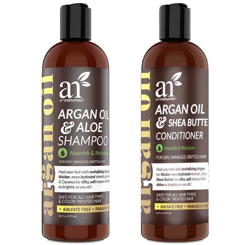
A had a good design and I liked the writing on it a lot. I found it interesting.
I like the tall and skinny design better. I also think the amount of the gold writing looks better and it is not too shiny
B is a little overwehlming
Option B looks more gimmicky. I liked how Option A looks more like a trusted brand.
I like the product design of option A better. The design, especially the color scheme, looks more gentle and relaxing.
The description and design of these bottles makes the product look more natural and organic.
Just based on the design, A's bottle looks much more higher quality as it is better designed.
better product description on packaging
I like it without the fruits on the label, looks less cheesy to me and like it's more professional.
I like the more uniform look the products on the left have. Really seem like part of the same line of products.
You get more for your money. It is organic which is a good thing.
I prefer option A because the ingredients look like they would be for my hair type.
I feel like A looks more trustworthy and legitimate.
I would rather buy product A as it is more detailed.
This bottle looks bigger and more attractive.
Most likely I would rather buy option A. I like the style of the bottle along with the style of the text and the logo. I feel they tie in really well together.
The images and colors used in the other one do not entice me to purchase the product. This bottle looks more professional.
This is a simple one for me; the statement that it can thicken strands on the label are what differentiate it from B. This is enough for me to choose A here.
Sulfate free is an important feature to me.
I like the more sleek and simple look of A, it looks a little more higher end. B says "WOW" which makes me not take it seriously as a professional product
I would choose A because I have heard a lot of good things about Argan oil and it’s benefits for people. I also like that it says no sulfates and parabens, whereas option B does not have that indicator.
I prefer the ones with the writing, there is no need for the flashy like photos of fruit and such.
28 Responses to Option B
B because it's easier to read the bottles.
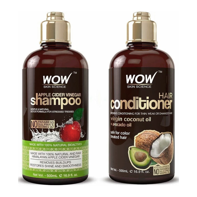
Option B looks more natural and shows things that are in the shampoo like the apples and the benefits from it.
I like the pictures on the bottle. I think the fruit makes it more appealing and you know what's in the bottle
I voted based on how appealing the images were to me compared to the others and which ones I would click on in the real world.
Seems like a more natural product at first glance and gives me an idea on how it might smell.
Cap of the bottle and label of the bottle seem more attractive than another option.
I like the outlines of these fruits and veggies that are used on this bottle and it makes it look more natural
the images of the coconut and avocado in B really draw my attention.
this text is far easier to read and i can clearly see the words on the label here while the other makes it harder
i like the gold letters and the colors, makes it look higher quality
I think I would want the one with the pictures of the avocados and such, it looks more natural and less like a medical type shampoo.
I like the bottle shape and bright colors on option B the best. It makes me want to try the product more.
B HAS A MORE ATTRACTIVE LABEL AND IS MORE APPEALING. THE INFORMATION IS ALSO PRESENTED VERY CLEARLY
I prerfer the apple cider and coconut ingredients to aloe/shea butter and don't know what argan oil is.
I like that option B has a picture of fruit on the bottle, I think it makes the product look more high quality. I also like the overall label design. I don't like the label design of option A.
I like the design of my first choice best. It looks like this is a pump top bottle which I prefer to the second choice top. I also like the design on the bottle in my first choice as it makes it easier to tell the bottles apart at a glance.
I like choice B the most because this option is the most appealing in terms of its layout. I like the inclusion of the fruits on the cover, such as the coconut and the apple. It makes the product look more exciting to me.
Option B shows the fruit the product is made from.
I would choose B, because ACV is very good for your hair.
I picked B as my top choice as I like the idea of using the pictures of the fruits.
I like the images of fruit and coconuts in this option, which look fresh and appealing. Looks like a really nice product for sure!
The bottles look better and apple the vinegar and coconut oil are suppose to be good for your hair.
Seeing the ingredients listed and shown simplifies the idea of what is contained in wow, and the other is worded with such long sentences, that it loses its appeal because it seems ambiguous in its phrasing.
This one looks really cool, from the package design to the bottle itself. I would go for this one every day of the week.
I would rather buy B. I like how the product ingredients are easily visible on the cover, making it seem more transparent and interesting to me at first glance.
I really like the look of the coconut on the front. It stands out and pops to me.
I like the image of the avocado and coconut at the lower right corner of the bottle. I also like the green boxed label at the bottom half of the other bottle. It think that choice B has better graphics and imagery and that's why I picked it over the other one.
I like option B better because the images of the coconut and aloe on the label stands out more.
Explore who answered your poll
Analyze your results with demographic reports.