Poll results
Save to favorites
Add this poll to your saved list for easy reference.
Which product packaging do you prefer for mail order underwear?
Option B won this Ranked poll with a final tally of 30 votes after 2 rounds of votes counting.
In a Ranked poll, respondents rank every option in order of preference. For example, when you test 6 options, each respondent orders their choices from first to sixth place.
PickFu requires a majority to win a Ranked poll. A majority winner differs from a plurality winner. A majority winner earns over 50% of the votes, whereas a plurality winner earns the most votes, regardless of winning percentage.
If an option does not earn a majority of votes, PickFu eliminates the option with the lowest number of votes. The votes from the eliminated option are reassigned based on each respondent’s next choice. This process continues in rounds until a majority winner emerges.
Scores reflect the percentage of total votes an option receives during the vote counting and indicate the relative preference of the respondents. If there is no majority winner, look to the scores to see how the options fared relative to one another.
| Option | Round 1 | Round 2 |
|---|---|---|
| B | 46% 23 votes | 60% 30 votes +7 |
| C | 36% 18 votes | 40% 20 votes +2 |
| A | 18% 9 votes | Eliminated 9 votes reassigned |
Answer Attributes
Age range
Education level
Gender identity
Options
Personal income range
Racial or ethnic identity
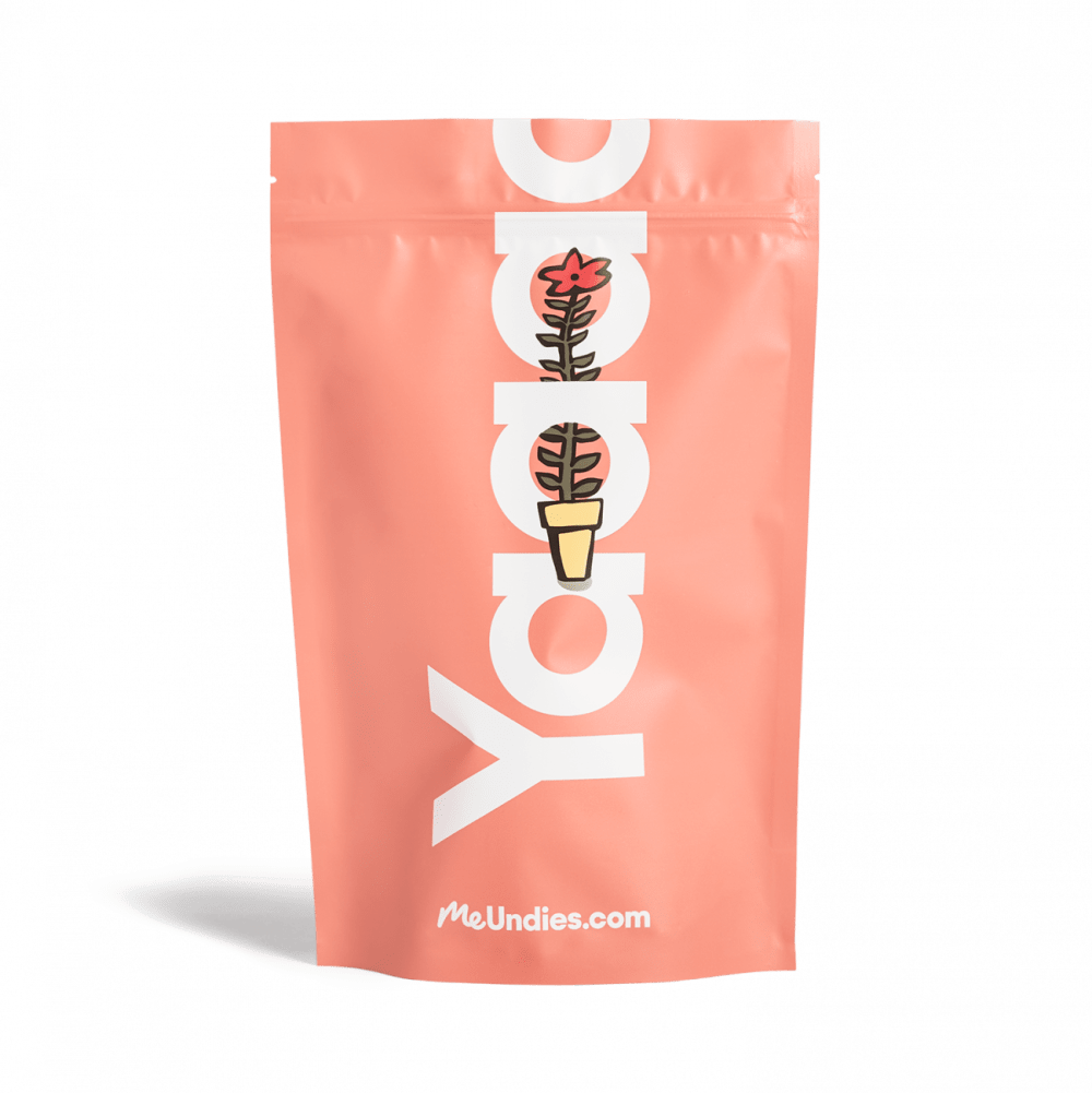
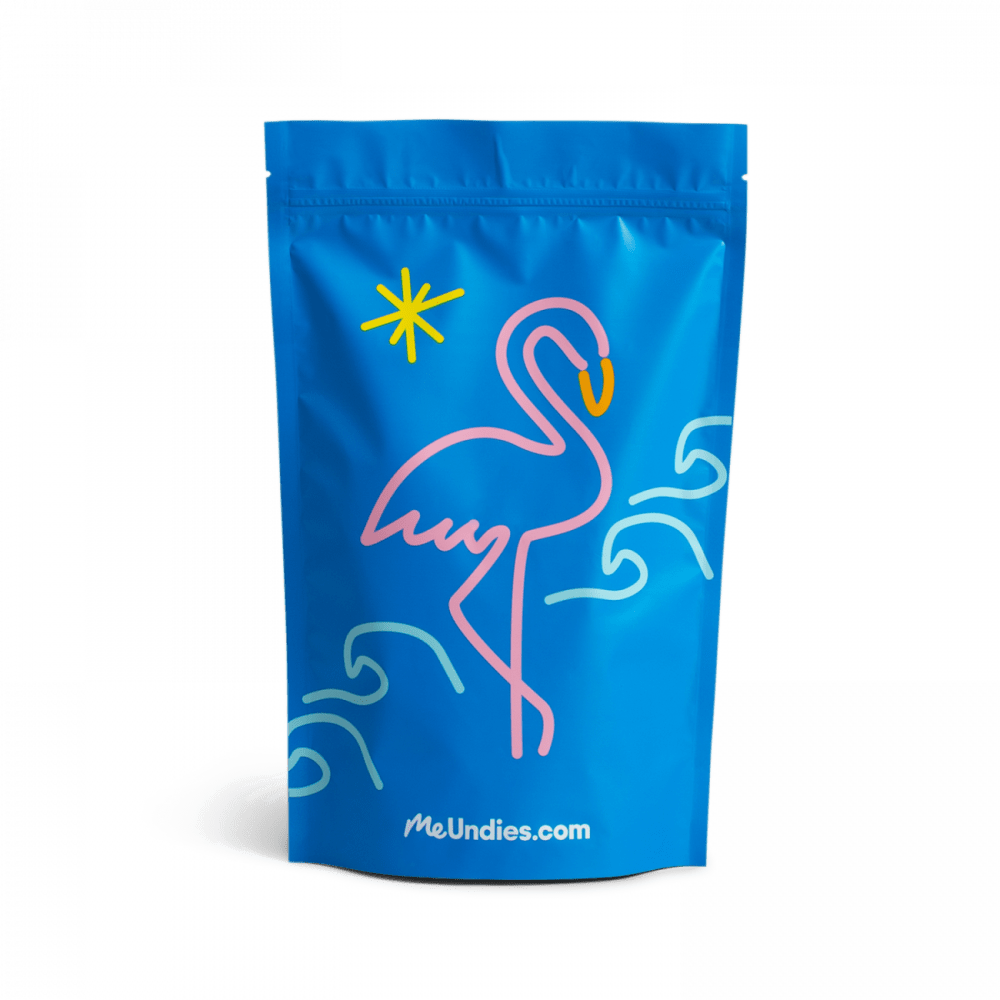
9 Responses to Option A
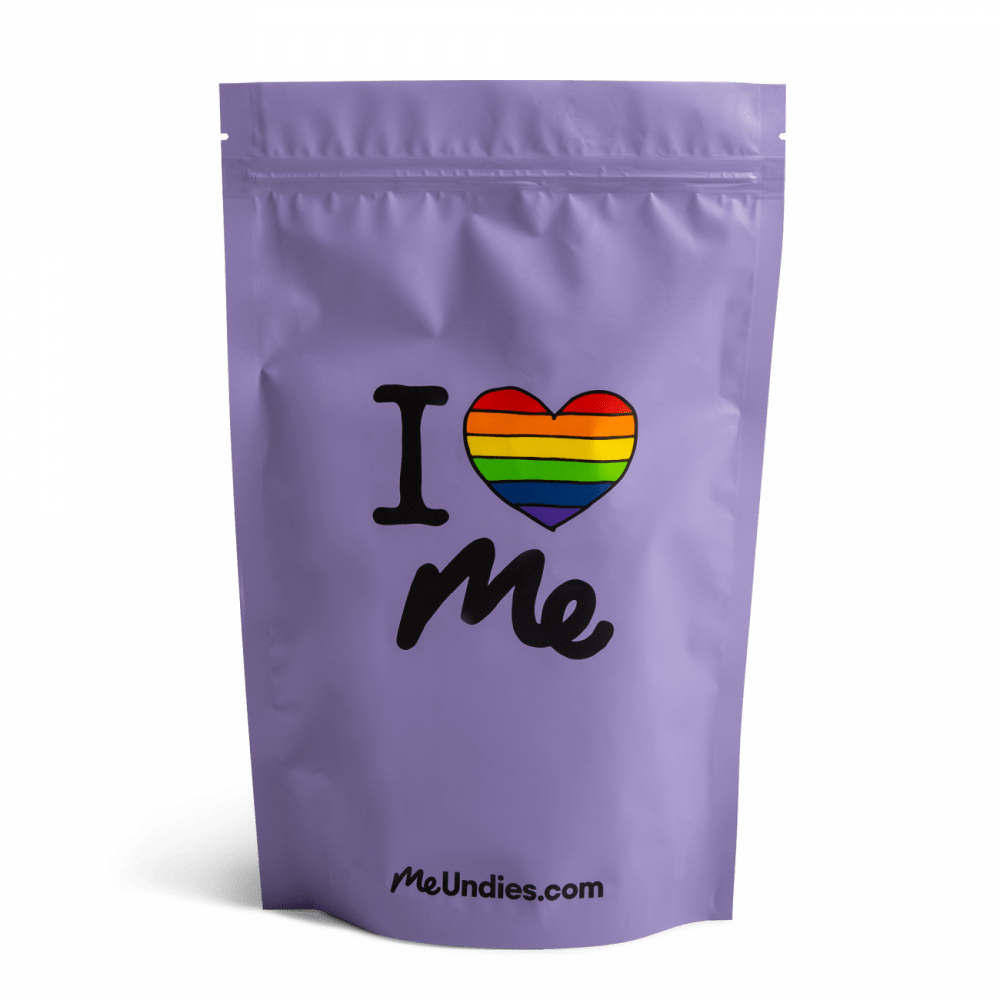
I don't like that the packaging is not discreet, with the website listed at the bottom, but I think Option A stands out the least and could be anything from a distance. Option B is okay, but the shapes and colors remind me of Miami Vice too much. Option C is the worst because of the rainbow heart, which makes me think of gay pride and such, which is not the type of underwear someone like me would want.
I prefer A for its beautiful colour and uniquely designed logo and packaging. It is extremely attractive
For me, I love A the most for underwear in the mail because of how simple the design is and how it's the logo with just a small design. I feel like this one feels the most modern and fun. I also like B as well and could buy it. I just feel like the animal is a bit odd, but I like it! C is last because I don't know how I feel about the rainbow. I get what it stands for but I may not want this on my underwear package.
To me, this kind of package immediately brings coffee to mind, so I ranked these in the order of how similar I would think they look to coffee. That being said, I actually like the flamingo package the best, but that would get people thinking about what's really inside more so than the one I chose first.
Choice A has the name of the product clearly con the package. I really enjoy how the flower is moving through the letters which makes the product (and company) seem fun and cheerful. The other two choices don't have strong company name on it and I don't think "I heart me" is the name of a brand. My second choice was B simply because I loved the colors involved and the simple 80s design of a neon lit flamingo. Choice C just fell short of grabbing my attention
I like the design of my first choice. The color scheme is better.
In terms of what I like about packaging, I prefer it to have vibrant colors and something that would attract me to buy it. I think that Option A has the most simple design and it's colors are really attractive to me. I think that it can stand out on a display shelf and make it easy to find. Option B is good but I don't like the flamingo that much. Option C's color isn't that vibrant and I don't like the color that much. As a result, I like Option C the most out of all the Options.
Choice A is the most appealing to me. This package design is discreet yet cute. I like the color of the product and the simple design.
I like the peach color and text. It makes for a more warm and unique look.
23 Responses to Option B
I picked these based on my preferences for the package design overall.
I ranked the design by what I felt was most pleasing to see. B I felt flowed the best compared to the other designs.
I don't like how the rainbow heart makes me think of LGBT pride - if I don't identify as that, why would I have underwear packaging that has that symbolism? I liked B best since it reminded me of being in a bikini at the beach, which felt sexy and freeing. A was a little plain and I didn't understand what "Yaaa" meant.
I like B's color scheme and flamingo the best. I hate A and C, I'd rather get a plain white package.
The flamingo outline is eye catching and cool.
I prefer packaging without text, if this is going to be what is seen for shipping.A and then C afterwards because the plant thing is cute (even though I don't like 'YAAAAA' what the heck is that supposed to even mean), and C is just weird for underwear.
I choose Choice B because it was the most discreet packaging for my underwear. Choice A has a plant so I'm not really sure what that has to do with underwear brand. Choice C is a little too vibrant for underwear packaging. I like Choice B the best because it has a nice artwork and it also has the brand name on the bottom.
I think choice B is the clear top option. I like the color scheme a lot, especially the blue color. It makes the product look more appealing to me.
B seems seems to have the most appealing color combination. I like that C supports pride
I would prefer option 'B'. The design on the packaging looks colorful and different. It's a design you don't regularly on a daily basis, very unique. The other options look common and bland.
Honestly whichever packaging is less harmful to the environment and produces less waste is always my first choice but I ranked them in the order of the picture I liked best
I like the flamingo design for option B, as I think it looks cute. It stands out more to me as the type of product it is trying to sell. The other two package designs seem rather generic in comparison.
B has the best design. Cute and adorable. I feel I could use the package for many other things afterwards. C is cute, but not as cute as B. I feel it would cheer me up a bit. A is okay, but kind of boring as well. It looks like a generic image.
I prefer option B the most because the design is creative and fashionable. Seeing a flamingo on a sunny beach is awesome. Option A is not bad either with a simple design. Option C is too generic.
B - I thought the swan was cute. A -2nd choice if the swan wasn't available, I liked the bright color and the flowers. C - the desigh just didn't appeal to me
I really dig the flamingo!
It looks cool. Retro and yet modern.
I prefer Option B for mail order underwear. The design and the color of the product looks amazing. I like the bird symbol embedded on it. Then secondly, I prefer Option A that pink color is also looks very nice. Then lastly, I like option C.
I liked the Flamingo on the front of Option B and it gave it a very beachy feel. My second choice was Option A because I liked the peach color of the package.
I like option B the best because the blue label design on the outside catches my eye the most.
Option B is whimsical enough and I really dig the blue/pink contrast. I think Option A is the next best because it's rather subtle. Option C is eye-catchy, which is a double edged sword because some might prefer privacy and something a little more lowkey that doesn't attract attention (I fall in that camp).
Option B looks more appealing to my face i will opt in for B
I like the text and blue color best for B. I am not sure what the text is on A, but I like it better than C because I find the text embarrassing for C.
18 Responses to Option C
I love me is a really great slogan and I love the purple packaging. I also love the peach colored packaging of yaao or whatever it's called, but it's hard to read the letters.
I chose panel C. I like the packaging itself, the nice purple color is a bonus and the heart and gift to myself is great!
love symbols on the pack is very attractive
this makes you feel happy
I love the product packaging of option C more. The product packaging if option C is well designed and the labelling of option C makes the product to be more attractive. I would love to purchase option C product packaging.
Choice C seems the most rewarding and would be attractive as a package for a gift as well. Choice B is well designed and the colors blend well. Choice A look a bit too plain.
C the saying on it makes the person feel special and the item they bought themselves means a bit more to them. A was okay but nothing stuck out about it. The bird on B does not make me think of underwear at all.
I like choice c for the powerful message. Also because it is colorful yet simplistic.
I like option C because it is colorful and more personal.
I chose Option C as my top pick for several reasons. It is the only option with a graphic that directly connects to the MeUndies brand name with the "I <3 Me" design. I think the purple color that was used for the packaging is subtle yet bold. The colors of the rainbow heart really stand out against the purple background. I think the black lines used in both the heart and in the text look really crisp and bold. It is both playful and sophisticated. I selected Option A as my second pick because the text is very well done. The pink and white color palette looks as fresh as the flower design displayed in the middle of the packaging. The flower design looks nice with the bold lines used in the design. I appreciate how the stem of the flower is actually woven through the text. Very nice. I ranked Option B as my third pick by default. I like flamingos but this design looks sloppy in comparison to the other two choices. It looks like they were trying to create a playful child-like design here but it just looks unfinished somehow. The blue background is also very overpowering and distracts from the design itself.
I like the rainbow for inclusivity on the first package. I'm also a big fan of the subdued purple. The fact that it includes "me" on the package for the me undies brand is also pleasing. For the second option, I liked the flamingo pattern a lot, and I think the pink and blue really pops and makes me feel more comfortable. Finally, the last option I thought was incredibly inconsistent in theming and the color isn't particularly pleasing. I also do not like how the typography falls off the package, it makes it more annoying to read.
I prefer option C to chose.Because the cover looking more attractive and perfect for underwear cover.
I think both C and B are adorable. I love the affirmation that is C and I find B to be a cute form of slightly tacky (IN A GOOD WAY). I don't really understand and don't find it too appealing.
I like the saying on my first choice
I chose C as my first option because it is a positive message and it also can fit with the product as it can be depicted that you are buying beautiful underwear because you love yourself. I feel the colors and the message make the package by far the most attractive and would be the most appealing to me as a consumer when receiving this product. My next choice was option B as I feel the colors used on the package really compliment one another well. I also chose this option because I feel that the image on it is something I can relate to and identify as I have no idea what is being depicted on the package in option A. Because I dont know what is on the package or it doesnt indicate any message I made option A my last choice.
C is my first choice. The colors and design is attractive, and the text is very self affirming. B is a close second choice for me, I think the flamingo and ocean design is very cute. A is my last choice - while I like the plant part of the design, I don't really care for the background color or the large vertical text.
Choice C is super cute and I would reuse that bag. Choice A is kind of fun and interesting and I would probably reuse that one for something as well. The flamingo one, choice b, is nice, but I like the other two much better.
Love the rainbow heart in image C here. This is fantastic and very fitting for the underwear. I feel the look of this is the best and most fun. Option A is cool with the plant and that feels like a cool image. The flamingo in option B is good as well. I don't think you can go wrong with any of these choices. But option C looks best for me.
Explore who answered your poll
Analyze your results with demographic reports.