Poll results
Save to favorites
Add this poll to your saved list for easy reference.
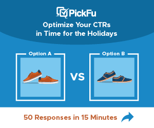
Which ad would make you more likely to click on it, and why?
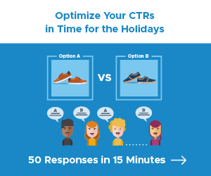
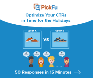
Option B won this Ranked poll with a final tally of 59 votes after 1 round of vote counting.
In a Ranked poll, respondents rank every option in order of preference. For example, when you test 6 options, each respondent orders their choices from first to sixth place.
PickFu requires a majority to win a Ranked poll. A majority winner differs from a plurality winner. A majority winner earns over 50% of the votes, whereas a plurality winner earns the most votes, regardless of winning percentage.
If an option does not earn a majority of votes, PickFu eliminates the option with the lowest number of votes. The votes from the eliminated option are reassigned based on each respondent’s next choice. This process continues in rounds until a majority winner emerges.
Scores reflect the percentage of total votes an option receives during the vote counting and indicate the relative preference of the respondents. If there is no majority winner, look to the scores to see how the options fared relative to one another.
| Option | Round 1 |
|---|---|
| B | 59% 59 votes |
| C | 29% 29 votes |
| A | 12% 12 votes |
Answer Attributes
Age range
Crowdfunding participant
Cryptocurrency investments
Education level
Gender identity
Hobbies and interests
Number of kids
Online shopping marketplaces
Options
Personal income range
Pet owner
Racial or ethnic identity
U.S. geographic region
12 Responses to Option A
The cartoon people answering the question emphasizes that you will get people answering your questions
C seems like it isn't as personalized, A feels more personal and inclusive, and although B is also personal and inclusive there's a little too much going on in the image and it feels a bit cluttered.
A has a nice design and I like the way the images and the texting works well. B and C don’t really appeal to me the same way.
Ad A gets the point across the best while using the least amount of clutter.
I think Option A is the most information that is still understandable. You do not want to overwhelm someone looking a the AD!
I like the images with the people talking because it matches the text
I like how personable the little emojis are it makes the add more fun
This one seems to have the most info on it which makes it interesting without overcrowding.
the infographics used on option A and option C makes the images easier to read and process
I prefer Option A as my first choice. It bright and attractive looking with pleasant graphics and a appealing color palette. Option B is also quite nice and has a simplicity that's pleasing. Option C seems lifeless in comparison to the other two.
I dont see much difference between A and B. So it could go first either way as they are more appealing compared to option C
The option I chose seemed more straightforward.
59 Responses to Option B
The advertisement looks the most professional with the nice centered information and graphics.
B I feel is the most informative and has the most pleasing design to it.
B looks the best. C has the logo. A is the most plain and doesn't have the logo.
I think option B is best, having a little color for the top logo and the people icons makes the image stand out from the rest. It's a well balanced image.
I like B and A because it shows that people give their opinion for choices. People are the focus unlike C.
I like choice B because it discloses company name.
Option B shows the company name to show it is reputable in addition to showing how it collects responses from a wide range of respondents to ensure there is less bias.
The combination of a cool color scheme of blues and whites is nicely highlighted with the red. It's very eye catching.
The pick-fu logo is really popping, in this first place lead the logo memorable.
Made my choices based on which ad makes me more likely to want to click on it. Ad in B is the one that stands out to me,is more detailed,and makes me want to click on it
Seeing the Pickfu logo at the top really gives this nice visual balance and appeal because the colors draw your eye right to it and it feels more complete this way visually.
I picked B and C as my top choices as the pictures tell me that my vote counts.
I like the colorful header of B and the graphic of people in B and the graphic withpeople in A as well.
I like options B and C equally. I think your logo needs to be in the image.
Option B is the best as it shows the people across the bottom of the ad and the company name across the top. The product is sandwiched in-between with a subliminal happy face on the boundary between the white and blue spaces. Option B is a well laid out ad graphic and makes a great statement as to what PickFu can do for them. Option A and C could be combined, but then you would have Option B.... which is the best choice. Option B also utilizes color as an advantage and the brand name is really prominent as a result.
First, I simple find that Option C looks really basic and a bit drab without the human figures in it. Then, when I was comparing what I liked about Option A versus Option B, I realized that the header in Option A with the curvature almost resembles a smile, which gives that option a much more pleasant and inviting feel!
Option B i like the red letters in the name. The name stands out more. option C i don't like the red at the bottom to show 50 responses . i like the people faces on A and B
The color options look better for the one I chose.
Showing the brand clearly (PickFu) in nicely colored headline AND showing how the responses can come back is helpful. B does this best by far. A shows the voting process, in a more concrete sort of way. C doesn't really intimate a crowd sourcing aspect, which is what you want to show.
I like B. The logo is in color and the curve gives some good dimension to the ad. All the text looks thoughtfully organized as well.
The pickfu ad at the top of the panel is neat and I like the swoop design for the white space and the answer colors with the cartoon at the bottom like seen in B and A
B because the bottom tagline explains the possible benefit and the ad also has a company logo to build trust.
I wouild likely click option B first, because it has the company name and a good design
I chose B because I like all of the features in one with PickFu at the top. C was next but was missing PickFu. A was last because it didn't have the workers.
The PickFu logo looks very professional and catches the attention
The options with the people giving their opinion seem clearer about what is being offered. The brand name on top is more appealing in Option B.
B has a modern design, A has a pretty weird design because it doesn't give me the company name
The two options that show the options being decided upon by animated characters are preferred and between those two, my clear favorite features the company logo top and center. Having the immediate knowledge of the company name enables me to evaluate them as I review the graphic quality and message. It's a positive message in that it shows how quickly I can get results and how responses would work in a general way. The graphic shows how preferences and data are managed versus the bottom choice which is too generic.
Having a logo help sells it. Also like the people at the bottom
I prefer option B because this advertisement image design looks the most balanced and well put together, important and relevant information catches attention and is easy to process.
I'd most likely check out these ads in terms of what they show
I liked B first because it has the most information about what the product is. It illustrates the product with two graphics and also contains the logo. A is next for the same reasons, but doesn't quite work because the logo is missing. C is entirely too simple and needs more explanation.
I picked option B, as my favorite choice, because I found the variety of colors, to be really eye-catching. Also, the two contrasting colors of the word, "PickFu," easily caught my attention. Finally, the curving at the top of the blue section, tied the words above it, to the images below it.
I like choice B because it shows PickFu at the top and also a variety of people at the bottom.
I think the colored PickFu logo really stands out, so I'd want to click on that the most. Having no logo I think makes the ad lose some reputability.
I think option B is the easiest to read, most eye catching, and easiest to understand.
The first choice is more engaging to me and the last is very basic
2 seems to have the most info easiest to read at a glance. they all are similar but 2 is my favorite. I prefer the ones with the little people on them.
I like option B because the name of the company is on the top and easy to identify. I also like the color scheme.
B is the most eye-catching while displaying enough information to be useful. C and A are both decent, I just find B more appealing.
The little people in B and A are both super cute. However, B is better because of the PickFu logo.
Option B is the best infographic because It is detailed and simple
I think the blue adds a lot of life to the image and the curve keeps my attention because it's the central element I focus on. Plus I like to call to action and white.
B feels a little more involved and not so cookie cutter, mainly I think because of the curve at the top of the white area. It makes it look like at least a little more time was invested in designing it. I really think C is bland and unappealing, so that made A my 2nd choice.
I ranked in order of which images were busiest and therefor hardest to ignore.
I prefer option B because it looks more user friendly and inviting for everyone .
Choices B and A give a better sense of what you get when clicking the ad which is helpful. I like the overall look of B the most as it isn't just simple lines.
Options B and A are more detailed and explanatory while option C is vague for me. Option B looks the most professional and trustworthy.
The best one have the most writing and includes the Pickfu.
I like option B best. I like B the best because I like that it has the PickFu logo on the top, I personally trust PickFu and seeing the brand will more liekly make me want to use this software. I also like that has a little animation of people deciding what they prefer. My least favorite is option C, I dislike how generic it looks.
i liek that choice b shows all of hte information to guide you. i also like the presentation.
I like the ones that show both the Option A vs Option B as well as the people who are responding. Gives a good story of what can be expected. I also prefer the curved block at the top with the two-colored logo. Much more powerful branding than A or C.
I prefer option B. I like that the title "pick 4u " is colorful and noticeable. I like the people at the bottom giving opinions.
B has the most information and is displayed in an eye catching way. Whereas A is pretty vague.
I prefer the text on top in a white space, and also like the bit of orange to differentiate Pick. C seems too vague, and I'd be a bit confused by it.
The branding is prominent and visually accessible. The design is creative and modern.
I picked B first because I like the people in the ad and that it says Pick Fu, I picked A next because of the people and C last, it's the least attractive of the three because there are no people.
I picked B first because it has the most information while also being the most eye catching. I picked A next because it has the cartoons of people to explain things. I picked C last because I almost missed the text at the bottom and it's hard to see.
I like option B the best. i like how the lettering is in white above. it is easier to read and see
29 Responses to Option C
I find Option C most clear and concise
I would be most likely to click on option C because I think that it is the simplest, cleanest, and most visually appealing ad out of the three options. I think that options B and A are a little too busy and feel a little too cluttered.
C and B stand out more by putting PickFu clearly up at the top whereas A has me hunting for meaning. C looks better deigned too, more professional and trustworthy.
I like the more simple and uncluttered ad. The additional people are not needed because it is implied that the 50 responses come from someone. The curved graphics in B are more interesting than A.
I think the dark label is easy to read and clear on C, I liked the colorful font on pickfu on B and A did not stand out as much as the other two options
C stands out the most and has the most clear and clean design and message. It is easiest to understand, and not visually cluttered
I prefer Option C over the other two options because of the layout. Having the top of the blue square background in a darker blue with a curve at the bottom helps direct the readers' eyes to the center and then down. This makes it easier to read the text and to understand what is being said about CTRs. Additionally, having the "50 responses..." in red text with the blue arrow is very easy to read and encourages response. I selected Option B as second because having the different colored "PickFu" text is eye-catching and easy to read. Also the curved blue background makes the eyes move in the right direction. Option A doesn't do much for me.
I like option C the most because my first impression was that I liked it the most in terms of a variety of factors compared to the other two options. I like that option C has a great color scheme with respect to a contrast of colors, with the dark blue and lighter blue as the background making it much easier to read the name and message with the white font. The contrast of the colors makes it more aesthetically pleasant to look at. I like that option C includes the name, and that it doesn't have the images with the speech bubbles that don't have legible text. I like option C the most because it is direct, unambiguous, and communicates the information clearly. The main reason I like option C the most though is that the blue background looks the most consistent and it makes the presentation look better overall. I like option B second best because it also includes the name and that information is important when considering the information that is being provided to me for an advertisement. I like the variety of colors for the font. I don't think the white background at the top of the screen is as effective at drawing the gaze to the words as option C does because the words seem smaller by comparison and the smaller images below the words are not as easy or clear to look at. Option C is very effective with the consistent presentation at the top of the screen such that the font color is easier to read because there is a darker background such that the words are more memorable and distinct. Option B is not as memorable or as distinct, it's rated my second favorite because it includes the name. I like option A the least because it doesn't include the name. By not including the name it makes it less specific and more ambiguous as to what exactly is being advertised and when I consider which ad I would be more likely to click on I always consider who the ad is from as a consideration so I can decide if the product is right for me. The absence of that information with no name means that it's ambiguous, and ambiguity is not something that I like as much with respect to considering whether to actually click on an ad. So that's why I like option A the least, because it doesn't include the name. I also think the smaller images makes it more complicated to look at the image compared to the directness of option C. Option C is effective at communicating the important information and the images are large enough that the distinctions are easier to see, which I like with respect to the overall presentation. So that's why I like option C the most.
C first because I like that it has the brand name at the top, then B because it has the brand name as well but is not as easy to read as A.
C- the more simple, usually the better, B- this lets me know the company I'm dealing with at the top, A- a little too cluttered and generic looking
I definitely prefer the logo being there, I like it better without the people though because then the message is bigger, it’s pretty simple to understand without them there as well.
It tells me the number of responses in red letters which stand out, there is also less "fuss" whiteout the little people - much cleaner.
Its easier to read the text when its all in side the box, and i like that there is less pictures. I prefer simple designs
I liked C the best because the picture was easy to understand and the "50 Responses in 15 Minutes", in a contrasting color felt more immediately clickable. I liked B second-best because of the colors used in the PickFu logo. C lacked the PickFu logo so it seemed a little vague. I do like the cartoon respondents in A and B, but they might be better in a larger format ad.
I like C the most because it gives a simpler explanation of the product. I like A over B because A is easier to read.
I like the big choice boxes in C, clear to the point! then B is better than A because it has the PickFu logo on the top
I chose the image that looks simpler and clearer
I prefer C. I think C flows the best and looks good as a unit. The other two options seems almost cut in half because of the blue and white background colors. I think C looks the most professional and is the easiest to read. It is simple.
I like C because it looks simple and easy to process the information.
I like the Pick Fu at the top and the red lettering at the bottom is eye catching
C is my first choice because the ad is the most eye-catching and straightforward. I think the vs. aspect is important consideration, and the text describing 50 responses in 15 minutes conveys the information well without adding the people graphic. I like that the branding is on the top, and that the vs. opinion is emphasized. I would have liked the PickFu branding to be in color instead of white, but that is not a deal breaker. I think option B is my next choice because it is a little more cluttered than A. I like that it has the branding, but I think the ad might be a little too busy, or at least it seems to busy at this relatively small size. The information gets a little muddled. I do like that the PickFu branding is in different colors on this option though. Option A is my last choice because it does not have the company branding on it. I think PickFu needs to be on the ad so that it is more memorable as part of that brand, unless this ad is part of a bigger page with additional PickFu branding on it. I like that the image is a little easier to read because of the made-up space, but without the branding, it could be any other company with similar services.
I don't like the icons of the people in here and I think it looks too cluttered so I chose the one without
I ranked C as #1 because it's basic, short and sweet, easy to understand. B is a little cluttered, and A doesn't even have the PickFu name!
I like C the best because it is not as busy or cluttered and straight to the point. B is better than A because it features the PickFu logo prominently.
My choice would be the one with the shoes. I like the look, catches my attention, isn't too busy like the other two, and I like that the colors have more distinction the the other ones I have ranked.
C is the best because it has less white backgrounds particularly at the top
I prefer simplicity and that is "C" definately.
I like the dark blue colors - the mention of the shoes and the mention of the upcoming holiday season.
Option C is the cleanest and easiest to understand. My eye was drawn to it first. Option B is cluttered and distracting.
Explore who answered your poll
Analyze your results with demographic reports.