Poll results
Save to favorites
Add this poll to your saved list for easy reference.
Which product image looks better?


Option B won this Ranked poll with a final tally of 55 votes after 3 rounds of votes counting.
In a Ranked poll, respondents rank every option in order of preference. For example, when you test 6 options, each respondent orders their choices from first to sixth place.
PickFu requires a majority to win a Ranked poll. A majority winner differs from a plurality winner. A majority winner earns over 50% of the votes, whereas a plurality winner earns the most votes, regardless of winning percentage.
If an option does not earn a majority of votes, PickFu eliminates the option with the lowest number of votes. The votes from the eliminated option are reassigned based on each respondent’s next choice. This process continues in rounds until a majority winner emerges.
Scores reflect the percentage of total votes an option receives during the vote counting and indicate the relative preference of the respondents. If there is no majority winner, look to the scores to see how the options fared relative to one another.
| Option | Round 1 | Round 2 | Round 3 |
|---|---|---|---|
| B | 32% 32 votes | 38% 38 votes +6 | 55% 55 votes +17 |
| C | 25% 25 votes | 34% 34 votes +9 | 45% 45 votes +11 |
| A | 23% 23 votes | 28% 28 votes +5 | Eliminated 28 votes reassigned |
| D | 20% 20 votes | Eliminated 20 votes reassigned |
Answer Attributes
Age range
Amazon Prime member
Cosmetics and body care habits
Education level
Gender identity
Options
Personal income range
Racial or ethnic identity
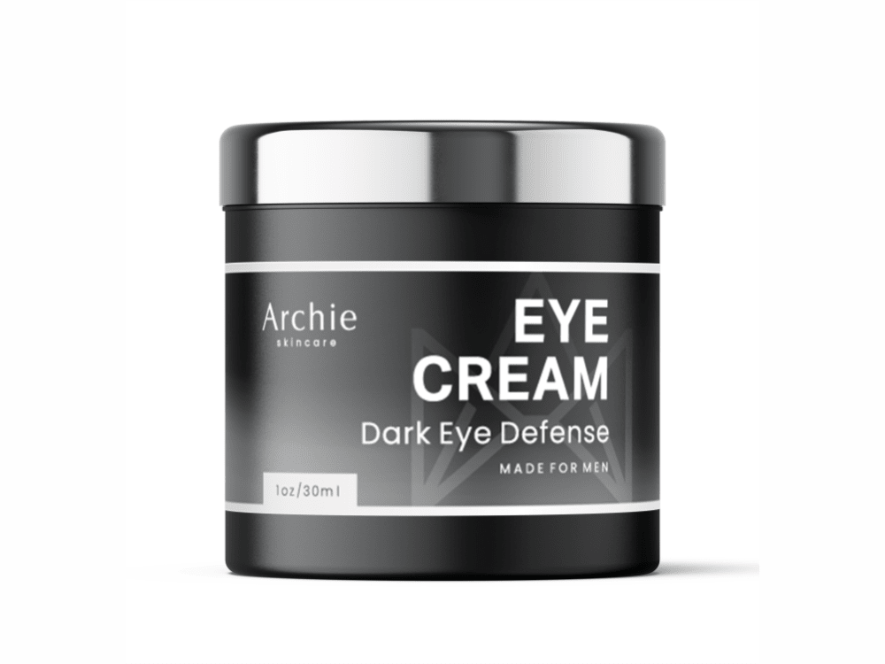
23 Responses to Option A
They all look nice and professional in my opinion. I like the black color, but it sticks out to me and fits the product too.
Black and white with the shiny lid is appealing and still looks like it is for men.
I like option A because it is pretty utilitarian compared to the other options. Since this is a men's eye cream, I like the sleeker, simplistic design of the packaging. I am not a fan of the black and orange or white and orange color schemes and the option with the wood look to it is a little out of place for me.
I like choice A the most because of the color scheme. it makes the product look very effective and appealing. Choice C is a great option as well because the color scheme and the text is easy to understand.
Options A and B look better because the packaging and presentation is more masculine.
Choice a looks like a better product
The black and white looks classy and appealing. The orange on black has strong appeal also. Choices D and B fall far behind A and C. Between D and B, I prefer the simplistic look of D.
I like the classic look of A and C over the others.
I prefer Option A because I like the color scheme of the product and it is easy to read the product's label. Following that, I like Option B because it also has a good color scheme and it is easy to read the label as well. After that, I like Option C because the black background and orange trim is eye catching. Last, I would select Option D because the color scheme is not one of my favorites and it is somewhat difficult to read the label of the product in my humble opinion.
I liked choice A the best since the product looks the most trustworthy and appealing with the black label and silver top. Choice C is the least appealing since the label looks too busy and distracting.
Choice A is the most visually appealing design of that product and the one I would most like to purchase
i like the clean modern design of A and B. Really a classy look
Like the sleek and charcoal or black themes, but not so much into the orange and the wood tones. They just don't seem to fit with the product for me
I prefer simple sleek designs, generally black or grey/silver for these type of products. I find them to look a bit more masculine. I prefer it not have images. I would rather it not have "men's" on it as well as it works for everyone.
Choice A is the best looking with the platinum color packaging and overall elegant design and text that fit so nicely and smoothly onto the container.
I really prefer the sleek black and white packaging of my top choice. The contrast in the white font with the black package is really sharp and easy to read. Additionally, the lid and the jar itself are the same size so the uniformity is appealing from top to bottom on the package. The others had some differences or look oddly shaped with a different sized lid. Others have distracting designs that don't add value.
I would be interested in this i it works. I have dark eyes and getting worse the older I get.
I liked the darker colors the most. My number 1 rank was one that looked manly and strong and felt like a quality product. My second choice also looked solid but I thought the wood looked a bit gaudy. Number 3 was also nice looking but just felt a bit less professional. The last choice was okay but the color was not my favorite.
I really like option A. I think the color combination looks really sleek and attractive. I also like that the label is easy to read.
I think that choice A is the best because the packaging is modern and the text is most easiest to read.
I chose A for a few reasons. First, I have become more and more opposed to anything that says it is for a specific gender. Second, I like A because it is dark colored, which I think will look cleaner over time, where light products tend to pick up bits of oil and dust.
Choice A and D look the most appealing in terms of design with A being the best as the package color matches the dark eye product. B and C look poor in design quality with C being the cheapest looking one.
Option A stood out the most as I scrolled down the page. Neat design, classic color combination. Good font and clear labe.
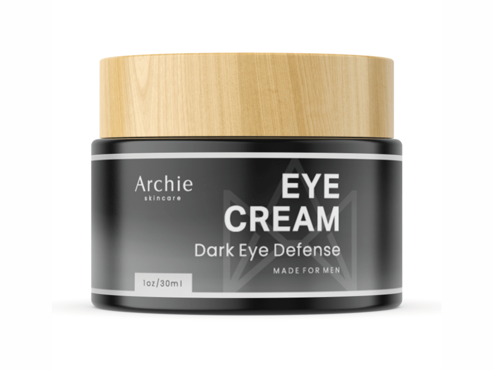
32 Responses to Option B
Darker color schemes look best for masculine products, in my opinion, so B/A/C are my favorites. Of those, I really like the wooden cap of Option B - it looks very classy and high quality, which is appealing.
B is my favorite by a pretty large margin. Container and label wise, it's a smart design.
B is the most appealing with the wooden looking lid
Option B looks the most classy of the options.
I like the wood look on the lid.
THE PACKAGING IN B LOOKS CLASSY AND ELEGANT. IT LOOKS LIKE A HIGH QUALITY PRODUCT
B has excellent contrast of color and the wooden top, D looks premium in quality and elegant in hues, A seems standard but potent, C seems underrated and less appealing at a first glance on a market shelf
B the design and easy to read text I put 1stA like the design put 2ndC easy to read textD text to small bad design on font put it last.
Option B is the most creative looking product design. It stands out the most and it is the most unique of all the choices given. Option C I would say is a close second. Its a great product design that is different an all black bottle really stands out and it looks like it is a premium product. Option A is alright its not that special when you compare it to the other two choices. Option D is the least appealing of them all, with a plain white bottle design.
In this case the black and white with the wooden top was the winner. It made it look both exotic and expensive. Good marketing sells and in this case my choice was the winner.
Option B is the best image, and is the most enticing. Option A is a close second. Option C is also a relatively pleasant image, but option D doesn't have the same allure.
Prefer the dark black labels - just more manly. And the sand color top gives it a nice look.
I like the black bottle and having the wooden lid on top makes it stick out more to me and also looks natural which I want in a cream. I like A next because the black and silver looks good and high class. I like C better than D because I think the black and orange matches better
I enjoy the black case and I picked B because the wooden top looks beautiful.
I like the black and grey with the wood lid. The wood makes it look like a higher quality product.
I like the ones that are dead on the best. I also like the wood cap in B.
Option B looks the most professional, effective, and potent. Option A and D look decent too. Option C looks the least promising and quality to me.
The wood cap in B really jumped out at me. I thought it looked cool and unique. I liked it much more than the others
Option B over the others for one simple fact that it has wood lid. I love wood grain on items and with the black color to fading to white fits perfectly my style of product.
I like the modern look of b with the wood looking top. Would look nice if left out in the bathroom
B - I like the wood top - conveys an air of "naturalness" to the product. The dark jar is manly. A - The silver top is also nice and professional-looking. C - a little more plain and unexciting. D - pretty boring, plastic top looks cheap and maybe even feminine.
The wood lid draws the eye first, along with the orange color scheme. The stone image seems like it's trying too hard and would actually deter me. The more mute color scheme seems like it wouldn't be overly eye catching, so it's ranked last.
The wood lid gives the product more style and appeal.
B is the best out of these because the way the colors and material of the container look, it looks classy. It looks like this is an expensive, high quality product inside.
I went in order of most to least masculine
I really like B because I like the wooden top look that it has. It makes it different and also makes it stand out compared to others. I put C and D in the same category because I like the orange blend that it has with both its other colors. I put C first because I love the way the orange goes with the black. It has the Halloween colors and it makes it stand out. I also like D for the same reasons as C with the blending of the orange and in this case the white. I prefer the black and orange but this is also a good look to me. I put A last because it looks like any other type of bottle to me. The colors really don't stand out much so I think it blends in with any other bottle with those colors.
I like B a lot more than the others because design makes me feel like the product is more natural. In particular, the wooden lid promotes that image.
The wooden cap implies that the eye cream is natural and healthful. The orange-on-black zigzag motif is also appealing: the label is easy to read and the contents seem like would be high quality. The remaining two aren't as appealing, and the one with the white cap looks similar to an inexpensive brand that I sometimes see at discount stores.
I like option B the best. i really like the wood top on the bottle.
Looks like a higher quality material of the lid, almost wood-like. Others also have better looking fonts and colors on the labels.
I like option B because the wood grain top is more manly looking.
B looks the best because it seems more professional and higher quality base on the image. A and D are okay. C seems like some Halloween product.
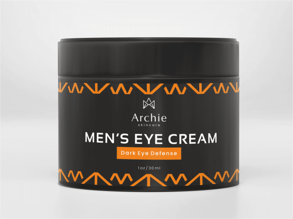
25 Responses to Option C
The dark color looks better so D 4. Out of the remaining, C looks the most elegant so C 1. A > B so A 2 and B 3
I really like the C the most i like how it really pops out compare to the others. It's a real eye catcher to have and fit in with everything.
Orange contrasted with the black is eye catching. Silver and black isnt a bad combo either. Not a big fan of the wood with the black for some reason but do like the black design more for a mens product.
C looks sharp compared to the others and stands out well the orange and black design.
I like the product in option C the best. I like the design and color choice of this container. It has a clean and elegant look.
The difficulty in marketing any men's product that can be perceived as 'makeup' is that it needs to be presented in a 'manly' way. I think C does this the best, with straightforward black packaging, clean white lettering and orange accents to catch the eye. B is also good, with the wood cover giving it a rustic, outdoorsy feel. D would be attractive to some men, not all, but would likely work in their targeted audience. A feels very generic, not distinctive in any way.
C looks the best because it has a more modern style, it has a more sleek look to it which I prefer.
I don't like the color of D but I think the all black looks of C and A are classy
I like the color scheme in option C. This is great and a sleek design. This would be the best but you can remove the "Men's" part of it. I think option A is good too and the shiny, glossy packaging is excellent here. I like that one a lot too. So between C and A, I'd go with C as the nicer design.
C and A look particularly masculine, so i prefer them
I like the orange and black color scheme in my top choice, which is bold and confident. Looks like a really nice product for sure!
C looks modern and simple, it would look ok on almost any counter or nightstand. A is similarly modern, but the silvery top is a little cheap-looking. B's wood-grain top wouldn't fit in in many places. D looks cheap.
C and D are, how do you say, eye-popping. Definitely something I'd give more than a glance if passing by it on an aisle. A does not have that quality, B has that quality even less.
As a man, I ranked the options based on what I feel is most masculine. I think option C is the most attractive from a male's perspective.
I like the black designs with the accented colors
I've always been partial to black and orange coloring, and for pick 2 I like the wood look.
The dark bottle that states its for men
I chose them in order of personal preference
Option C has the best use of complementary colors with orange black and white with the subtext. D uses nice gradient on the plastics. B has a cool wood top. A is really too plain .
Option C is a masculine bottle and has the boldest description that it is an eye cream for menOption B is the next most masculine bottle, although the words "Made for men" is in small printOption A is the next most masculinebottle. Again, the words Made for men is in small printOption D is not even a masculine bottle
Option C's sleek and masculine design looks more geared towards males. Option D, while it ditches the dark theme, still looks the most like a facial cosmetics container. Option B's wood-like top doesn't really communicate "men's eye cream" to me, but I appreciate the unique offset to the black container. Lastly, Option A strikes me more as a candle container.
I thought options C and A looked the best in terms of presentation and for me were the top two options. I thought option B looked decent but the color coordination in option D wasn't great for me.
I like it best because it clearly says "Men's Eye Cream"
I like the combination of orange and black so this will be my first choice
I like Choice C the most due to the cool orange chevron design along the top - it attracts my attention and counters well with the black background. Choice D has a nice ombre tone to it that makes me think about my skin and seems relevant, but I don't like the white cap. Choice A seems too aggressive and I feel like the silver cap tries to make it seem fancier than it actually is, almost like its overpriced. I hate the wooden lid on Choice B since it doesn't seem to fit at all and matches horribly with the container, while attracting all the attention.
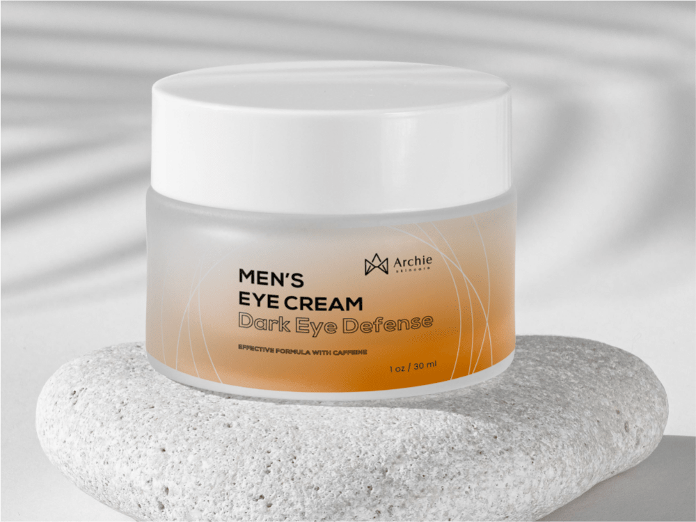
20 Responses to Option D
I love the white to dark orange fade that is shown in the choice D, it looks complete in my opinion
D looks very unique and interesting and appealing with the orange and white colors mixed and how its placed on the rock and looks very professional compared to the other images that are just placed looking basic with no backgrounds
Ranked based on how attractive the product image is
I like the brown color and I like the clear plastic
the color and semi clear container looks clean and nice/ the wood texture and black is somewhat classy/ the black and silver is eye catching/ the orange design all around is too busy and looks tacky
The cap on Option C makes it look cheap and untrustworthy. I like the packaging on Option D and B.
D is the best design wise in my opinion. B is also nice having the wooden screw on top. A and C are okay too but pretty standard.
D looks the most intriguing, modern, and high quality as well as eye catching. It looks clean and well designed. The wood lid on B looks nice, and unique. C and A are okay, but don't stand out
I like the magenta color of the first one and how you can see more of the product. Like the next two and a different color schemes. They have a good array of colors and show off the interest of the product
The all white design -- AMAZING. I love it. IT definitely says its for men just in it's style. It also has these modern geometric lines in the design -- amazing looking. The black one with the silver lid is almost as good too, it looks very modern and sophisticated. Then I ranked the one with the wooden top. IT was almost good. too much color clash though.
I like the tan/peach coloration of D, it looks interesting and soothing. And somewhat medicinal.
The images caught my eye in this order. I like the opacity of D
I chose option D. I really like the packaging of this product. This little jar is clean, neat and professional and I would notice it when shopping for such an item.
Option D looks much more professional and enticing.
I made my choices based on the creativity of the package design wqwhich is important to me.
I like the background. It looks exotic and foriegn.
I like option d because it lets you actually see the product.
I like option "D", it looks like a different product from the common ones, the image looks very original and attractive too.
Option D: My favorite is the white/light colored one as the point of eye cream is to whiten/reduce blackness, so the color of the container fits the theme of the cream's purpose. Option A's lid makes it look like a premium product. Option C's container makes it look cheap.
I put the mens eye cream first so that's D and C. I prefer the white packaging of D to the black of C so that's why they're positioned where they are. As for A and B it came down to looks and I think A is more sleek than B.
Explore who answered your poll
Analyze your results with demographic reports.