Poll results
Save to favorites
Add this poll to your saved list for easy reference.
Based on the cover, which book would you rather buy?
36 Responses to Option A
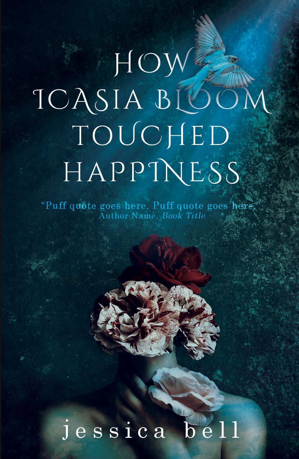
I like how A has a beam of light coming from the sky since this makes me think of happiness more than the darkness of B.
It is a bit hard to see what is going on in B, A is much more clearer.
A is my preferred choice because of the uniqueness of the design and the display content of the cove, the book cover looks good and attractive and will call more attentions to it, it a beautiful color design on the cover and it is pleasant to the eyes
A's design stands out more. It is the more interesting design to look at. It is a design that will get people to pick up the book.
Base on the cover, I would love to buy the book of option A, the book of option A is well designed and well titled.
its the most interesting cover very creative! the entire cover just screams read me!!
The font is more creative and interesting
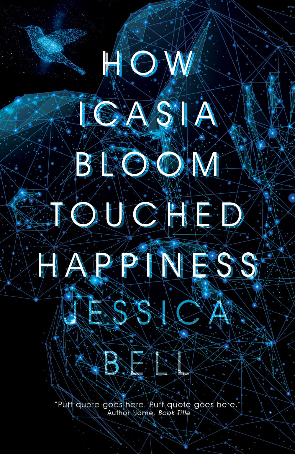
I would rather buy Option B because it is very intriguing and I like the flowers because they are fitting for the book title. I'm not quite sure what is happening on the cover of Option A. It makes me think of something astronomy related, so it is not fitting with the title in my opinion.
The real flowers (as opposed to the conceptual or constellation of flowers) seems a little more connected to the title. Although 'happiness' is kind of an abstract concept, the word 'touched' implies something tangible and the real flowers just feel right to me.
I like everything about this one: It's spiritual looking, mysterious, intriguing-- the womans head being flowers makes me wonder what the story is-- the background with the rising dove makes me think she overcomes or transcends something and I want to know what. the colors add to the mystery, the font is beautiful and captures your attention. The other one is nice, but with all the stars and celestial patterns, it makes me feel like it's science fiction and I have less of an idea what it's about. I think the other is much prettier, much more memorable and attractive.
At first B caught my eye but I had a hard time reading the text with it being so busy. A seems to be more conventional and easier to read.
I prefer this cover because it looks smoother and more pleasant. The other one is eye catching but doesn't look overall as visually appealing to me.
I feel like the flowers and the girl adds a more mysterious and creative tone to the book cover. The flowers really work well since there is "bloom" in the title as well. I feel like option B feels a little more tech/sci-fi rather than the feminine feel that option A has. Option A seems to capture the essence of the title better while giving you an atmosphere.
I think that the flowers with the person holding them relates to the title. I feel like the other book doesn't really relate.
I liked the flower. I wished there was more detail on what the book was about though.
I like the look of this cover more
Better font and overall design.
I prefer the design of A, although I do not find the text very readable. The text of B is better. A has a nice layout
First, I prefer the more subdued color of this cover. Secondly, the female's face hidden behind the flowers intrigues me.
I like that choice a has a picture depicting the story on the cover.
The image of the feminine frame with the flowery head really portray the meaning behind the title.
This image catches my attention more and makes me curious about the events of the book. The other doesn't give me any information.
I think the image used on the cover is very creative and it gives me the impression that the book is unique and interesting.
i have no idea why, but i like uncapitalized letters better for some reason. also the font on the one i chose looks like some neil gaiman books that i like.
The cover I selected seems more unique with the flowers being used for a lady's face. It's intriguing to look at overall compared to the alternate that is primarily composed of text.
The bouquet of flowers is intriguing
I like option A because the title and author are spaced out more and easier to read.
The bloom of flowers relate better with the title.
I have a hard time reading the words on option A, but the graphic is cool and interesting and sort of girly. I like the blue background and over all blue on the body on the girl. I love the pretty flowers. Option B looks to much like a text book or something on astronomy and science fiction, that I am not interested. I like option B ok, but I would definitely pick up option A and check it out of the library but leave B on the shelf. Option B reminds me of Stephanie Myers book, The Host, and I don't want to read that story again. I like A the best out of these two!
Option A has the visual appearance I prefer when it comes to art and illustration. I love the detail and it has a romanticized feel to it. I'd be most inclined to notice this and pick it up based on the example.
I'll pick up Option A first, because the text is closer together. I felt I can read it faster while I was skimming covers. I think the art is also eye-catching.
I like A better because the script and picture itself elludes more "happiness" which is the topic of the book. I like the gentle script used in the title better too and the background coloring is much more soothing.
The other font is more difficult to read the name in, it looks a bit distorted
I like the cover with the flowers and person. It seems more approachable to me.
The cover looks like it has bloom.
I much prefer A as it kind of implies a happy ending for the tragic Faulkner story "A rose for Emily."
14 Responses to Option B
I like the Richer and darker colors used to express the cover better in that one
B looks more intriguing, the cover sort of looks like the universe. It has a high-tech feel and stands out. A's cover is boring and I don't care about the flowers.
B looks mysterious and has a beautiful cover that really takes my attention. Seems like it would be more interesting than A, A looks very weird and creepy, I would stay away from that book.
The title of the book was well constructed, it a defined meaning and understanding. The design of the book greatly portrays what the book is about especially with the female icon and flowers.
I chose Option B because the cover is mysterious and darkly original. I found option A very creepy and seemed like the book genre would be horror. There is something very off putting about the figure on the cover of Option A
The background with what looks like science fiction tech/neurons makes the book seem much more interesting.
B had more of a science fiction feel to it which I liked more. I found it more interesting.
I like the fact that there is really no pictures on the book
Option B because option A looks kind of messy and non specific
The cover is much easier to read due to the font color
I like choice B because the font is much better. It look more professional and it is easier to read. I do like the image of the person on option A, however.
I like the more simplistic look to this cover and the font is a lot better. Option B has a lot going on with the cover and is kind of distracting. The color scheme of option B is really nice.
Choice b stands out more and is easier to read the title
I chose option B because it is a less cliché way of visualizing a person's happiness. Showing birds or flowers or other "nice" images is a traditional way to depict happiness. I think that is played out. Happiness occurs in the brain so I think showing something that looks like neurons in the brain lighting up to show happiness is creative but also more eye catching for a book cover.
Explore who answered your poll
Analyze your results with demographic reports.