Poll results
Save to favorites
Add this poll to your saved list for easy reference.
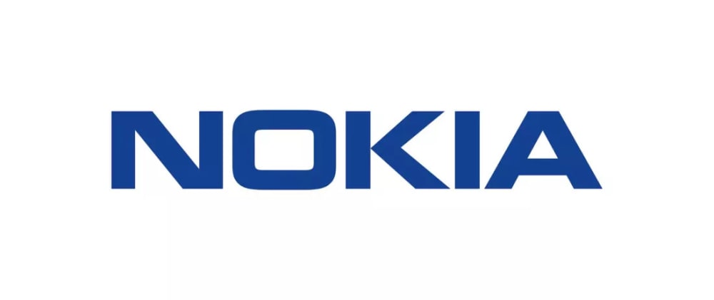
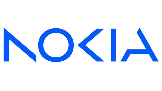
Which Nokia logo do you like more? The old version (option A) or the new version (option B)?
25 Responses to Option A
I prefer the old version because I think it not only looks better, but more legible.
B is not easy to read
I much rather prefer the option A Nokia brand logo design because I like the easier to read font style and the darker blue color design much more here.
The classic logo is a no brainer for their brand.
I prefer the old logo but I understand the need for change, growth, and innovation. I just don't think option B is it.
I disliked that parts of the letters are cut off in the new version.
I prefer the older version. It's been around forever. No need to change it.
I like a because even though it is the older version I like not having to guess what brand it is.
I like the old version more. It just brings about more nostalgia for me.
I LIKE THE OLD LOGO BETTER. THE NEW ONE LOOKS WEIRD BECAUSE THERE ARE MISSING AREAS WHICH MAKE IT DIFFICULT TO RECOGNIZE THE BRAND.
The new version is just too ornate for me, I like being able to easily read things.
The old version seems solid and dependable. The new version is rather hard to read.
B is too hard to read at a glance.
I like option A, the old version.
I prefer the old Nokia logo, it's simple in design, I like the bold text, the darker blue, and just how well the font flows. It's iconic, and just has a smooth appearance to it that remains modern.
The classic will always be the best logo and you can actual read what brand it is. Option B is hard to make out that it is Nokia.
The old version is very clear. The newer one is missing just enough that it’s hard to tell what the letters are.
I like this one more because it is more classic, I feel like this is a very iconic logo, and should not be changed
I like the more classic look just because Nokia is just such a classic brand.
It's so much easier to read and just seems more modern.
I much prefer the old logo, because it can be clearly read at a glance. The new logo in Option B tries so hard to be edgy and interesting, that I would struggle to even read it if I wasn't already so familiar with the Nokia name.
I prefer the original logo because it has a stronger bolder style and it's easier to read.
I don't like that half the letters look missing in B. If I didn't already know that B said Nokia I would need to sit there way longer than necessary to work it out.
A - You can recognize it anywhere in the world, the letters are the perfect style no matter past/present/future
I think the classic is way more recognizable, and I am not a fan that the newer version is frankly hard to read.
5 Responses to Option B
I prefer B because it looks more modern and dynamic. It is unique.
I like the more unique design of B; it's time for a change because A's logo has been around for as long as I can remember.
I like the new one because it looks sleek and modern compared to the old one.
The new version looks more modern and is nice to see as opposed to the old logo which has been around for years
I love this one more becauase it has a more confident vibe and looks so much more modern, making it more attention getting.
Explore who answered your poll
Analyze your results with demographic reports.