Poll results
Save to favorites
Add this poll to your saved list for easy reference.
Which of these App Store icons would make you want to download this game, and why?

Answer Attributes
Age range
Console gamer
Education level
Favorite mobile game genres
Gender identity
Options
PC gamer
Personal income range
Racial or ethnic identity
Video game player
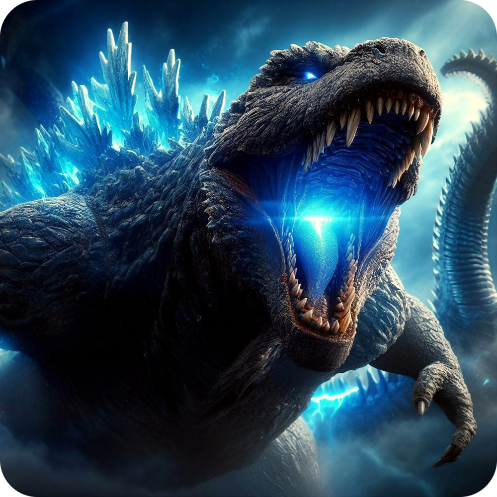
19 Responses to Option A
A is more intense, so I would be more drawn to A over B.
I feel like Godzilla is coming right at me. It's a much more dynamic and interesting picture. I would catch my attention right away.
the power in its mouth looks really cool
The close up image of the creature makes it look more fearsome and exciting.
Godzilla's arms looks very awkward in B's icon and A is able to stand out more to me.
I like this one it stands out and draws my attention faster
The app icon of Godzilla up close is much more exciting. It has that T-Rex escapes in Jurassic Park vibe, just menacing.
The logo is iconic, and I like the close-up shot that shows Godzilla with ferocious teeth. The color scheme is balanced and suitable for presentation here.
This one gets me more pumped and excited.
It looks full of excitement and action and I like the thrill of it.
this one looks more dark and mysterious.
Godzilla charging up his beam staring right at me is much cooler looking.
A is so nice seeing his face in a closer up image with him about to shoot out what im going to call a laser is really cool. on image A its screams dominance to me where the other is just anger and those are two very different things. the background hue of the blue really makes this scene pop too
Option A makes the monster look more fierce and threatening, which is more exciting for a mobile game. In Option B, it is difficult to make out the features of the animal, whereas in A you can see even the monster's scary looking eyes as he appears to be coming towards you.
I would be more likely to download and play option A because I think that it has a more eye-catching and visually appealing app icon design. I like that it feels like Godzilla is coming right at you. Overall, I just think that it is a more interesting and exciting app icon design.
The Godzilla looks cooler up close!
The roar of the montster looks good for an app store cover art for a mobile game
very cool looking image with it head on and that blue really pops. The other feels common
I like the style more direct to viewer.
11 Responses to Option B
I like B's more zoomed out look and that it shows the power plant/factory.
I prefer this image since you see more of the monster. Good picture here.
I like seeing the monster attack the city and the buildings.
you can see more of the location and scene on this one which is more intriguing
For some reason, B is just more intriguing and compelling to me.
B is the one I would download as I like the scale, scope and angle of this option. Great graphics!
The side view lets me see much more of the action. This view also gives me a more complete look at the monster and allowed me to immediately recognize who it was.
Because it shows Godzilla being destructive, which means there is probably some good action in the game.
Seeing Godzilla and some of the power plants wants me to click on it more than just seeing his open mouth.
Seeing a big godzilla type monster destroy something is infinitely more interesting than just seeing it ready to fire some sort of attack.
Close-ups of Godzilla don't really do much for me. People that grew up with Godzilla enjoy seeing its size discrepancy compared to buildings, so option B would be more appealing to me.
Explore who answered your poll
Analyze your results with demographic reports.