Poll results
Save to favorites
Add this poll to your saved list for easy reference.
Which cover would you prefer, and why?
Answer Attributes
Age range
Audiobook listener
Education level
Favorite book genres
Gender identity
Literary preference
Options
Personal income range
Pet owner
Preferred book format
Racial or ethnic identity
Reading frequency
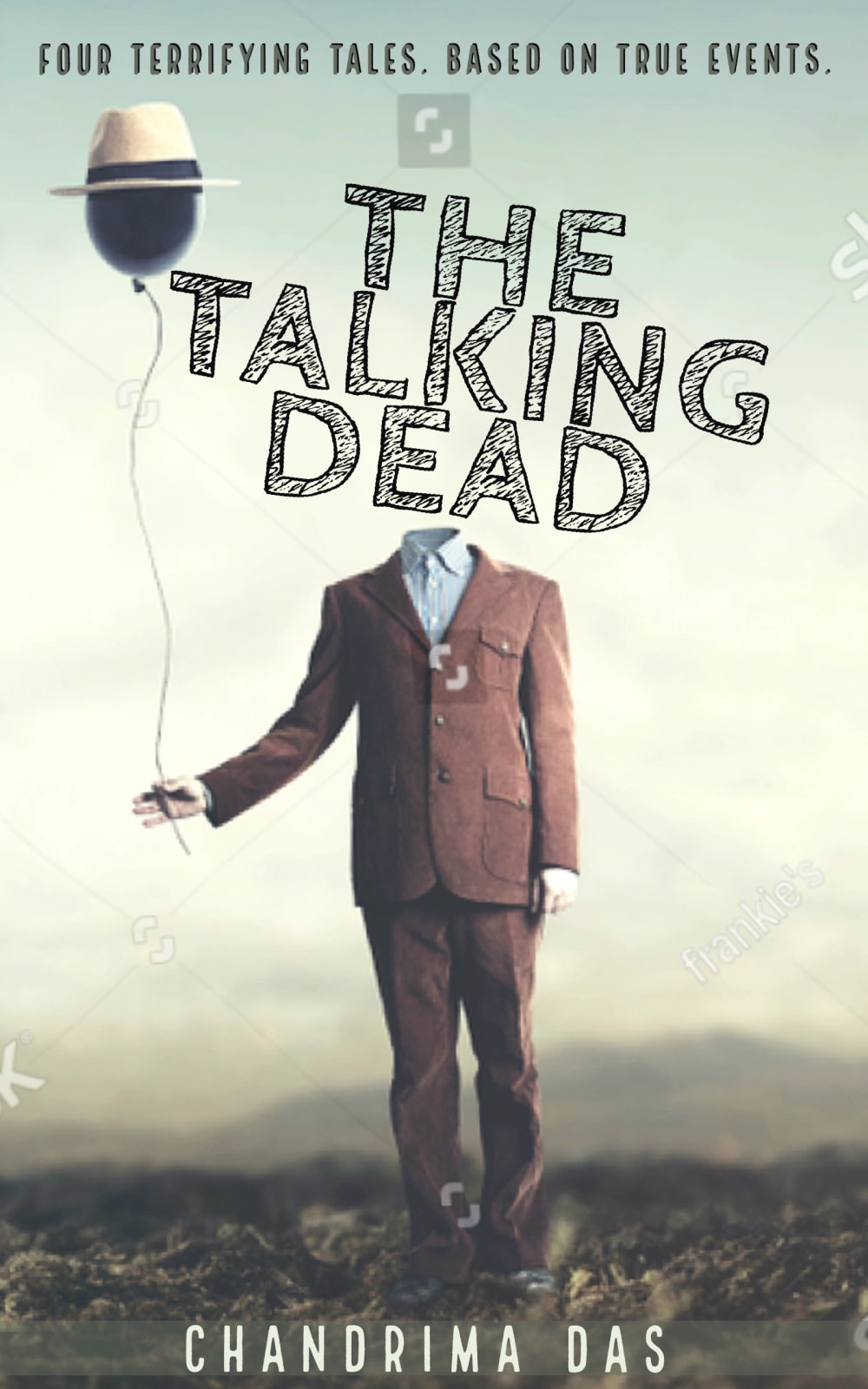
30 Responses to Option A
B is too Silence of the Lambs.
A i like the look of as it has kind of a surreal twilight zone look it and i kind of like that aesthetic
the walking suit man is bizarre and eye catching and also fits with the title of the book more.
This would really make me think that the dead could talk.
I really like the eerie feeling I get looking at the photo of the book cover in option A, I think it fits the title really well.
I really like the headless guy in A, it is clever and intriguing to look at, it is something I would like to learn more about. The other cover is rather boring and plain.
I like the cover in option A better. The image is more striking and captures my interest better.
I found the design of the book cover of option A to be more compelling than option B's design.
This has a lot more impact because of the unique color scheme and fonts choices for me
The cover is more appealing and interesting with the artwork and the headless man, fits the theme.
That is a pretty good cover design. it's certainly distinctive and eye-catching.
Option A was selected for the missing head image. the image really grabbed my attention over the other option.
A is more artistic and eye catching
This looked more interesting and had things to look at and ponder on what they mean. The other cover just seemed creepy and serious.
The cover comes across as creepier than B. I assume by the title that the stories are about people and the headless man on this cover brings that to my attention more.
The image of the body without a head and a balloon with a hat is intriguing. This image makes me wonder about the stories.
This image seems to fit the book's title well in my opinion. The colors may not be as eye-catching, but it still catches my attention well.
I prefer option A because I think that it is a much more interesting, attention-grabbing, and visually appealing cover design. I also think that it is a more fitting cover design based on the title of the book.
I like choice A because of the art on the cover. The suit with the balloon head that's floating looks very cool.
The design on choice A is more interesting with the headless man with a balloon.
I like option A cover more because the cover is more attention grabbing. The picture makes me check out the title and subtitle of book and makes me interested to read it.
This is the cover that I prefer. This one stands out more.
I like the mystery and intrigue in option A its different and makes me want to crack this cover
Option A is mysterious and engaging
I really like to cover of option A it is a great picture and I think it really captures the essence of the title of the book
I can relate to Option A better than B. A human being illustrated on the cover helps me know what this may be about - option B looks like dead insects.
The humor shows through in this. THe other cover seems too serious for something of this type
I absolutely LOVE the cover on A and that's why I chose it! It really stands out and makes you focus in on the name of the book and immediately curious to find out what the book is going to be about. It would make me click the link or pick up the book instantly! B is boring and just okay. The skulls make it kind of mysterious and the red color could mean blood so definitely fits with terrifying. So I guess it's more for what the author is really going for?
I choose A, because it really made me laugh. Something about a "floating head, balloon," seems really funny to me. Probably, because we all say such ridiculous things, at times, and have all had "floating heads." Also, the image of A, made me curious. I wonder what the "Talking Dead," have to say.
I choose A because the picture of the ghost figure holding a balloon looks a lot more spookier than the other picture. I also like the clouds and the cloudy sky in the background too it looks really realistic.
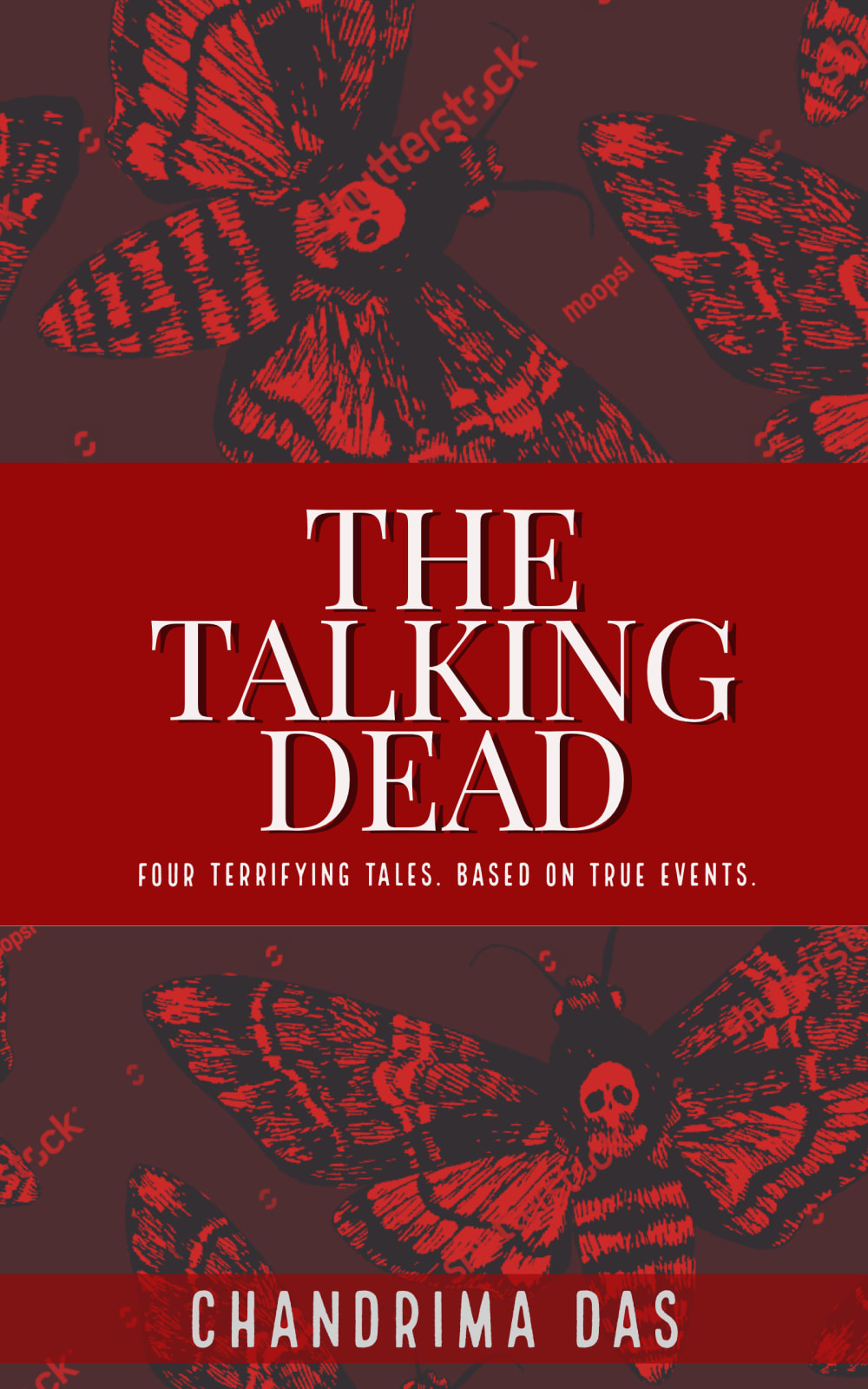
20 Responses to Option B
B, for a horror novel the imagery is more fitting.
B seems like a more professional cover in contrast to the other one
B cover looks scarier. A looks more comedic.
The cover is dark and ominous. The blood red cover makes me think of horror. Really fitting look for the theme of the book.
I love the red and black moth design
I like B as it seems more scary of a cover. Cover A looks whimsical.
I would choose choice B first because it has a good theme and the color of the background matches out really well with the theme of the book as compared to choice A which just a clear cover and nothing really to pass the emotions of the book.
i actually missed the tagline at first with A, I noticed it right away with b
I love this option more because it has a scarier vibe making it more intriguing to read.
I would prefer option B because i like option B because the colour red is giving the cover such a vibe and the detailed work on the cover just catches your attention.
I prefer this cover for this type of book because it has far more impact.
Option B reminds me more of Silence of the Lambs. I think it would be more to my tastes over the other option which doesn't look very polished.
I prefer the cover in Choice B. The death's head moth is something that's related to death and misfortune in a lot of cultures, so its association with the title is clear. I don't really see any good relation between the elements of A.
I picked B because I think the red background/illustrations are more bold and better emphasize that the book is definitely part of the horror genre. A could just as easily be a self-help book.
I thought the headless man in A was way too creepy.
I feel that B's cover is much more fitting with the title of the book.
Considering that there are four 'TERRIFYING' tales, B gives the impression of more mystery and darkness while A gives the impression of magic or wizardry.
The red cover looks darker and more menacing. It looks more serious compared to the other choice. I think it would be a better read at first glance.
I like the look of the moths and skulls better, seems to fit with the title.
The cover loos more trailing and horrorful to view maing it fit for the intended reason.
Explore who answered your poll
Analyze your results with demographic reports.