Poll results
Save to favorites
Add this poll to your saved list for easy reference.
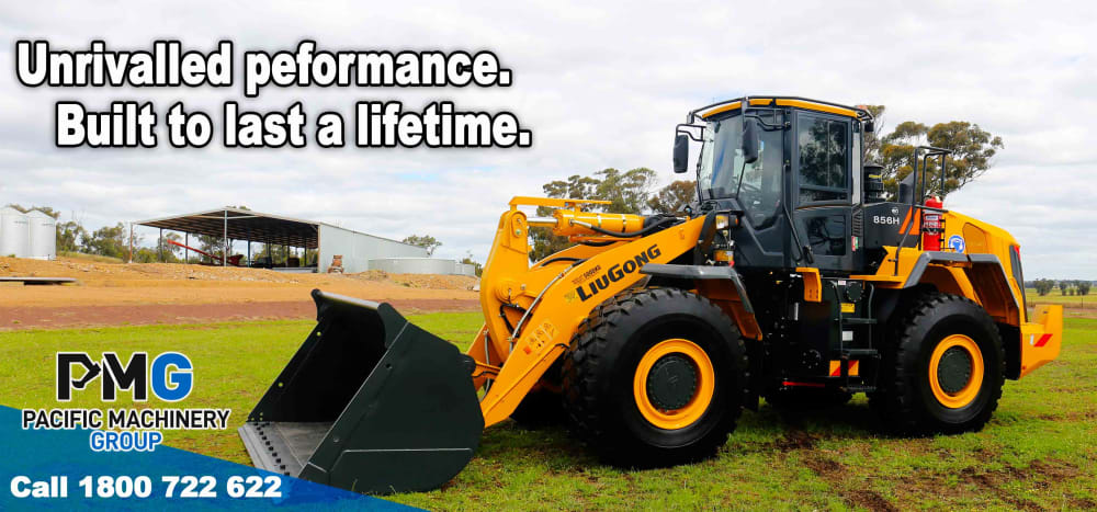
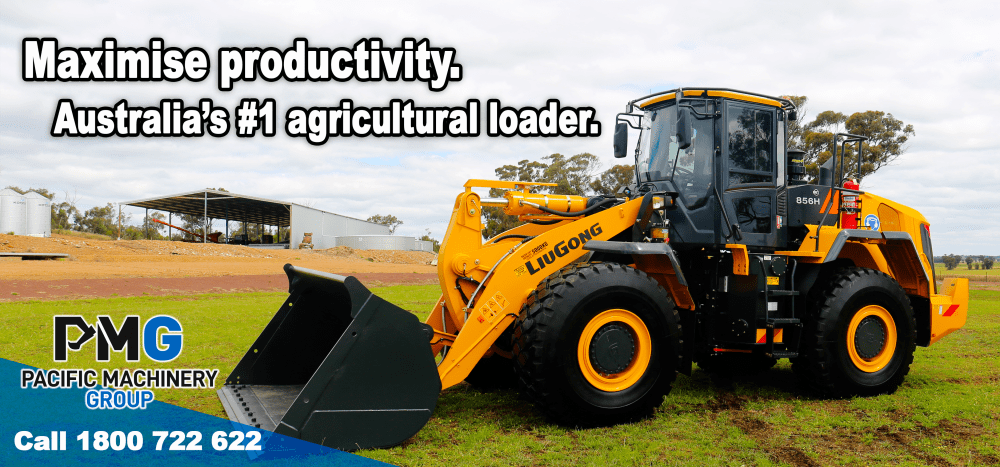
Act as a farmer, travelling by car to a country town between 60km to 100km p/hour, which Billboard Advertising will catch your attention? Why?

Option C won this Ranked poll with a final tally of 30 votes after 1 round of vote counting.
In a Ranked poll, respondents rank every option in order of preference. For example, when you test 6 options, each respondent orders their choices from first to sixth place.
PickFu requires a majority to win a Ranked poll. A majority winner differs from a plurality winner. A majority winner earns over 50% of the votes, whereas a plurality winner earns the most votes, regardless of winning percentage.
If an option does not earn a majority of votes, PickFu eliminates the option with the lowest number of votes. The votes from the eliminated option are reassigned based on each respondent’s next choice. This process continues in rounds until a majority winner emerges.
Scores reflect the percentage of total votes an option receives during the vote counting and indicate the relative preference of the respondents. If there is no majority winner, look to the scores to see how the options fared relative to one another.
| Option | Round 1 |
|---|---|
| C | 60% 30 votes |
| A | 20% 10 votes |
| B | 20% 10 votes |
10 Responses to Option A
larger and more prominent, easy to read from the road compared to the others
Built to last a lifetime would definitely catch yhe attention, it would make me stop and look
The truck size makes it more noticeable and I don’t like the red on the other banner
I liked the vehicle as it stands out the best, the sentence speaks well of the tractor saying built to last a lifetime. I do not care much of an image of a farmer, so I ranked that last. I can hardly see the vehicle as he is covering it and it is not on a good angle.
A. Built to last a lifetime B. The red makes it stand out C. Maximize productivity
It is more eye catching, and must be if advertised on a road. Further the words in the ad are easy to read and simple, quick and succinct, great imagery also. Number 2 is similar to the first ad but with harder to read description as is longer. Option 3 is filled with good content but needs a more modern image.
It was more straight forward, just advertising the machinery. Not as distracting as the other billboards.
A and B are cleaner and draw more attention. They aren't cluttered like C. I ranked A over B because i feel like the message is more attractive.
The built to last a lifetime is something I know farmers will appreciate
Simple and to the point the others seem to have to many details to understand fully in what couldn't be more than a glance.
10 Responses to Option B
B looks most appealing to me and makes me think the travel is most interesting. A is also quite good but I like the words of B better
Increased productivity and #1 in Australia says it’s a popular choice in the market
This ad stands out more to me because of the large tractor in it.
Good looking equipment, doesn’t need a farmer to sell this product
Option B looks clean and simple. The message is better than in Option A in my opinion. C looks cluttered and I don’t like the red
My number one choice was chosen because at a very quick glance I am caught by the picture of the tractor and the word Maximize hints to me that this piece of equipment is not only better quality that I am currently using but will actually increase productivity.
Out of the three I prefer the presentation of option B. The position of the vehicle is appealing and stating that it’s #1 in Australia caught my interest.
It would look most appealing to me if i were a farmer. A big tractor. It stands out the most and has less text. The other two dont write have the boldness of the initial one i picked.
Clear and not over crowded is more efffective than a lot of writing or many images. You only have a short time to take in information so its important to only have the most relevant items easy to absorb.
My eyes were automatically drawn to this image. Seeing the words Australia’s #1 made me want to continue reading
30 Responses to Option C
The colour and gentlemen in option c catch your eye more than the other two plus make you realise it is for farming and not construction. The plain images of the other too are dull and not worth a glance.
The first choice has a man as well as the vehicle in it. The caption also suggests that the man is probably from farming profession.
I think having the colour red will make the billboard "pop" and having a face to the company name will make it a bit more appealing
The red on first choice stands out the most and would most likely be noticed while driving Second and third choice are very similar and could be mistaken for anything other than the topic under discussion
It’s more personable by showing the friendly face of a farmer
the colours seem to stand out more, the other ones look like they would blend into the background more as they are the same colours as the land around them when travelling along a country road, yellow with red would be instantly noticeable as they arent normally found in nature especially on a country road
Stands out with a farmer on the billboard. It catches your eye. The writing is more clear when not over a picture. Easier to read.
It has a farmer in the picture so it’s easy to relate to it. He looks happy with the machine and so makes me want to know more
The red colour will catch my attention first and it has the least number of words too so it’s easier to read
The colour red with man standing catches my attention. The words used also intrigue me
It stood out to me more so because of the bright red which is eye catching and also the up close view of the person posing
Option C billboard would stick out to me because of it's bold colours especially where it's call to action is. Its clear and percise and appeals to me. I can clearly see it's aimed at me with it's words and pictures. It speaks to me and shows that it understands my needs.
The person standing beside the farm equipment gives it a stamp of approval and the red at the bottom is also more eye catching
The red border stands out more making the yellow wording also stand out so would be more noticeable
The red frame is a lot more eye catching than the other ones. Option A suggests it will last for a very long time. The last option well I just had to rank that one.
Local true country farmer advertising his business
I ranked Number 1 because the advertising seems More personal seeing a farmer on the cover
Option C:My eyes will probably catch red colour first. There is a man wich might look familiar from somewhere. Good letter contrast.
A tractor with a farmer is trustworthy if I had a farm it is also colourful enough to grab my attention it stands out across the paddocks of grains
Bright colours catch the eye, message not clear as too small
Red always catches my attention. It always makes me look. The big images are very appealing.
C provides a person, which gains more trust than simply a piece of machinery. A & B are alike. Both fonts are harder to read in relation to the machinery and background colours.
The colours grabbed my attention. Bright and the other 2 are dull
This has a man in it. The design is more attractive than than the other 2. The others are plain, no man, no text in red. They are not memorable
Able to see the text clearly. Having the man appear seems like he can be relatable to others in the same industry in option 3. The other to options are harder to see the white writing.
The colours used jumped out at me right away, getting my attention.
Red coloured signage is distinguished from others and the others are exactly same images and no differences shown while driving fast
Its very eye catching and it nice and simple. Having a farmer makes it relatable
The red catches y my eye first. Plus it has the person. The other two aren’t as eye catching.
First is Very bright so stands out from the other choices. It explains in just a few words the benefits of the item. Second has a catchy catchphrase but otherwise wouldn’t catch my eye as it is too similar to the third option.
Explore who answered your poll
Analyze your results with demographic reports.