Poll results
Save to favorites
Add this poll to your saved list for easy reference.
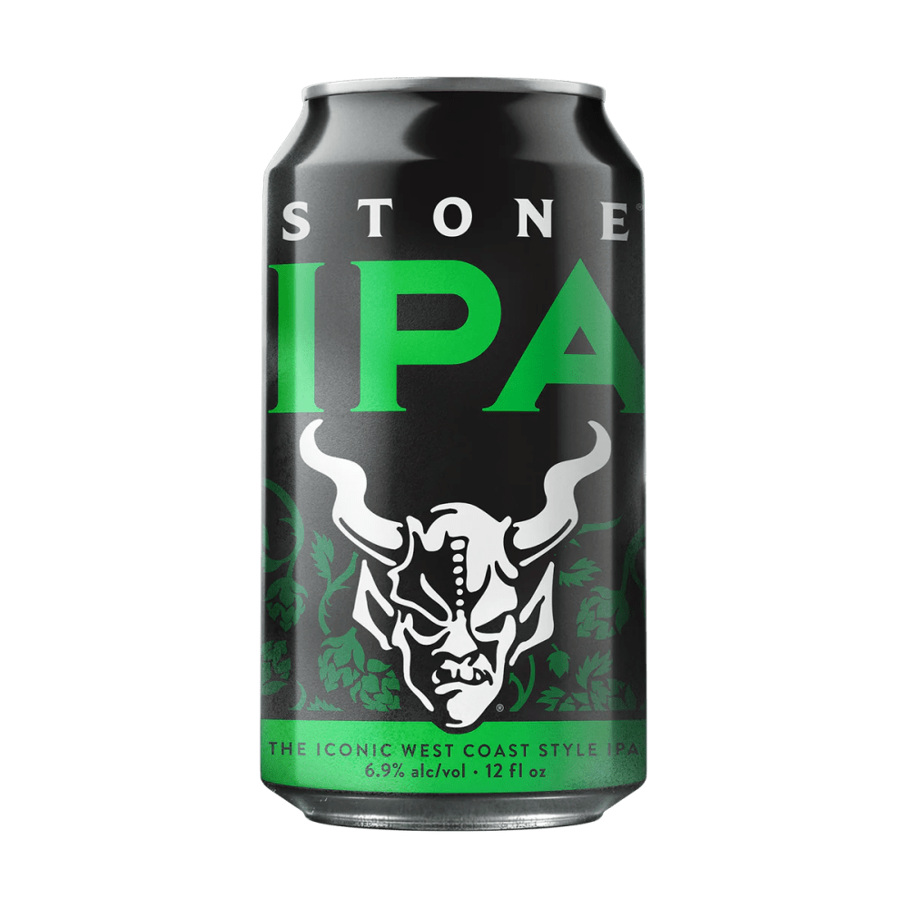
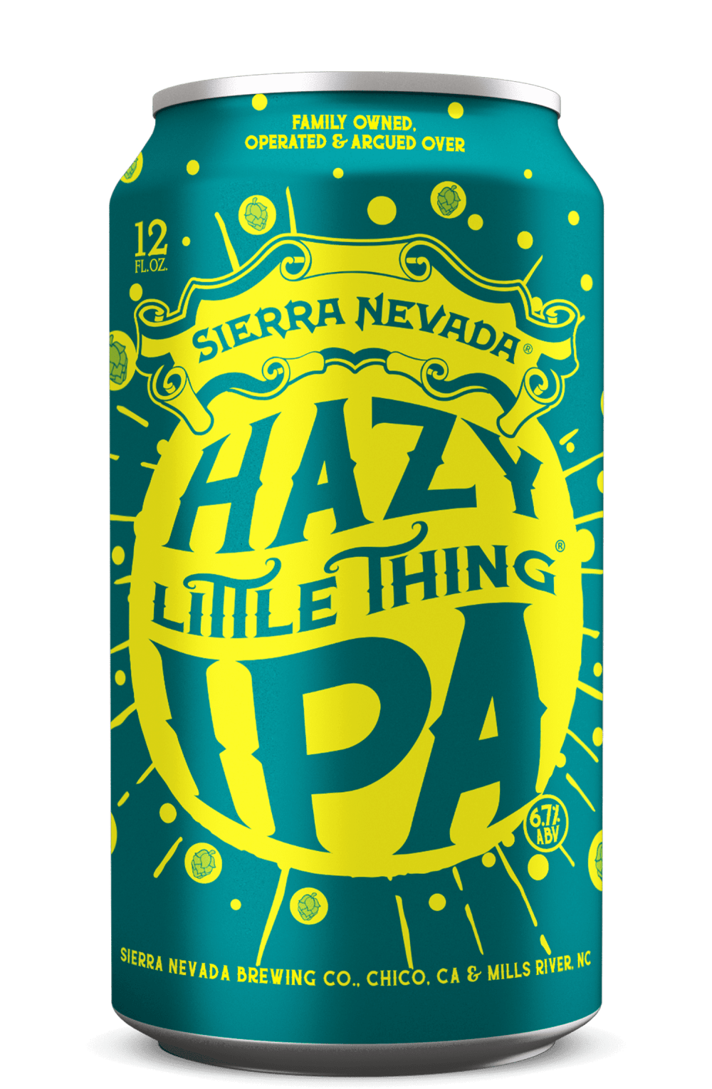
Which packaging design do you prefer if you were looking to try a new IPA out and why?
Answer Attributes
Age range
Beer consumption frequency
Education level
Gender identity
Options
Personal income range
Racial or ethnic identity
12 Responses to Option A
I like this logo better. It looks cooler and stronger.
The image is rugged and looks powerful.
There is too much is going in B and also dull, A is simple and has powerful look so I chose A.
It actually looks more like an IPA and not a soft drink
I think the black and green look the best out of all of these. The design is simplistic but memorable
I am mainly picking this one, because I tried the other option already. This options looks good as well due to the black and green color of the can.
A to me I feel has a better design on its can that looks more appealing.
B looks more like it would taste fruity, and I'm not into the fruitier flavors.
I like the cleaner look, prominent-icon design of A a little more.
darker color makes it seem like it has a bolder flavor
the black makes it look modern and lets the green pop out more
I prefer the cleaner label. There are so many like the other one, that seem to imply that "we're different!"
38 Responses to Option B
I like B more. I think it's more unique and I like how it fits the name and look's 'Hazy'.
Option B has a cool design and makes me want to taste this new concept. Option A has a bad and horrible design.
The design isn't as intense looking as the other choice. And going by brands, I like Sierra Nevada better. I've actually tried this exact IPA. It's good.
I selected option B because it looks like a fun brand. It looks like a brand with fun flavors and great taste. It looks like it would be tasty and enjoy.
I prefer B because I think it has a much more playful and eye-catching design to it.
I love the bright color combination used on this one.
I like this one as the color and design just pop out for me and get my attention right away
I have seen this brand before and I like it so I am comfortable and I think the bright colors make you notice it more.
This one has more of my fave colors and just looks fun and delightful
A. Color stands out more. Looks nicer and more refreshing.
If I wanted to try a new IPA in one of the two packaging options, I would choose "Option B", which is the "Sierra Nevada Hazy Little Thing" beer in a 12 fl oz can with 6.7% alcohol by volume. This beer falls under the category of Hazy or New England IPA, know for its smooth texture and fruity hop flavors. The blue color of the can with yellow ornamental style, resembling a splash of water, is visually appealing and enticing, suggesting a refreshing experience. Just looking at the can already makes me crave a nice cold beer, especially considering the reputable brewery behind it, Sierra Nevada Brewing Co, known for its quality craft beers. Therefore, the combination of the intriguing packaging, style of IPA, and the brewery's reputation would make me inclined to choose "Option B" for my new IPA experience.
I prefer choice B because the design is more exciting. Stands out more on the shelves.
B looks more decent and highly attractive. The design is modern and has a brighter color scheme. I find it more professional and relatable.
I like option B better, because it has way more positive energy than the other option. It has a fun and active look. Option A looks mean and nasty.
Option B looks more fun and interesting. Option A looks like a red bull design - sort of.
This is brighter, more colorful, and fun.
This one looks fun. The other one looks weird and mean.
I think this is more fun and adventurous so I would pick this can first.
I like option B for the design aspect. Hazy little thing has a nice ring to it. The graphics isn't much. Plain and simple looking. Not to rough to look at. But still gets the subject of the title of the beer out there. Hazy little thing.
I choose B because its design is visually appealing and creative to me, compared to A
This one looks more approachable. I dont like drinking beer that looks satanical
I think the colors and graphic design look more upbeat and festive in Option B.
B is more gender neutral and stands out
Option B is the best option because of the colors of the can. The green and yellow colors grab my attention and look aesthetically pleasing while the other option looks bland.
I chose B because A is just not my aesthetic. Its too serious and masculine.
It looks trendy and like a craft brew
I like the brighter colors, the black in A makes it look like an energy drink.
Option B makes the content of the product look delicious. It also makes it look fresh and bubbly. In a way it's also gender neutral looking so it expands your target market.
I like B best because it's fun and entertaining. Very nice colors. A is harsh and looks for only a very specific crowd, like goth or alt or heavy metal. While I like that crowd, it's not something I want everyday aesthetically.
the lighter brighter one feels more fun and exciting
B grabs my attention more and looks more refreshing given the color combination. The demon on A and the colors suggest something like an alcoholic energy drink mix rather than an IPA.
I like the crazy colors and design. The devil motif isn't really my thing and doesn't appeal to me.
I'd like to try B. This can looks funky and fun.
Since I am already somewhat familiar with Stone Brewing options, I would choose Option B if I was looking for something new, because it is a unique design and much more creative in its presentation.
I like the color and text. A just tries to look edgy which is a bit boring.
It feels friendlier and more "hip".
The logo and design are much more attractive. I also like hazy beers. The other option looks mean and discouraging.
I like the lighter aesthetic of B
Explore who answered your poll
Analyze your results with demographic reports.