Poll results
Save to favorites
Add this poll to your saved list for easy reference.
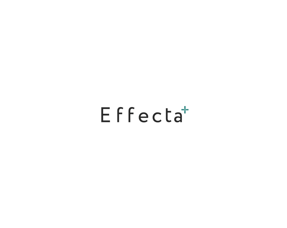
Which logo do you prefer?
Answer Attributes
Age range
Crowdfunding participant
Cryptocurrency investments
Education level
Gender identity
Hobbies and interests
Number of kids
Nutritional supplement use
Online shopping marketplaces
Options
Personal income range
Pet owner
Racial or ethnic identity
U.S. geographic region
20 Responses to Option A
A, there's no specific letter that needs to stand out
A is simpler and doesn't require any thought to process what I'm reading.
I like the font and the simplicity of A.
Simple is usually best. The small + sign at the end is all the extra bits it needs.
The logo is more clear and easy to read
I like the font of option A, the letters look classic and simple and the name stands out more.
This logo looks very balanced. It's simple, yet effective. I like the font and the subtle color used.
I like this logo because the font is simple but also classy
i like the simplicity of choice A and the darker print better. i feel like it stands out more but still isnt an eye sore if that makes sense.
I picked option A because it is simple and easy to read. In the other option, the letter "C" was unnecessarily large and distracting, but I did like its font and color.
Simple is elegance to me.
It was easier for me to read the word with the 'C' with the same font and size. With the larger C I was at first unsure how to pronounce the word.
Clearer and easier to read
I like the simplicity. Seems more modern.
A looks much better. At least you get an A Plus (+) with it. You're given a middling C + with B. C plus isn't great.
I like how the black coloring stands out better.
I like the Plus on the end.
The logo depends very much on the "type" of business. I chose A because it's actually generic enough to go with many different types and you provide no explanation about why the C is enlarged in B.
I think the logo for A is much simpler while still giving off a professional and memorable effect.
I prefer A, logos that are cute are often difficult to make out what company they are for. A is very straight forward and easy to see what company it is for. It is simple and I prefer that.
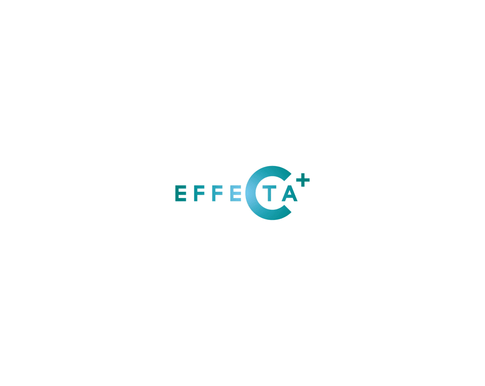
30 Responses to Option B
This one looks more high end and better done.
The b stands out much more and is very eye catching. A is a little too spaced out and looks off.
B i think is more creative looking and stands out more and i like the color gradient that it uses
I definitely like this better. I like the font better. I also like the color scheme much better
B because the large colored C catches your eye and is memorable compared to A.
Option B is more colorful and will stand out more to viewers. Option A is bland.
It seems like better quality and ensures trust. I really like the large c.
I like the font and how it the letters are a bit closer to one another. It has a nice creative appeal and seems to give off a premium, quality and professional vibe like something you find that is related to the medical field.
Compared to option A, b is better achieved, option A has a basic and normal lettering.
This logo would gain attention from me since it makes me think that the company cares about their platform since they put so much into the logo.
I like Option B best because of the different colors used and the lettering....it really grabbed my attention.
i like option b because it does look like a logo for maybe a coding company and option a really looks more like someone's name
I love this one more because it is colorful making it stand out to me and I love the shade of this color.
This just feels a little more creative.
I prefer the accentuation of the C in this option. I think it could make a good minimalist logo.
This stands out more and seems more unique
This looks nice, modern, and really eye catching/ memorable
i prefer the logo in option B because it looks professional and innovative to me
I like the color of B.
I feel like this one is a lot better due to the addition of color as well as the incorporation of the letter C into it.
I picked B as my top choice as I like the better design of the logo.
The cross colored makes it look multi platformed.
I chose B because of the gradient green to blue color. I think the logo is more interesting looking. A is too plain.
Option B is a much more powerful logo. It really stands out. good looking logo design. I like it.
I prefer Choice B, easily. While I tend to think simple is better for these kinds of things, A is just way too simple for me. B is memorable without going crazy into overdesign.
I prefer the more modern and sleek design of the logo of option B compared to option A.
I liked the logo for option B more. It just looked more interesting.
B's logo stands out a lot more and is not boring like A's.
I like the color and how bold the color and text look. The other option feels bland and generic.
I chose B because I like the giant C a lot in the word Effecta. I also love the pretty blue color a lot better too. It really draws my attention.
Explore who answered your poll
Analyze your results with demographic reports.