Poll results
Save to favorites
Add this poll to your saved list for easy reference.
Which layout and design for this makeup brush set do you find more appealing for making a purchase, and why?
Answer Attributes
Age range
Education level
Gender identity
Options
Personal income range
Racial or ethnic identity
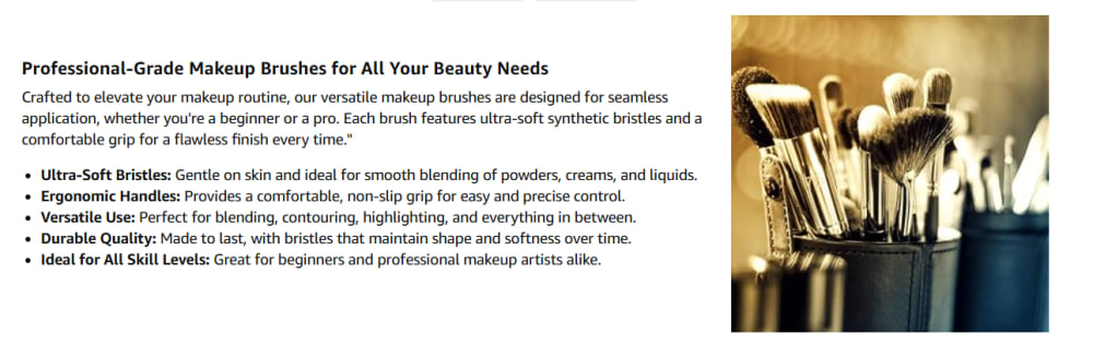
6 Responses to Option A
A is easier to read as the font is in a more natural position (left and not on the bottom) and it is larger. The formatting has more white space making it easier on the eyes as well.
I prefer the slightly larger and more legible text in the graphic in option A.
I prefer option A, because I like the image more when then image is more in line with the text description beside it
I prefer the text to the left of the image, and both text and image being centered in the image. For this reason I find Option A preferable. Option B has a large image which appears to be AI generated (same as Option A) and is not as appealing when highlighted.
When both the words and picture are side by side, I feel like I can look at them both at the same time. When the words are under the picture, it feels like I need to keep looking up and down.
Although I like the larger image in B, I think the layout is nicer in A. It also has better spacing between the image and text.
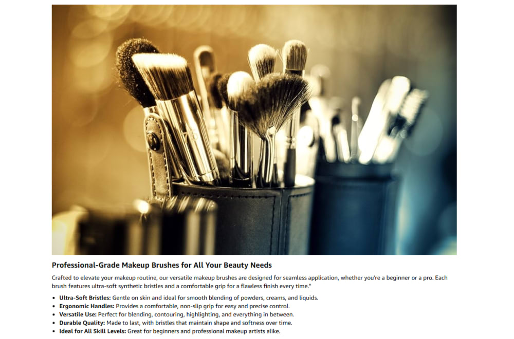
24 Responses to Option B
This option shows the brushes in a clearer, more straightforward manner.
The larger image is more helpful in my assessment of the product quality and features.
I prefer the picture of the brushes on top and bigger. I think it’s more eye catching that way.
I like the picture being more prominent than the text
I think it looks better with the information under the image. It's more balanced looking.
I prefer to see the larger image of the toothbrushes, so I would choose option B.
The layout of the wording is better and I like it better in this position.
B offers a bigger picture of the product and it is easy to see the description below the photo.
I think it works best with a large picture above and copy below.
I like the bigger image of the brushes. It just make s the overall layout look more impressive.
pictures are worth a thousand words and this blown up image paints (pun) a much clearer picture of the image
I prefer this layout because it provides a larger photo so I can see more details of the brushes - I can see how many they are and what the quality of the brushes is.
Option A's photo is too small and becomes hard to read.
The makeup image on the top is a better look. That is more fluid I feel. I like that choice better and you will naturally read it vertically down. So I'd go with option B as the best choice here.
The bigger image is definitely more attractive, and you dont even lose any information from the text
I think that uh option B looks a little bit better because of the close-up view of the makeup brushes . They're quite a few and they're used for different things and some that's a professional or someone that knows what they're doing would really like this especially .
This is a much more high end set and the brushes are definitely professional grade. This picture is super pristine looking also. I will select B.
I prefer the larger image size which allows me to have a better look at the products being featured.
I think the image sells itself, so having it blown up in the center of the frame at the top is best with option B
I like Option B Makeup Brush set's design and layout very much. The big makeup brush image is very attractive and visually pleasing. I can clearly see the brush's details and features. The bottom texts look informative and have a natural design. The overall presentation looks very appealing. I prefer to buy Option B's design and layout more than the other one.
Option B shows more of the detail of the brushes than Option A.
I prefer to have the information about the product underneath the item as shown in B. It flows easier for me to read and still look at the product
i like the layout in option b better because the photo is more bigger and details on the makeup brushes can be seen more clearly
I like option B because I think it looks better with the bigger picture on top and the text on the bottom. I'm more likely to read the text with this format.
Explore who answered your poll
Analyze your results with demographic reports.