Poll results
Save to favorites
Add this poll to your saved list for easy reference.
Which logo style better represents a fishing gear company?

27 Responses to Option A
This has a more classic look that I would trust more and it has a calmer style as well which I prefer.
While it isn't as eye-catching as Option B, I think the calmer design of Option A better captures the human aspects of fishing, and it better suggests the range of products that might be available from this company.
I do like the fish better in B but i think overall A seems like a more memorable and complete logo.
I like option A the best because I like that I can see the boat and the fishing rod because I think those things best represents a fishing gear company.
I would say that A's logo is a bit more on-point, since it's more broad in visual representation. There's a lot more to fishing gear than just hooks and lures, so that's my logic in saying that about this version over B.
This looks more about fishing. I can relate to this as I fish from canoes and kayaks. It looks more exciting.
the blue background is easy to stand out, B blends in with the white. the starry moon looks very cool in A!
I chose option A because it looks more relaxing and appealing to fisherman.
Option A is the best option because of the blue background and the art on the logo. The guy fishing with the sea and the sun or moon in the background stands out. The other option does not look as good.
The fish in the other version looks too cartoonish to me. This logo looks more professional and better suits this type of product
I think A is better because it shows the fisherman in the boat.
I liked the design of option A more.
I like A, as I feel this is a classic outdoors themed logo which works well for a fishing gear brand. It is a timeless aesthetic.
I think that this logo encompasses everything that comes with fishing. It makes you think about all the gear that you need to have as well as the gear that you would need to wear and for your boat.
I feel like option A's logo best represents a fishing gear company because the image paints the idea of fishing rather than just a fish being the focal point of the logo
The text looks much better in A as compared to B.
This is more soothing and fits the atmosphere of fishing better.
I would choose option A over option B because I like the old fashion themed brands over modern ones. I also don't like the white background on option B. Makes it look ordinary and bland.
Option B is kind of creepy, even if you’re into fishing like me!
I liked that this option showed a guy in a fishing boat.
A's logo looks a lot more appealing and stands out much more to me.
I like the image of the fisherman on the boat. Looks more outdoorsy. Also the text is a little bigger and easier to read.
I prefer option a because the person in the logo is actually fishing.
I like the blue background of the logo and I like the look of the fisherman, it is more comforting.
They both work pretty well in different ways. It seems to me like option B is better suited for ocean/deep sea style fishing, while option A is more reflective of fresh water/pond/inland fishing. B seems more action based while A seems to focus more on the peaceful aspects. I myself do a lot more fishing in lakes and ponds than oceans, so I prefer A.
I think this one looks much more and is more vintage. Classic fishing. The other one seems kind of crass
Because it looks more professional and less cartoony, showing a person fishing, like the gear would be better.
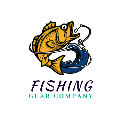
23 Responses to Option B
I likethis one the best it catches the eye better and stands out more
Without knowing the name I cant really make a full judgement. One might be far more appropriate than the other. Generally speaking I like choice B. It has a nice up to date look.
I like this one, with the fish in it. It’s amusing and definitely gets the point across.
I chose B because the logo includes an actual fish.
I chose Option B because the picture is more exciting and dynamic.
Option B has more humor and seems to show gear to better advantage. The alternative seems kind of hokey.
The cartoon fish logo is a solid fit for the fishing gear company, it feels cute to me their logo choice.
I picked B because I liked the whimsical fish jumping out of the water after the hook. To me that could apply to either fishermen who fish from the shore or those that go out in boats. A is also nice but the boat makes me more inclined to think it’s only for boat fishermen and the picture is smaller than I’d like
I like B's logo much more. The fish looks much more interesting and unique in B as opposed to the one in A.
I like that B has some personality to it. A looks so... generic. I've fished my entire life, and my favorite baits and things have always had logos that stand out a bit.
It’s modern and fun but can also be simplified if need be.
The blue background in A gives a very amateur feel to the design. The person on a boat also feels generic and boring for a logo.
Well there is literally a big fish being hooked so it has more of a powerful fish effect for sure than something more in the background
Option B is my choice for the logo style representing a fishing gear company because it represent the actual catching of your goal whereas option A represent spending time on the water for relaxation.
I think Option B because the focus is on the gear which is used to catch the fish.
I prefer this option. I like the exciting ifsh image showing the fish getting hooked which is the perfect image for a fishing company and what every fisherman wants to experience....a fish grabbing the line.
I chose option B as because this is a Fishing gear company so the picture of the big fish with the hook really shows this. Option A has a boat in it and boats are not only for fishing and being that it is fishing gear do they even sell anything for boats? Too many questions can be raised about the validity for using option A. The big fish with the hook is very clear that it is for fishing even with out it saying fishing gear you would know.
I think option A has been done a lot - option B is new and different
I prefer B because it looks more unique and memorable.
B is more modern and up to date but both are great logos.
I think option B is a better choice because it shows the actual act of catching a fish which I think make people think of fishing rods, hooks and bait. Also it is a really cool image.
B gets right to the point with some action.
One is more classic, my choice is more modern and different.
Explore who answered your poll
Analyze your results with demographic reports.