Poll results
Save to favorites
Add this poll to your saved list for easy reference.
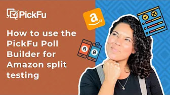
Which thumbnail would make you more likely to click on the YouTube video?


Answer Attributes
Age of kids
Age range
Cryptocurrency investments
Education level
Favorite mobile game genres
Favorite social media platforms
Gender identity
Options
Personal income range
Pet owner
Racial or ethnic identity
14 Responses to Option A
The person in the other image looks like they're pointing and laughing at me.
I like Option A because it is more informative and I like how the art and the background work together.
Pointing in my face is pretty aggressive, and the finger is taking up most of the image on such a small space. I don't like that. I also don't like the capped letters, which seem to be yelling at me.
I think that the finger placement in B looks really bad.
Was more direct and word better explaining what it does.
I chose a because it states exactly what I am trying to do. No guesswork, or pro tips needed until we actually know how to use the poll split testing
The text in B doesn't make sense... not sure if it's grammatically correct? Also the all-caps makes it seem like I'm being yelled at.
A is more specific, direct and clear.
I like the picture on A. I prefer the wording on A.
I think knowing how to use the product is more helpful, and in time you will become a pro yourself with this information.
Both are good but this one makes it a bit more clear what it's about.
I think it depends on what the viewer needs. If they're new, A is the best choice as a "how-to" instructional video. If they're more experienced, "pro tips" would give them pointers on improving.
The all caps in B make it seem low quality and clickbait.
This description is much easier to understand
16 Responses to Option B
I prefer Option B because the woman looks more enthusiastic and thus makes me more excited to use Pickfu.
Looks more fun and exciting and includes pro tips
I like this one the best it seems to have more ecitement to it and makes me wonder about it more
I like the Pro Tips and the pose of the model in B. They are both nice, however.
The big bold letters in choice B is more eye catching. Immediately more drawn to it.
I feel more drawn into the option B image.
This engages the viewer more and gets my attention with the finger point and bigger imagery
The photo looks more realistic and nicer.
Because she looks more engaged, more interactive.
I would choose option B because the person in the option looks more friendly and the rewards look more attractive.
I mean this image is almost taunting you to click. It's hard to ignore.
I like the bold font in this image and the text is more direct and succinct about the purpose of the video.
She looks happier in this picture. Due to that, it's making me more positive about this option
Option B's photo caught my eye and gave the photo a more exciting look to it.
I prefer option B because this ad is more attractive and inviting.
I think B stands out more and catches your attention better to me.
Explore who answered your poll
Analyze your results with demographic reports.