Poll results
Save to favorites
Add this poll to your saved list for easy reference.
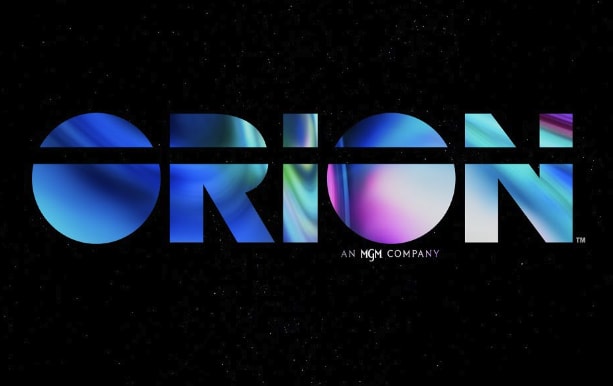
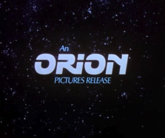
Which logo do you prefer for a company that does film production ?
Answer Attributes
Age range
Crowdfunding participant
Cryptocurrency investments
Education level
Gender identity
Hobbies and interests
Number of kids
Online shopping marketplaces
Options
Personal income range
Pet owner
Racial or ethnic identity
U.S. geographic region
19 Responses to Option A
A looks a lot more modern. Both are about the same in terms of readability.
A is much more colorful and appealing
I like option A more because the colors are more fusionesk and look very fun.
I chose option A because I liked the color and the font better. I also liked how it was bigger and bold. It made it more noticeable and stood out more.
feels more modern, more with the times if you will
The colors shown in A are more vivid and the stars in B take focus away from the name.
I prefer option A. I love the color in the lettering. It adds a lot of depth to the ad. It makes me think that the films will be well done.
In my opinion, option A goes really creative with its fill design and looks really unique. But, Option B looks really outdated.
I would prefer Option A. The logo looks catchy with its design and perfectly suitable for this film production company.
Orion Pictures! Awesome....anyway, as much as I like the classic logo (and I think it is great for nostalgia and merch), I think A is a better logo for the contemporary market. It is sleek and minimalist and has that simple vibe that a lot of branding nowadays has. I think B still has a lot of value though when it comes to catering to the more hardcore film audience, esp. with Orion's back catalogue.
The large and bold logo that Option A has is very unique and appealing to me.
I definitely prefer this. The variety of the colors in it look really good especially on the black background. I also like the line that goes through the name
This logo looks rather creative and has the original look that attracts my attention quite easily. I'm fond of the colors that stand out without looking too "corporate".
I just like the black background with the large letters and the different shades of blue and purple.
I love the cosmic energy and space logo
I think the iridescent metallic look for A looks super nice and eye-catching. I think B looks a bit too fuzzy and also cliche.
I feel that option A is a more modern version of option B and would be interested to see what films they were producing.
I like the more modern look
I chose A because I love the large font and the fun, trippy colors.
31 Responses to Option B
I'm more familiar with this one and think it's good as is, doesn't need to change.
I love the original. Classic look and brings back good memories.
Pretty iconic at this point, why would it change?
the other logo is confusing and oblique to look at
Option B is better defined and stands out better and clearer. Option A is too abstract, unless the logo is well-known to the user and/or public.
I think option B looks a lot more creative and interesting, so that is the one I would choose.
I recognize that old orion logo and it has plenty of warm nostalgia for me
Classic, nostalgic logo.
I like the old school style to it as it looks much more pleasing to me.
I prefer B because I like the background of the stars.
This logo has MOTION which is of course relevant to their brand
B is more catchy and looks much better as compared to choice A.
I feel a great deal of nostalgia for the logo in B. I have a great deal of affinity for it.
The design has an 80's vintage feel to it which brings a sense of nostalgia.
B looks like something I'd see at the beginning of a VHS, and gives me nostalgia.
I picked option B because the name is more easily readable and I like the space theme.
Option B looks very old school. It's nostalgic for those who grew up watching films from this company. Has a classic look, almost timeless.
I think I like B, because I like the thought of a retro aesthetic for a film production company. Although, If you take the colors of A, and implement them into B, it would look even better.
I love how B looks so retro. It also gives it an air of authority due to it looking like it has a long history. A is nice, but the line through the whole thing is uncomfortable.
I prefer the logo in Choice B. The space theme this one has fits really nice with the the name of the brand. I suppose A can too, but that those are gas giants or such isn't nearly as clear, and frankly, I don't think it looks as good. Too many bright colors.
This logo looks really neat - I'm not that old but it sort of makes me feel nostalgic for those old VHS tapes or CDs in a way.
I chose B, because I like the retro look of the logo, and it somehow fits with the space imagery and name of the company to me.
I like the scale of this logo better as it leave a good bit of black space in the background. It would be a recognizable logo.
(B) is easier to comprehend.
This feels way more spread out and balanced instead of overwhelming
I like the rather 'traditional' look for Choice B. While it may seem a bit common place, I believe that type of logo and 'starry' background is what people are familiar with.
I prefer B; it's clearest, it's appealing, and it's easiest to read.
I like the more simple lettering and it is easier to read. Plus i looks more familiar.
The only thing I get from the first one is how it reminds me of those stickers with liquid inside that you used to move around with your finger. I feel like B is tried and true and I know what it is.
The starry quality of option B seems more in line with film production and presents well the imagination of movie-goers.
This is the classic logo that I am used to. Perhaps they can jazz the lettering up like the other option
Explore who answered your poll
Analyze your results with demographic reports.