Poll results
Save to favorites
Add this poll to your saved list for easy reference.
Which cover do you prefer for an Italian Phrase Book?


Option A won this Ranked poll with a final tally of 34 votes after 2 rounds of votes counting.
In a Ranked poll, respondents rank every option in order of preference. For example, when you test 6 options, each respondent orders their choices from first to sixth place.
PickFu requires a majority to win a Ranked poll. A majority winner differs from a plurality winner. A majority winner earns over 50% of the votes, whereas a plurality winner earns the most votes, regardless of winning percentage.
If an option does not earn a majority of votes, PickFu eliminates the option with the lowest number of votes. The votes from the eliminated option are reassigned based on each respondent’s next choice. This process continues in rounds until a majority winner emerges.
Scores reflect the percentage of total votes an option receives during the vote counting and indicate the relative preference of the respondents. If there is no majority winner, look to the scores to see how the options fared relative to one another.
| Option | Round 1 | Round 2 |
|---|---|---|
| A | 46% 23 votes | 68% 34 votes +11 |
| C | 28% 14 votes | 32% 16 votes +2 |
| B | 26% 13 votes | Eliminated 13 votes reassigned |
Answer Attributes
Age range
Gender identity
Literary preference
Options
Personal income range
23 Responses to Option A
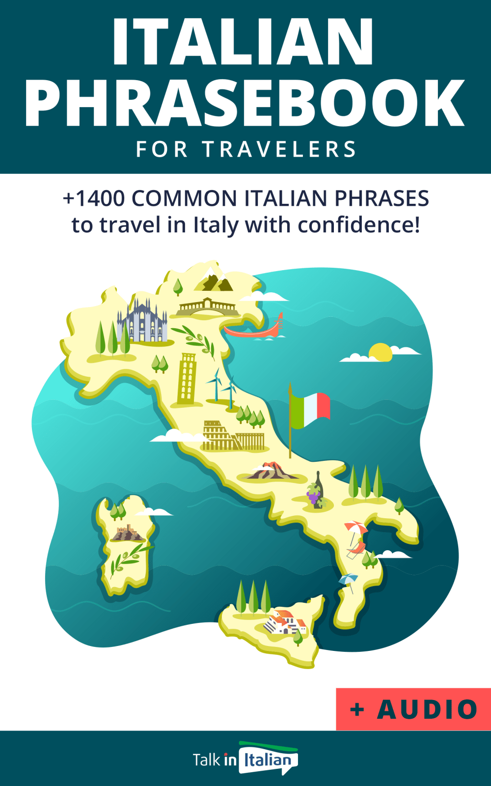
A is definitely my favorite -- it promises help with speaking common phrases confidently, plus I'm a sucker for fun maps!B is my next favorite because it also suggests that it would make communication easy.C is my third choice; although Rick Steves is a respected name in travel, this cover is a bit "basic" (and if glancing quickly, I'd probably see the name Rick Steves and assume it was a travel guide).
I like seeing the animation of the country up against the water. With choice B I like that it shows Italian things and that it says it's easy. Choice C has a regular street in Italy, but the other ones feel much more exciting.
I made my choices this way because I like that the cartoon image really makes my imagination feel like I want to experience the culture and the store.
I ranked my choices A, B, C. Choice A is the most friendly looking, shows the whole country and is the most welcoming. B and C are progressively less, although B is much better than the last option C.
My choice seems more broad in its appeal since the entire map of Italy is shown
I chose Option A because it includes audio, and because the cover is at least as attractive as the others. Without audio, the most one can hope to master is the written word.
The map of Italy as a cover for Italian Phrase Book is the best idea. I also like the picture with italian street life.
I chose A first because it is offered as an audio book which the reader could hear the words pronounced correctly. B was chosen next for the cover image and C was too plain.
"A" is definitely the best because it says "Audio" on the bottom. "B" is second best because it says "every day use and travel." i wouldn't even consider "C" unless a friend or relative recommended it or unless i couldn't get "A" or "B." clear choices here.
A I feel has the best design to it that is able to draw most of my interest.
I prefer A because I like the front cover's illustration. It looks fun and inviting. I chose C last because it's not an illustration and it looks kinda dull.
I would prefer the book on option A as it is captivating and attractive.
I like the simplified map of Italy pictured on option A. The drawings of landmarks is also quite good on option B. I am not a fan of Rick Steves so that option comes in last place
I lke how choice A had audio option so I could hear the words Choice B had a more animated view of italy and looked funner Choice C looked boring like stero instructions and made me feel like this was going to be a long class
I prefer this option. I like that it's for travelers however the inclusion of audio is what sold me on this option. Audio is very important when learning a second language.
The cartoon ones are more cute and interesting.
Option A is my preferred choice because it includes audio, which would be very helpful in this context.
Option A book cover got my attention the most out of the others.
I prefer A because I like to see the map of the country. I think it is a nice drawing with nice colors and I would like looking at the map and seeing all of the different places that I would want to go. I would choose B second because I like the different landmarks that are on the cover. They are the ones I would want to visit in Italy
The with audio aspect really gives a the advantage.
I like the map of Italy on the cover because it is very clear what the book is about and it also shows a bunch of the major tourist sites/areas.
I find option A the most appealing. The words "plus audio" immediately catches my eye and is a plus. The cover is appealing and gives me confidence that I could learn the phrases that would help me out traveling in Italy.
I ranked in the order that I would be likely to take the book off the shelf and begin studying it.
13 Responses to Option B
I like to chose option B. Because it is seems easy Italian phrase book.seems comfort.
I like how Option B shows plenty of landmarks in Italy, which is appealing to me. Option C's image is too "specific."
i ranked the the italian phrase by considering the design used and the color and how well it looks apealing.
I think the little cute cartoons look more modern, the design of c looks very dated to me
B - I like the word easy, the graphics were nice also. C - I love the graphics. A - did not care for the graphics.
I like that option B shows how many common phrases are contained in the book, and the combination of the word "easy" and the cartoony illustrations make this choice feel less intimidating and difficult than I would feel about using option C, which at a first glance appears as if it might be a more advanced book.
Option B is my favorite because it looks fun and cultural. I liked option C because it looks like a real snapshot of Italy, and option A looked gimicky and I did not like it much.
I chose option B first because I like the large Colosseum illustration artwork shown on the front of this book cover the most. I chose option A second because the Colosseum is much smaller in this map illustration shown on this option A book cover image. I chose option C last because I do not like the realistic photograph very much in comparison.
I chose the cover that looks more entertaining.
Seeing the word easy would make me more inclined to buy the book as I am learning a new language
I prefer Option B because it has the most phrases, followed by Option A which has audio.
I prefer B as I like that the title states that it is "easy". Also, I prefer the graphic used on this cover over the other options, it is very eye catching. It shows the highlights of Italy in one cool graphic.
B I really like how it has more phrases than option A. I love the cover and illustrations. I think it is nice that it says common Italian phrases. A I like how it says travel with confidence. C I think it should add a positive message like the rest of them.
14 Responses to Option C
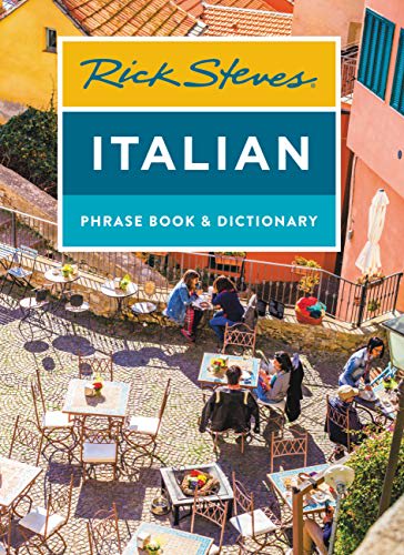
I greatly prefer C both because I recognize Rick Steves’ name and because I prefer photography to illustration. Of the other two illustrated covers, I think A looks better than B — but I think photography works much better than illustration and looks much more trustworthy.
Option C includes real people on the cover. Im older and the other options looks like kids books.
Option C looks very professional, and easy to initially see what the book pertains to. Option B and especially A look too child like where I feel it doesn’t appeal to adults.
I love Rick Steves! So yeah, option C is definitely #1. I watch his show on PBS and he's so knowledgeable, I would definitely trust one of his books. After that I went with option B because it boasts a 100 more phrases than option A. Option A has cute artwork, but I'll take more knowledge over the artwork any day, not that the artwork for option B is bad, but I do like option A's artwork a bit more.
I like option C the best because I like how it is showing looking down over an outdoor cafe and this makes me think of a place where the phrases in the book would come in handy.
I picked C first because Rick Steves and his brand are definitely a legit source for language learning and travel info. B and A look like someone just threw some clip art graphics together.
I chose C because there is an actual picture of Italy on the cover, not a cartoon. A is somewhat decent, as it has the boot on it, and B is just kind of stereotypical cartoons of what everyone thinks of Italy.
3 doesn't really make sense to me and 2 is already taken. I've definitely seen 2 before. I like the coloring a lot in number one and I also think it's got like an artistic style that I like
I chose Option C first because I would trust Rick Steve's lingo on this although I personally would like to see a better image of a city, and to have the number of phrases listed. Thank you!
I like that it’s real. It’s the most intriguing.
The cover in Option C is very nice and appropriate for this book because of the photograph, it looks very much Italian and well designed.
The cafe scene in Italy is great and excites me to learn more about the Italian language.
OPtion C looks less like a children's book than the others
I chose C first because I like seeing a photo of the country - it feels more real and would be more motivating to learn compared to the drawings / cartoons on the other two books. They are all fine - I just like C best.
Explore who answered your poll
Analyze your results with demographic reports.