Poll results
Save to favorites
Add this poll to your saved list for easy reference.
Based on the design color, which product would you rather buy?

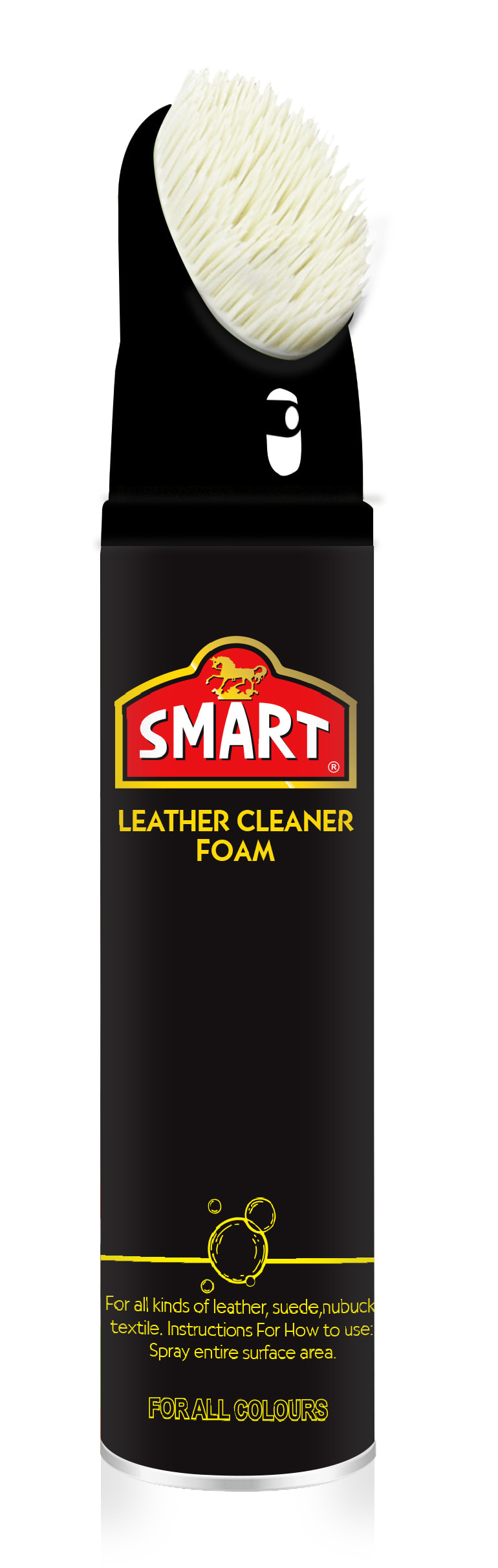
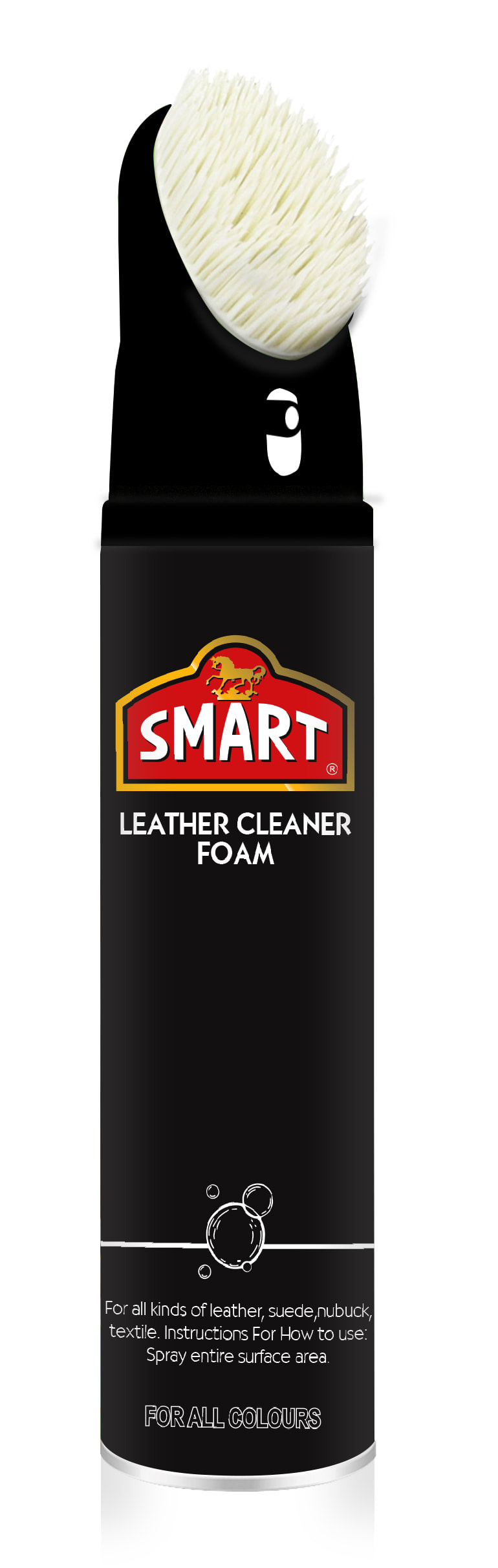
Option B won this Ranked poll with a final tally of 51 votes after 1 round of vote counting.
In a Ranked poll, respondents rank every option in order of preference. For example, when you test 6 options, each respondent orders their choices from first to sixth place.
PickFu requires a majority to win a Ranked poll. A majority winner differs from a plurality winner. A majority winner earns over 50% of the votes, whereas a plurality winner earns the most votes, regardless of winning percentage.
If an option does not earn a majority of votes, PickFu eliminates the option with the lowest number of votes. The votes from the eliminated option are reassigned based on each respondent’s next choice. This process continues in rounds until a majority winner emerges.
Scores reflect the percentage of total votes an option receives during the vote counting and indicate the relative preference of the respondents. If there is no majority winner, look to the scores to see how the options fared relative to one another.
| Option | Round 1 |
|---|---|
| B | 51% 51 votes |
| C | 34% 34 votes |
| A | 15% 15 votes |
15 Responses to Option A
The more mellow gold looking one is nicest. White does nothing for me.
I think the multiple colors of option a looks the nicest and goes very well together.
A is by far the most legible version, especially the bottom text. C I find very legible as well, but the yellow featured in the product subtitle at the top stands out better in A than the boring looking white in C. B is completely illegible at the bottom of the product and overuses yellow, therefore it is my last choice.
A looks good to me because the top text is nice and bold and eye catching while the bottom which is informative is clearer to read.
I like the logo and branding is yellow and the information is white on Option A. It makes the logo stand out more. I prefer the yellow text of Option B over the plain white of Option C because it stands out more.
I think the coloring in A and C are easier on the eyes so I would go with those for this product
I like A and C beacuse it macthes the bottle color and i like the bubble
I like the variety in font colors as the gold gets my attention but the white is easier to read.
I felt the use of yellow text and white small text in option A was a good balance. From there I felt all white text in option C was more appealing looking than all yellow in B.
I think using both the gold and white on the product is smart, so I chose option A
I like the yellow/gold text for the product name, but the white at the bottom. The white at the bottom is easier for me to read, but the gold text at the top ties nicely with the gold on the logo.
I think A looks best. I think option A has the best color design, the yellow and white text compliment each other well and makes the name of the product feel different from the description.
I think having the tag line in gold and the other miscellaneous details in white helps to add colored variety to this design
i dont see a difference between the products so its hard for to pick which one is better
I like the bottles with the gold text and clean white bottom text. That grabs my eye.
51 Responses to Option B
I would probably buy Choice B out of this trio. The all-gold color schemes is not only a lot more consistent in coloration, but also looks better than the others that use white partially or wholly instead.
This is the best and most appealing looking bottle.
I prefer choice B because the yellow font pops more than the white font.
the gold color seems more appropriate for the entire design overall and seems more appealing and more aesthetically pleasing.
I think they all look good and have the information needed to make a decision on it. I just slightly prefer the yellow to teh white.
The words in the lettering or the brightest. It's easier to see and I wanna know exactly what product I'm using when I'm using it
I like the yellow shade on the bottom and under the logo on B.
With option B the colors stand out better.
I like the yellow lettering with the yellow at the bottom in choice b. It makes it easier to read if you are looking for the product in a crowded lineup of other brands.
I picked B and A as my top choices as the yellow color makes it look like it's a very spotless brand.
Option A is brighter, bringing to mind a brighter, cleaner image. Makes me feel like the product will clean my leather/suede better.
I like option B the best because the yellow text on the product stands out the most.
The colors popped out at me more on B than the others.
The yellow color is understated yet makes the cleaner stand out. The other two options have too much of a color clash
I think it looks better with yellow instead of white. The yellow matches with the black bottle well and I also think it is easier to see. I would choose B over A because all of the writing is yellow instead of having a little bit of white
I love option B the most because it has the most amount of the color yellow in it making it more visually and aesthetically pleasing to me.
B - I like the yellow font, it ties in to the logo and makes the bottle a little more interesting. C - the white font doesn't have the color pop like the yellow, but it's fine - easy to read. A - I don't care for the two colors. I much prefer all yellow or all white. Having both colors makes the bottle look broken up.
I feel the yellow stands out more in B. C next because I like how it's all white text vs yellow and white in A.
The yellow and black looks nice. I like the yellow text, it stands out more and makes it easier to read.
I like the color combination of yellow and black thus my top choice. I find it more appealing to em.
The cohesive yellow color design was more appealing because it was cohesive. Then the yellow lettering of "leather cleaning foam" was secondly appealing because yellow reflected the word leather.
After carefully studying and comparing all three images of leather cleaning foam products displayed above, I selected Option B as my first preference and the one that I would most likely click on to purchase for my own use. I felt that this image had the most eye catching appeal based on the brightness of the coloring and the lettering on the product image. Option A was my second choice followed finally by Option C with all three rankings based on my own personal opinion of the relative attractiveness of each product image.
I would buy the design in option B first because it looks expensive and doesn't look regular.
I like that you use yellow, this makes the "All" aspects at bottom clear and visible. The other two options are less visible. At least A utilizes yellow for the product title. C omits it, using more pale and hard to read white only.
I like this one base on the design color because yellow and b;lack always looks great together
I ranked the designs of the leather cleaner foam that I liked the most. I really like the yellow font design on the top and bottom of option B the most. I then liked the design of the packaging of option A followed by option C.
I'll take the one that contains the most yellow text as the yellow on black is far more eye catching than the white on black.
B, the gold color stands out the most. C the white stands out. But A, the mixture of white and gold is not appealing.
B looks great with its same color over the fonts and logo,C is kind of same as B but white does not attract much.A is random and look bad.
The yellow really helps everything stand out more, so I think option B is my preferred design.
I like option B the best because I think the all yellow colored lettering stands out against the black background.
Choice B is the one that I would want to buy the most because I like how the wording under the logo and at the bottom of the product are in yellow to match with one of the main colors that is on the logo. It makes the whole thing match up more and it looks nice in contrast to the black background color. Choice C is second because I like how the wording and the bottom part are both white to still match with each other and it still kind of works since the color of the wording in the logo is white. Choice A is last because I do not like how the bottom part is white which is in contrast to the color of the wording that is below the logo.
I prefer option B because to me it looks the most intriguing and lavish. Option A and C do not really compel me as much!
I thought it looked better to use a single color for all of the text as it felt more coherent that way. Then, I liked the yellow text color the most, thereby making B my top choice.
Keep the yellow flowing top to bottom, looks better that way.
I like B the most since all of the font is basically that same golden color
My rankings are based on the the product item I would click on if searching online for this product. My top choice is Option A. I like the color cohesiveness of this product design.
The yellow color of the text and label stand out the most to me
I prefer the font to all match in terms of color.
It is jhst more visible, pops against the black
1. B: I like the yellow contrast color on the text better than the white, because it stands out the most, and the white looks a bit anemic and bland. B has almost all of its text in yellow.2. A: In the middle because the top logo text is yellow, but the bottom descriptive text is white.3. C: Almost all white text, just feels boring compared to the more colorful options.
The bright yellow is much more eye-catching and helps the picture pop.
I like the more uniform look, consistency.
The yellow wording and graphics are better to see and appealing.
B) The gold "Pops" more looks top shelf. A) This still makes the name look top shelf but not as good as the first choice. C) This doesn't jump out at me.
This option looks better, the yellow makes the text seem highlighted, more cohesive with the whole design. Option C looks nice, but I don't like the contrast of the white against the black of the bottle, the frame of the logo fights with the white text. Option A looks unbalanced, there are too many colors on the bottle and in some way looks disorganized.
I like the golden yellow color. I like it all in that color in B but even half it it in A is better for me than C.
The yellow stitching and lettering looks better against the black
The gold colored font on the bottom of the container along with the top looks the best. I don't think that the silver looks as good with the gold. I do like A better than C though because it has more of the font being gold instead of silver. A lot of things have silver font and different is definitely better.
I like B because I think all gold font looks the best. I think the white looks okay but I don't like A with the white and gold. It looks odd.
I like the yellow lettering, I think it makes it stand out more.
34 Responses to Option C
I liked that C looked more modern since it featured lighter and more refreshing colors. A and B featured more heavy yellow shades.
I don't like the yellow, it's too bright and offputting
I think it looks most appealing without any yellow text on it, the plain white text is easier to read as well.
the white text seen in choice c for the logo text is easier to read on the black background
I don't love the mostly Gold theme of B. I'm not a big fan of the part gold of A. When I think clean I think of the color White like is shown from White.
The yellow color is just too annoying to me.
I don't like the yellow lettering. The white lettering looks more professional.
The black and white color scheme is a classic and timeless look. It's easier to read the white text on the black background.
I like the all-white in C. I feel that the yellow in C and B looks way to dirty.
I like the white font and bottom banner. C has both. A just has the bottom banner in white. B has both in yellow.
I prefer option C. I like the white contrast against the black. It is easy to read and it is very clear to read. My eyes do not like to try to focus on yellow print. White and black look very clean together.
The subdued white font of option c really gives of a better feel that the produ t isn't trying to grab your attention as much as thr bright yellow. It seems more confident.
I like option A more mainly because I don't like yellow font colors.
The white text looks really good against the black bottle in option C.
I feel like the white on black is best, then the gold so I ranked them in that order.
I associate the white lettering with it really cleaning my leather more so than the yellow
I prefer more white text over the yellow. I think it looks better.
I prefer option C as the text Leather Cleaner Form is in white, which is a good match for the top of the product.
I think that the all white looks the best. It makes the product look more modern and premium. I would trust this company and product
The white text looks better against the black. The yellow under the logo is ok but looks bad on the bottom. If you are trying to match the logo the color needs to be more gold than yellow.
Any of the 3 products are a good fit.I prefer white on this background.
Option C is the most appealing as every bit of text is white. As in I associate the white with clean. Therefore, it looks more effective and cleaner than the other two options.
looks nicer and slicker for cleaning purposes
The yellow is tacky looking. I like the all white lettering
The yellow color does not look as nice or professional to me. The white font is easy to read with the black background.
Option C is my preference because it is much easier to read the white text against the dark background.
C looks slightly more professional to me but these are all fine and look good to me.
I liked the white font color for option c the most. Option A, I liked it had some white in the design. Option b, I wasn't a big fan of the yellow.
I like choice C the best. I love the white lettering the best.
I prefer the more subtle packaging (with the white lettering, etc.) . However, it could be argued that my 3rd choice is more color coordinated.
I find the white writing easiest on the eyes, particularly with the smaller text at the bottom of the bottle - so I ranked C first (all text in white), over B (at least the instructions are still white) and yellow (all text is yellow). Given the variance in color balance on various computer monitors, though, I can't say with ABSOLUTE certainty that these preferences would hold up in real life - maybe in a physical store, the yellow would stand out more to me and wouldn't look any harder on the eyes than the white.
on the black background white ever looked shiny / combination of black and yellow also considerable / on the black, yellow & white are not a good looking combination
I think the color gold is pretty tacky, the other ones are not better and don't need to have silly colors to attract customers
It looks best with more white text. It looks the most professional.
Explore who answered your poll
Analyze your results with demographic reports.