Poll results
Save to favorites
Add this poll to your saved list for easy reference.
Which landing page header would you be more likely to engage with? Why?
Answer Attributes
Age range
Education level
Employment status
Gender identity
Options
Personal income range
Racial or ethnic identity
10 Responses to Option A
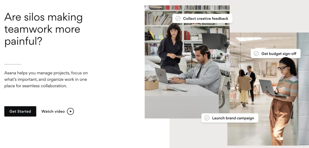
I prefer and would be more likely to engage with option A because I think that it is a more interesting, eye-catching, and visually appealing landing page.
I prefer the image with the actual people in it, so I would choose option A.
Silos are a major pain point and its more relatable than a corporate jargon term like cross functional teams.
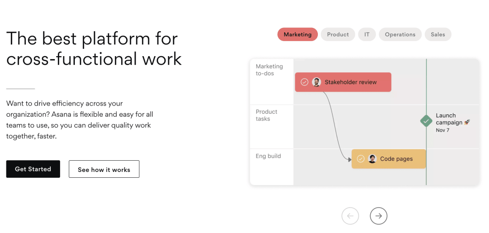
B asks a question and involves the reader more. It is more engaging.
The images and the cascaded arrangement add flavor to the page, it is attractive, warm and visually appealing.
Option A showcases a lot of cool features that makes this service worthwhile.
The actual people illustrate the idea better.
I prefer Option A simply because it is more visually appealing and it is easy to read.
I picked option A because this landing page appealed the most to me. The graphics design is impressive. The picture quality is superb. The
This one points out a problem and the solution is likely available. I think this is better than advice that seems more generalized like on the right.
5 Responses to Option B
B is more honest and less clickbait
Option A doesn't really make sense to me. I think that A is more confusing.
I like Option B. It feels more optimistic.
I vote for Option B because even though the pictures in Option A are more engaging and interesting, Option B shows what the actual work platform will look like and I think that's incredibly valuable and pertinent.
This title is easier to understand. I don't fully get what the other is asking about without reading further.
Explore who answered your poll
Analyze your results with demographic reports.