Poll results
Save to favorites
Add this poll to your saved list for easy reference.
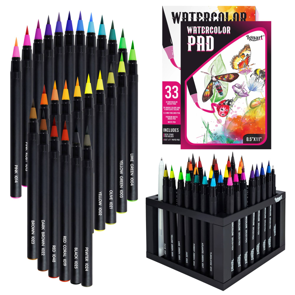
Based on the image, which product would you rather buy?

Answer Attributes
Age range
Amazon Prime member
Education level
Gender identity
Options
Personal income range
Racial or ethnic identity
53 Responses to Option A
A gives me a close look at the brush nibs, making the quality a lot more clear.
Option A you can see the tip depth better to see how blunt it is and safe to use on surfaces.
I like being able to see a zoomed in view of the tips so I can see what colors they are, easily.
I love this option more because it shows off the products in a more visually and aesthetically pleasing way.
I like seeing option A and the tips of the watercolor brushes up close and personal. This is great and looks fantastic for the brushes.
It looks more unique and interesting. The layout is eye catching.
I like that the image is boardered by all the different colors of pencils. Looks fun and interesting to me.
I think having close up of the actual pens is a good idea. Cuz you're a good idea what you're getting. I like to hold her too and I like how it showcases the pads
The layout of the pencils in this image is much more aesthetic and nice looking.
I liked both images, but felt I could better see the product in Option A. I liked how the colors were close up and arranged in a fun, but not overlapping pattern.
I liked the close up, you can see how fine the tips are
I like the zoomed in image of all the tips.
I prefer option A because this image showcases this product in more personal, thorough and favorable way, I like that product is shown close up and overall in a distance, as well.
I like the composition of this photo (A) better. I like how you can see the tips up close.
I would rather purchase option A because I think that it has a more interesting, eye-catching, and visually appealing product image.
I prefer the way the water coloring set is presented in option A more than option B. I like the close up image of the tip.
I like the layout and design of this picture better because of the close up on the tips and colors. It makes it a lot easier to get a full grip on all of the colors available. It also makes the picture stick out more
I like A because it shows all the markers and the colors in it. I like how you can tell exactly what color you are going to get. I also like how the pictures of the watercolor pad is on the left and the markers in the container is on the right because the container catches your eye first and it shows that you get alot of markers. Knowing you get many, many colors is a plus
After carefully studying and comparing both images of art supplies displayed above, I selected Option A over Option B as my first preference and the one that I would more likely click on to purchase for my own personal use. I felt that this image had more eye catching appeal to me based on the overall display and coloring of the image.
I prefer the option A product image because the tips of the markers are larger and more clearly visible and the product label is also much larger and easier to see in this product image.
I can see all the colors clearly
I like the close up of the tips; I feel like I can see the vibrance of the colors better than in B.
A shows off the colors better than on B. I would pay more attention to A due to that. I can also see the tip/nubs on the markers better and that shows me what I would be working with if i bought them incase I liked a certain type of tip.
I like the view of the markers in this image, the close up really shows the vibrancy of the colors
I like how you can see the tips better in A close up.
I like seeing all the tips of the pens and seeing the assorted colors is very nice
The colors of the watercolor pens were a lot clearer in this option since they were more spread out.
this one that shows you close up is much better because it shows you what you'll actually be working with.
A because I feel that the image had a much sharper quality and has a more intact brand when imaging this coloring set.
I like that tips of the markers are enlarged in this picture so it is easier to see.
I love this one because we can see up close what the watercolor pens look like.
The close-ups of the tips on the color brushes look like they'll last long and are in good quality
I like seeing the tips of the pens/pencils. It shows you that they are high quality products while also showing you all of the colors.
I prefer choice A because it shows every color more zoomed in.
I chose A because I can see the tip of the markers better in the photo so I can see how they would tend to write or color.
I like the way the pens are arranged in A on the bottom and top. I feel I am able to better grasp the range of colors.
In the color pencil is had a good quality to buy this product.
I prefer this because it shows the tips closer which is helpful to get a better idea of the quality
The image of the pencils details the color of each in a very straightforward way. It is most appealing.
I would rather buy this one because I like how clearly the colors are displayed. I can see them a lot better than in the other picture.
Showing a close up of the colors looks way better and makes the image *pop* more than the other.
This product is more colorful and captivating visually
I like the upclose image of all the colors that come in the water color marker set.
Based on the images i can say that i would buy the product shown in option A because the presentation of it is way more appealing than the one shown in option B and also the design in which element is placed is better giving more importance to the package of the markers and making it look way better to the public.
I feel like this image has a more zoomed in look which also allows me to see the colors a lot better and evaluate if I want to have this or not.
A grabs my eye with the artistic decisions over B
I think this design is more traditional for the layout of all the pens, and it lets me see all of the colors clearly
I like the image setup in choice A just a bit more than the one in choice B. I think having the book that comes with it a little larger in the set is good for me.
seeing the tips up close allows me to see what they would be like to use better
All the pencils are organized very cleanly with little overlap and you can see each color.
Its easier to see what colors are included with the product. I like the emphasis on the colored tips because that's what's most important.
I like that there's a closer look on the tips and I can see the various colors clearly!
I prefer this image here because it looks more catchy and the product presentation here is cooler.
47 Responses to Option B
I think the image in B is more dynamic and eye-catching, which is good for an art product.
not a fan of the hanging off the top markers, makes it look tacky
I chose B because I like them demonstrated in the S shape rather than at the top and bottom of the page
Looks more organized
I like the product image in option B better. The layout of the pens looks more appealing in this image.
My 11 year old daughter would want these. She has tons of things like this. Just going by what she would want.
i like seeing all of the marker with a sketch pad. it makes me feel like there is alot of them and that i could drawl like that too
This look here is nice with the unique array of markers like in B here, it looks really cool
I prefer Option B because it makes me feel as though I am getting more stuff for my money.
this image looks better to me, highlights the product in a better way
I like this layout a lot, the pens look great and you can still see the wide variety of colors, arranged in a rainbow-like way.
I chose B because A is a bit unsettling and headache inducing to look at initially. I think B does a better job of showing the product in an artistic way while remaining functional. A forces my eyes to too many different places with little benefit. The symmetry in B is much more relaxing and appealing.
Showing the full product organized this way really shows it off.
I like the presentation of the markers in Option B. The wave is eye catching and unique. I would look towards that picture first.
The markers lining the top and bottom of image A just look out of place.
I liked choice B since the image is direct and to the point. Choice B focuses on the product in a neat and orderly way. Choice A looks too busy and isn't as appealing to look at.
The colors in B are way too busy for my liking
Option B is a clean design that I feel like I am getting my monies worth. It presents as a lot of colors but the image isn't inundated with sharp edges around the top and bottom.
Just seems an easier image to process.
B seems less crowded and freer. It's A is more intimidating and harder to look at long run. The focus is only on the edges and it's hard to focus on the middle images. In B, while it's a well put together, it's also easy to look at each part individually
I like option B more because I like how the pens are lined up in the picture. I can easily see the different colors included in the kit.
I do like this image better than the other one. Thus I would buy this one.
I strongly prefer option B as it looks more organized and the watercolor pens/brushes are all facing the same direction. A is very jarring to see and looks like some 90s webpage border with the pens on the top and bottom.
I like the layout. It's very eyecatching and nice looking. Looks very professional!
I like how the colors are shown in B vs A, how you can see the whole item not just the tips. To me with choice B, visually, it seems like you are getting more.
I like B best because I like the way the pens are standing up and displayed. It gets my attention first over A.
The product layout is creative and abstract. The product is fun and bold.
I feel I get a more complete view here. Everything is arranged more neatly.
I think you get a better idea of the spectrum of colors arranged in option B. I just don't like showing the tips in option A and the unevenness doesn't look right.
B looks way better with its design, the placement of the product is good and attractive.
I think the points zoomed in at the top and the bottom don't make much sense and isn't appealing at first glance
I chose Option B for the watercolor set because not only is the arrangement very creative but you can get a better idea and perspective on its length as you see it fully while Option A crops out most except the tip for the color samples.
I would go with option B because to me it looks more stylish and creative. Option A feels less compelling to me overall.
I like how ordered and clear the products appear in B. The serpentine curve of color is attractive and allows us to see the products color in a more interesting array.
I think the spiral layout is less threatening than the one that makes them look like spikes, so it's more appealing
First of all both images are close to each other and good enough. I picked option B as my choice because I like a wave made from markers, it looks funny and unusual.
I rather buy option B because they look the most appealing.
Both are quite impressive. I chose panel B. I like the time it took to arrange this display, it is very impressive.
I find the arrangement of the markers highly visually appealing here. I like the flow in how it directs my eyes.
I do not like picture of the tips.
I prefer B, Its simpler and you can still see all products
I thought the layout for option B looked more organized and less busy than option A.
as much as i like seeing the tips up close the other one has too many
I like the way the product is displayed.
I like the spiral pattern the pens are placed in, it looks cool and makes me want to buy.
I think Option B is presented more clearly, and I like the layout of the pens and the book.
Without a doubt, this design is more logical and responsive to the user.
Explore who answered your poll
Analyze your results with demographic reports.