Poll results
Save to favorites
Add this poll to your saved list for easy reference.
Which Product Packaging looks better and why?
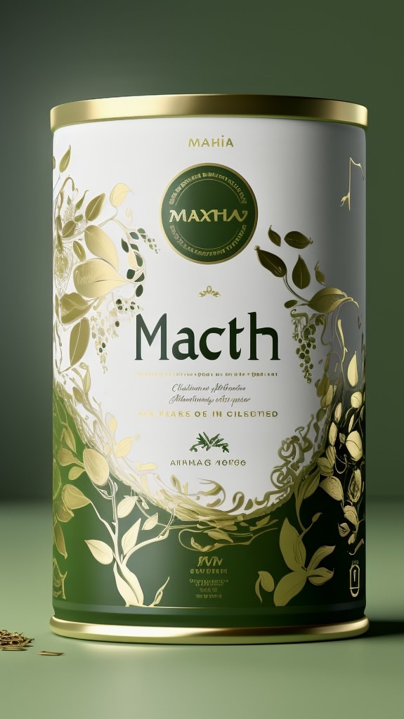
10 Responses to Option A
Because it has that Japanese style to it, especially with the artwork on the label.
stands out more with the coloring and looks more natural/high quality.
I absolutely love the green and metallic gold label shown in option A. I also love that the leaves look like they are blowing in the wind. This truly is a memorable can of matcha.
the green with gold leaves makes it seem more special, more of an 'import' and more interesting than the generic but clean b
I like all of the green on this one. It makes it feel more natural. They are nice shades of green too
Choice A looks better if you're trying to market a product as "premium". Looks aren't everything, but they are the first impression, and the blandness of B doesn't strike me as a premium product just by looking at it. A is much more what I'd expect.
A is a little more colorful, bold and eye-catching.
I just prefer the color and design of the container in A.
The green and gold makes the package pop and look like a premium expensive product. Option B looks very generic.
The green parts and nature bits of this cover makes it stand out for the matcha design
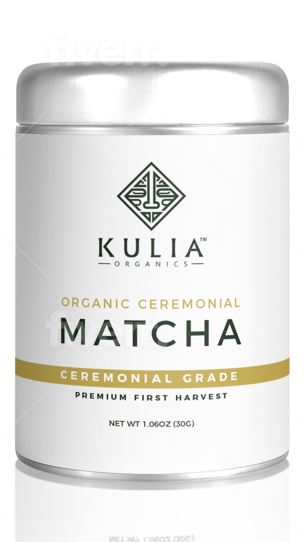
5 Responses to Option B
I prefer option B's packaging because it is simple and does not have too much going on in it's design that helps me understand what the product is offering.
I really love both of these but chose panel B. I like the white label as it is very professional and has a nice, clean look to it.
To me it looks like B is higher in quality and would work better.
This one shows the complete spelling of the word matcha and the overall design of the packaging is much more attractive or consistent with other brands. The other appears more old fashioned.
That is one ugly green in Option A, whereas Option B looks the more professional, which is important for a supplement.
Explore who answered your poll
Analyze your results with demographic reports.