Poll results
Save to favorites
Add this poll to your saved list for easy reference.
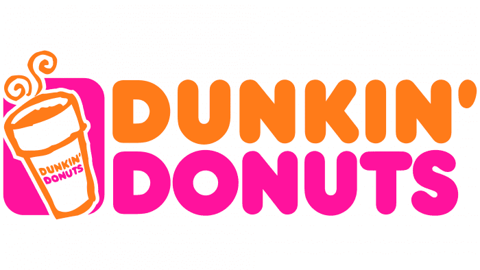
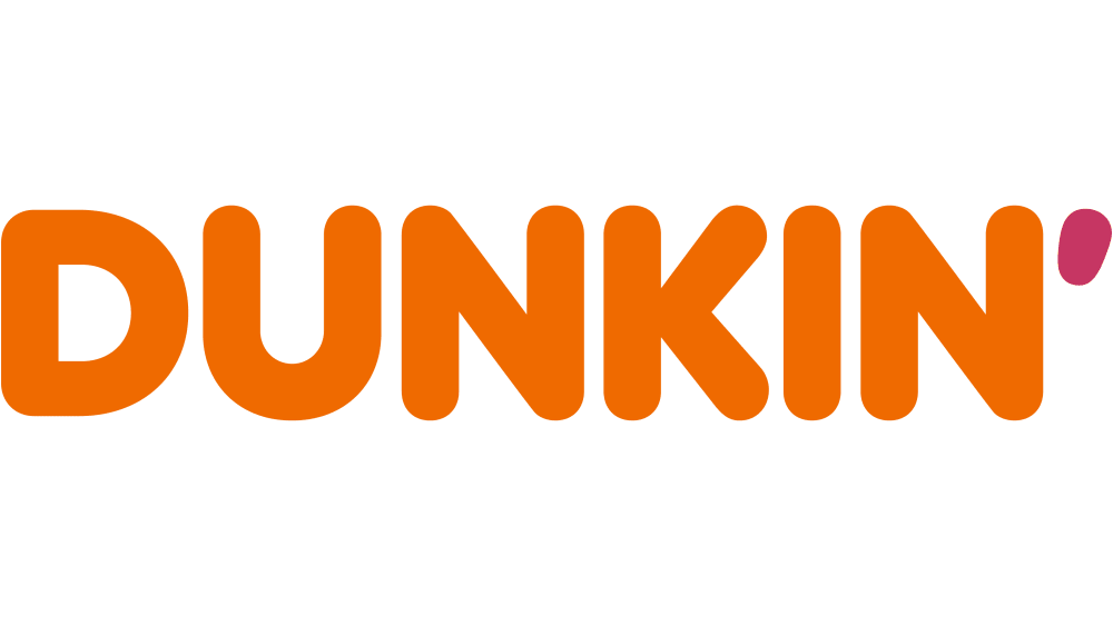
Which logo do you prefer and what do you think about Dunkin's new style compared to how it was as Dunkin' Donuts?
25 Responses to Option A
I will never call it only Dunkin. It's been Dunkin Donuts my whole life, and it's a donut shop for crying out loud.
A because the design is much more detailed and appealing than option B
I definitely prefer the old logo and name better than the new one. I don't really like how they rebranded themselves. I liked the donuts there as well as the coffee. I also like the way the colors go together. Seeing the coffee cup next to the name made it look even better
If I was not familiar with them, I would not know what they are selling. They seem desperate to be trendy. They need to put a better product on the shelf.
Choice A is the one because I felt like it was more all encompassing in terms of the wording and I liked the logo with it as well.
I prefer option A. I like seeing the variety of colors and the cup of coffee in the logo. It is friendly and cheerful It makes me feel warm and happy.
I prefer A with donuts especially since it has a better balance of colors. I'm not sure if it's the new one though.
I prefer the old Dunkin Donuts logo, I like the colors and the coffee cup icon is attractive.
More eyecatching with the icon of the coffee cup and the pink donuts underneath
I like this one. It is the one I am familiar with. But I understand if they want to update and re-brand themselves with the other one. I like it too.
A is a lot more recognizable and there is no need for a change.
Option A is more balanced and recognizable. The apostrophe in Option B looks very silly, and on the whole it lacks the personality of A.
I prefer the more nostalgic option in Choice A. I think company logos are getting way to simplified. They have no style.
Still like option A. It lets me know it's donuts and I can get coffee if need be
Option A is more iconic.
I still prefer the logo"Dunkin' Donuts" because it communicates directly the product the brand deals in.
I'm a sixty seven year old traditionalist. generally speaking i don't like changes. if something works, it's usually best to leave it alone.
I don't like how companies try to modernize their logos, I still get annoyed with things like KFC and Pringles changing their styles. I want it to stay as Dunkin' Donuts. Nobody is going to flock to them because they changed their logo.
I think I'm just used to seeing the old logo. The new logo isn't really "new" though. It's just a stripped down version of the old one.
A is more of the classic look. I miss the massive orange and pink contrast and with B I hate that there isn't the iconic pink and the only part of it that is left is a darker pink ' at the end. I think it just makes it stand out less.
I prefer the old logo of Option A. It's an iconic logo that everybody knows.
I Much prefer the classic logo and verbiage. its nostalgic. Choice a is my preferred option.
I like this better. It is more colorful and has a nice pic of a coffee cup with steam. I'm assuming this is the old style.
The orange and pink look really great together and what I am used to
I like the classic because it is easy to remember the brand.
5 Responses to Option B
I prefer the shorter and more concise name.
I think B is a logical next step. The brand is identifiable and it represents a growth into other non-donut areas (e.g., coffee).
We as a society have called Dunkin, Dunkin over the full name of Dunkin Donuts so this is why I prefer B over A. As this then is showcased by the color font.
I think there is such strong brand recognition with Dunkin' Donuts that just saying Dunkin' is understood. As nostalgic as the logo in option A is from my childhood, I don't mind the change.
I prefer this simpler bigger and easier to read logo
Explore who answered your poll
Analyze your results with demographic reports.