Poll results
Save to favorites
Add this poll to your saved list for easy reference.
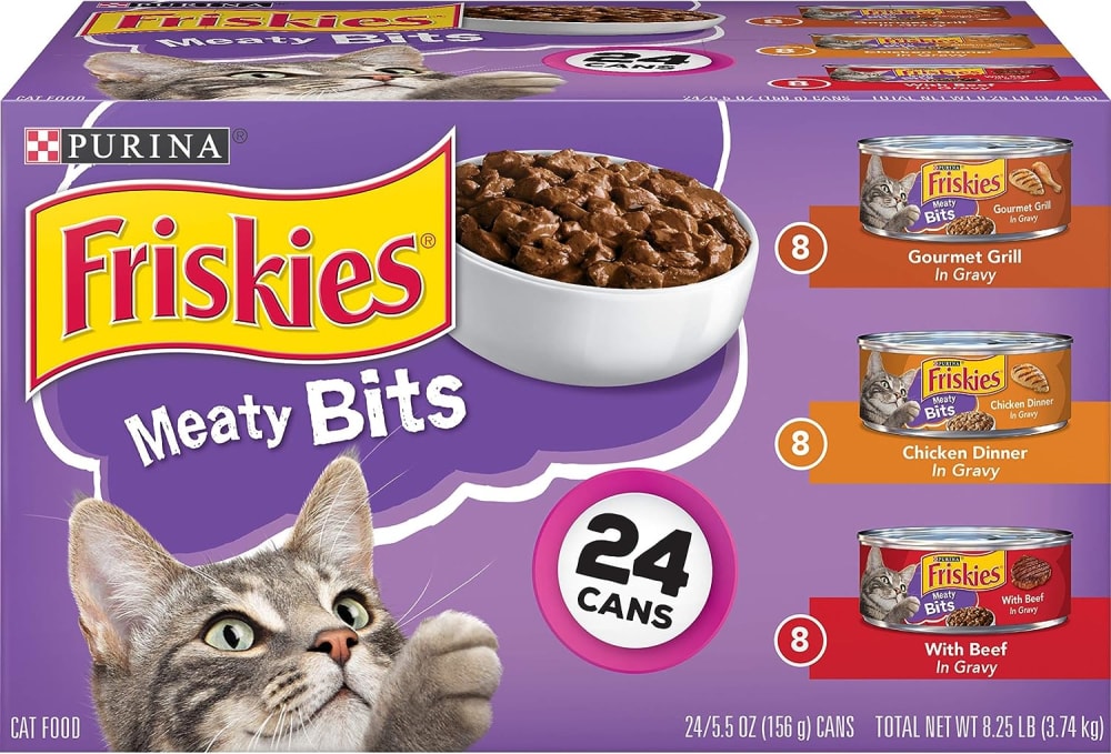
This is a packaging design for cat food. Which area would you improve and why?
Audience:15 U.S.-based respondents
Private
Answer Attributes
Age range
Amazon Prime member
Education level
Gender identity
Personal income range
Racial or ethnic identity
Recently purchased categories
15 Responses
Make the bowl smaller or less full, as you immediately lose cat owners showing them that kind of a portion size.
#1
Bookmark response
Mark response helpful Mark as helpful
Mark response unhelpful Report bad answer
Ask follow-up question Ask follow-up questioni think in this area it could use some open box showmanship of the product to see what it is
#2
Bookmark response
Mark response helpful Mark as helpful
Mark response unhelpful Report bad answer
Ask follow-up question Ask follow-up questionThe bowl seems a bit generic on an otherwise very well designed to stand out box.
#3
Bookmark response
Mark response helpful Mark as helpful
Mark response unhelpful Report bad answer
Ask follow-up question Ask follow-up questionThe cat paw looks a little awkward. Would be just as effective without the paw. Just showing the cat looking at the food.
#4
Bookmark response
Mark response helpful Mark as helpful
Mark response unhelpful Report bad answer
Ask follow-up question Ask follow-up questionjust a little bit of added information about the differences of each would be great
#5
Bookmark response
Mark response helpful Mark as helpful
Mark response unhelpful Report bad answer
Ask follow-up question Ask follow-up questionI feel like the description is too basic and tiny.
#6
Bookmark response
Mark response helpful Mark as helpful
Mark response unhelpful Report bad answer
Ask follow-up question Ask follow-up questionI think I would reduce this graphic a little bit, and add a little text about the benefits of the product itself.
#7
Bookmark response
Mark response helpful Mark as helpful
Mark response unhelpful Report bad answer
Ask follow-up question Ask follow-up questionI would probably change the purple background color. It stands out somewhat on the shelf but it's not very appealing for cat food.
#8
Bookmark response
Mark response helpful Mark as helpful
Mark response unhelpful Report bad answer
Ask follow-up question Ask follow-up questionI think that "gourmet grill" is a bit deceptive and confusing. It doesn't really tell you what kind of meat is in the can. I think that it should follow the pattern set by the other two variations below it and specify what type of meat is in the can of cat food.
#9
Bookmark response
Mark response helpful Mark as helpful
Mark response unhelpful Report bad answer
Ask follow-up question Ask follow-up questionI don't think the cloud, balloon design image part is needed. It is distracting and adds too much going on box wise. It would streamline it the simpler the better.
#10
Bookmark response
Mark response helpful Mark as helpful
Mark response unhelpful Report bad answer
Ask follow-up question Ask follow-up questionI think the food bowl looks deceptive because it is too much meat for a single can. I don't like when companies do that.
#11
Bookmark response
Mark response helpful Mark as helpful
Mark response unhelpful Report bad answer
Ask follow-up question Ask follow-up questionI suggest moving the number of cans more to the bottom of the package and making it smaller as it is a repeating information.
#12
Bookmark response
Mark response helpful Mark as helpful
Mark response unhelpful Report bad answer
Ask follow-up question Ask follow-up questionI would show the bowl of cat food a lot more directly and show it in a more visually detailed manner.
#13
Bookmark response
Mark response helpful Mark as helpful
Mark response unhelpful Report bad answer
Ask follow-up question Ask follow-up questionthe top of the packaging is the exact same so it could be varied with information
#14
Bookmark response
Mark response helpful Mark as helpful
Mark response unhelpful Report bad answer
Ask follow-up question Ask follow-up questionmaybe add "in gravy" since all of the flavors have in gravy in them
#15
Bookmark response
Mark response helpful Mark as helpful
Mark response unhelpful Report bad answer
Ask follow-up question Ask follow-up questionExplore who answered your poll
Analyze your results with demographic reports.
Demographics
Age range 25-34 (8)
Amazon Prime member Yes (11)
Education level Bachelor's degree (9)
Gender identity Male (10)
Personal income range $0-30k (7)
Racial or ethnic identity White (9)
Recently purchased categories Computers and accessories (13)