Poll results
Save to favorites
Add this poll to your saved list for easy reference.
Which logo do you prefer for Safe Place, a national youth outreach program? Why?


12 Responses to Option A
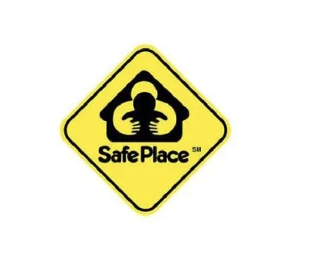
I like the non-verbal aspect of this sign, which clearly shows love and support.
The loving embrace of option A is far more desirable.
The logo on the sign is satisfactory and contains a superb amount of detail that most people would understand upon first glance.
Option A is the best option because of the logo of the adult with a child. It gives me a warm feeling while the other option just looks bland.
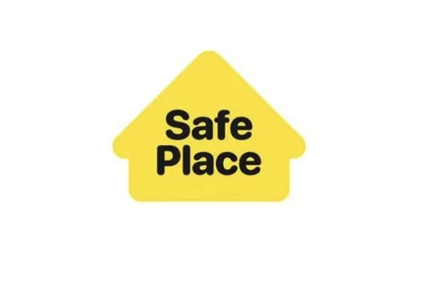
B looks too boring and I prefer A, which as a better icon and I like the font better and the shape better
I would choose Option A here. The logo looks better than just the house symbol with Safe Place on the inside. It brings to attention that this location is a safe place. Like telling us here are railroad tracks at this spot.
I chose A because I think it stands out well
Option A is more emotionally appealing to me, because it incorporates images of acceptance and compassion into the logo, instead of just words, as with B.
I prefer this logo because of the human embrace.
I like this better because it seems more caring, the picture of the hug makes it seem safer and more realistic.
I like the logo, i feel seeing the hug is what sells it.
I actually volunteered for Safe Place in high school, and if I recall, A looks more like the original logo! B is fine, but a little too generic.
18 Responses to Option B
I think simple is better. I don't know what the image is supposed to be on the other image.
This looks a lot clearer and is more serious looking which I think fits the item better.
I prefer the simplicity of the Safe Place logo shown in option B; just black text in a yellow house. The symbol in option A has too much going on; the house with two people hugging in it?
The other image is really creepy like some weird big man kidnapping someone
Option B looks unique and believable.Option A looks like a traffic sign.
I like B because it has a more simple design to it. I think A looks odd and confusing.
Option B because it included the house picture. Makes it seem like it would be more along the lines of a home
This is simple and easy to understand, the other option not so much.
I don't like the graphic in choice A. It might make some children uncomfortable who do not have good relationships with adults.
Option A could possibly look a little sinister, depending on the child's past.
The image of the larger person hugging from behind is very creepy. It looks like a predator.
I like this one more because of the house shape for the logo, I think it offers a much warmer and more inviting feeling about it.
I liked that this option featured a more bubbly and kid friendly font.
This looks more inviting in comparison to A, which has a strange creature on it? I think B looks like a mix between an arrow and a house.
in "A", the person in the house looks strange. what are the 3 horizontal lines? it looks very weird.
To me it looks better as just text. I like the font choice. It has a childlike charm to it.
I love this one more because it is shaped like a home, making it more comforting and attention getting.
i prefer this one more namely because the other example is just so confusing. like is it hands in hands?
Explore who answered your poll
Analyze your results with demographic reports.