Poll results
Save to favorites
Add this poll to your saved list for easy reference.
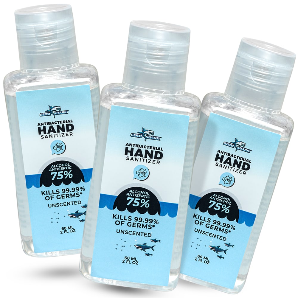
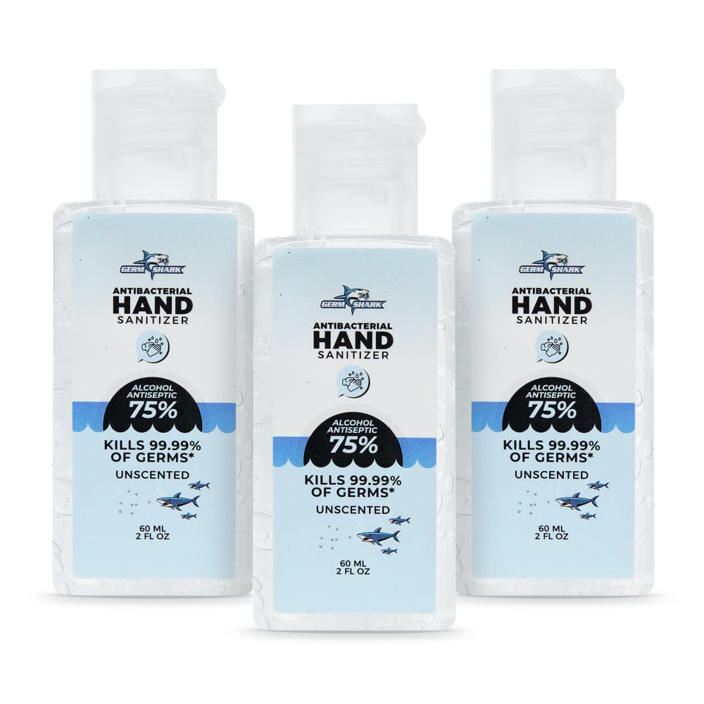
Which image do you prefer for this 3-pack, travel sized hand sanitizer?

Option D won this Ranked poll with a final tally of 32 votes after 3 rounds of votes counting.
In a Ranked poll, respondents rank every option in order of preference. For example, when you test 6 options, each respondent orders their choices from first to sixth place.
PickFu requires a majority to win a Ranked poll. A majority winner differs from a plurality winner. A majority winner earns over 50% of the votes, whereas a plurality winner earns the most votes, regardless of winning percentage.
If an option does not earn a majority of votes, PickFu eliminates the option with the lowest number of votes. The votes from the eliminated option are reassigned based on each respondent’s next choice. This process continues in rounds until a majority winner emerges.
Scores reflect the percentage of total votes an option receives during the vote counting and indicate the relative preference of the respondents. If there is no majority winner, look to the scores to see how the options fared relative to one another.
| Option | Round 1 | Round 2 | Round 3 |
|---|---|---|---|
| D | 40% 20 votes | 46% 23 votes +3 | 64% 32 votes +9 |
| B | 28% 14 votes | 28% 14 votes | 36% 18 votes +4 |
| A | 16% 8 votes | 26% 13 votes +5 | Eliminated 13 votes reassigned |
| C | 16% 8 votes | Eliminated 8 votes reassigned |
Answer Attributes
Age range
Amazon Prime member
Education level
Gender identity
Options
Personal income range
Racial or ethnic identity
8 Responses to Option A
Option A is the most natural as it shows the hand sanitizer bottles in a way that they are meant to be handled. Option C feels far too rigid and straight. Options D and B don't feel right because this product does not normally come in a box such as this.
I liked see all 3 bottles, so you can see what you get
I prefer option A to buy. Because the image explains the offer and the product well than other options. And make more interest to buy the product.
based on picture quality is good , brand is good , and based on size
I really like my first two choices. I feel like the other two options may be misleading on how many bottles you will get when you order the item.
Option A is a bit more eye-catching with the leaning bottles B is really bad for hiding parts of the packging.
I don't need to see the box for these products since that just adds visual clutter; all the information I need about the product should be on the label. Seeing the box in D and B just felt clunky and unnecessary. I liked that A gave me the clearest closeup of the label, and I liked that the label grabbed my attention with the bright blue color. The label was more dull and muted in C.
I like the close up sot of the 3 pack.
14 Responses to Option B
B and D are better because they show the outer package as well, and B looks more dynamic and interesting. Of the two that have no package in them, A is more visually interesting.
B and D show ful packaging, which I like, though they can feel a bit busy. A is fun and almost looks like they are floating. C is typical.
The product photo in Option B looks full and clear.
I chose panel B. I like the packaging and the arrangement of the products. I think I would notice it while shopping.
These all look ok, I like the ones that have an overall nice structure of how the bottles are arranged.
I found options B and D show a better design and provide a bit more information than options C and A. I like having the box design in the background.
I really prefer the image where you can see the packaging that says you donate a bottle for every pack sold. I ranked D lowest because the way it's shot/photoshopped makes it look like you have a typo in the package
I feel like image A stuck out because of the creative angles they put the product in.
I slotted image B first because I like how the presentation is staged. It shows me the full packaging that I will receive and it also shows me, visually, how many I will get. D is similar to that but I slotted that one last because the image presentation doesn't really communicate to me that I will get three of the hand sanitizers all in one package.
I think seeing the packaging is appealing so B and D are my favorites. I prefer B to D as the image feels more playful so B 1 and D 2. I prefer A to C as C feels quite bland so A 3 and C 4
I like to see the ones that are lined up and in the box, the other ones are not as nice to see just because they look like a smaller quantity
Both B and D have packages but like B over D because the three hand sanitizers are displayed unlike D which has one displayed.A and C have no packages but the style displayed on A is what has made me prefer it over over C.
the box tells you information which is useful
I prefer option B for the three pack even though it's still just three bottles the package and the extra bottles shown on the outside make it seem like you're getting more value even though you're still getting just the three bottles.
8 Responses to Option C
I like C the most. I think that it looks the neatest. The other ones look a little sloppy
i don't like them on the edge and seeing 3 is right number
I went with the pictures that looked the most impressive and professional.
I don't need to see the box it comes in in a picture like this, so C and A are definitely preference, with C looking a bit cleaner. I don't like that B has one laying down sideways.
Option C, I ranked first because I thought the image kept it simple and clean/minimum which I liked compared to the rest. It didn't really try to be all fancy, because at the end of the day it's hand sanitizer. Option D, I ranked second because I did find the image more organized compared to the remaining options. I liked that it just had one hand sanitizer outside of the box. Option B, I ranked third because I didn't really like it had all the hand sanitizers out of the box and one on it's side. It just didn't look as good as option D. I would had preferred a more simple look without the box like option C. Option A, I ranked last because I didn't like that the hand sanitizer bottles were at an angle. I much prefer they be upright like option C, D, and B. Even having one laying down would had been better.
I like C because it's a nice clear image of the 3 bottles. I like A somewhat also because it shows the 3 bottles too but they look a bit odd being on an angle I think. I like that B and D show the package, but the bottles outside the package make it look a bit cluttered to me.
I liked C because the sanitizers were easy to understand, and very plain.
Choice C is the best, as the product is clearly displayed, and no bottles are blocking one another like in choice A. D and B are bad, becuase i do not like seeing boxes in product images, as you are just showing me trash. B is the worst because it looks like i am getting 6 bottles, but in reality it is only 3.
20 Responses to Option D
Great color way and the best view of both the bottle and box.
I think packaging is always best to show so I like D and B. however, i think the photography of D is better than B so thats why i ranked it higher. I ranked C better than A because the way its set up it looks neater.
I prefer choice D because it shows both the packaging and the product all in one. It also shows a bottle big enough to see and read clearly.
If you didn't show the 3-pack package I wouldn't know that's what it was. I think D's slightly closer image is the best.
D is the best because it shows a bottle and the box it comes in. B does too but has the bottles arranged in a funny way. C and A are just the bottles but C has the bottles laid out nicer and cleaner than A.
I like the inclusion of the box with the product which is why I chose D and B as my top two choices. Option D was better because of the germ shark logo view and the close up of just one bottle to focus on. Option B was a little harder to read the label so it was second to me. Option A was third for its closer view of the labels of the three bottles which made it easy to make out all the information and get a better feel of the product. Whereas option C was slightly farther back and lacked the same blue colorfulness to it, which gave a little boring vibe.
I like when it's shown in the box it makes it look much more professional and has more information on it
option D looks good when compared to other option.
I like the inclusion of the box in the listing. It looks more professional, well, at least in Option D. In Option B, one of the containers is on its side and it's aesthetically awkward, perhaps off-putting to the consumer.
I like being able to see the product with its original packaging , so that makes choice D really intriguing to me. It looks very clean, organized and professional. Choice B is my second favorite option , but I think it looks a bit disorganized compared to choice D.
I choose D as my first choice because I like the labeling on the hand sanitizer and the box that it come in. I choose Choice A as my second choice because of the label. Choice B and C were my last choice because the label was a bit boring due to the white-ness of the label.
Something odd about the box that D and B come in, the 3 pack box is marked 1 pack bought = 1 60 ml bottle. each picture shows 3 in the box. Anyway I would pick D and B because I would be more sure of getting 3 bottles rather than with A and C which may only be one bottle. Other than that they're all the same size and brand
I like option D the most because it shows a compact package and the packaging design looks very minimal and simplistic. Option B shows nice packaging too but a little cluttered; not as minimal. Option A and C are too plain and doesn't show the packaging too well.
I like D the best, it shows there is 3 items and it shows the packaging as well.
D and B allow you to see the full packaging. However i do prefer the colors of A. C just looks boring
Showing both the bottles and the packaging seems like the most helpful of the images.
All are okay - they are all simple and straightforward. Nothign is all that special.
I like the image of D the best, since I feel it has a good balance of positive selling points.To start with, the image is well balanced with just the right number of items with its packaging. The color contrasts showcases the products well. Having the 3 bottles as part of a set makes the item feel like a complete package rather than 3 individual pieces. Some people may also prefer a pre-packaged items to insure that the items are tamper proof and sanitary.
Option D does a perfect job of showing me the product in packaging to make it feel like something I am picking up in a store, and showing that it comes with three bottles by having the third outside the packaging. This also gives me the tactile feeling of the bottle itself, so I can picture the entire experience of the sanitizer. Option B looks at first glance like I am getting six bottles, but if I then looked and saw I was only getting three for the price listed, I would feel a somewhat irrational sense of getting ripped off. I think potential customers would feel the same way and would then choose to look for a cheaper option, or may even buy it expecting six and then complaining that they only received half. As I said, it's irrational, but I think this is what the emotional side of the brain would do given the ad. Of the two middle ones, I greatly prefer Option A, as the angles really give life to the image, especially since the shadows show that they are levitating or jumping into the air, making for a great eyecatcher.
I really love D and B because I like seeing the package together as it looks really premium this way and stands out to me as it shows that extra work was put into making this. D is higher than B because I like the close up of the box and the brightness of the box. A ranks above C personally because I like the brighter bottle images as it pops from the screen instead of looking plain.
Explore who answered your poll
Analyze your results with demographic reports.