Poll results
Save to favorites
Add this poll to your saved list for easy reference.
Based on the design, which product would you rather buy?
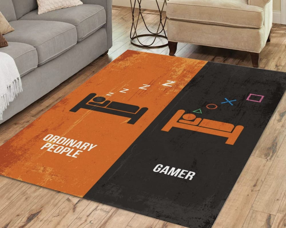
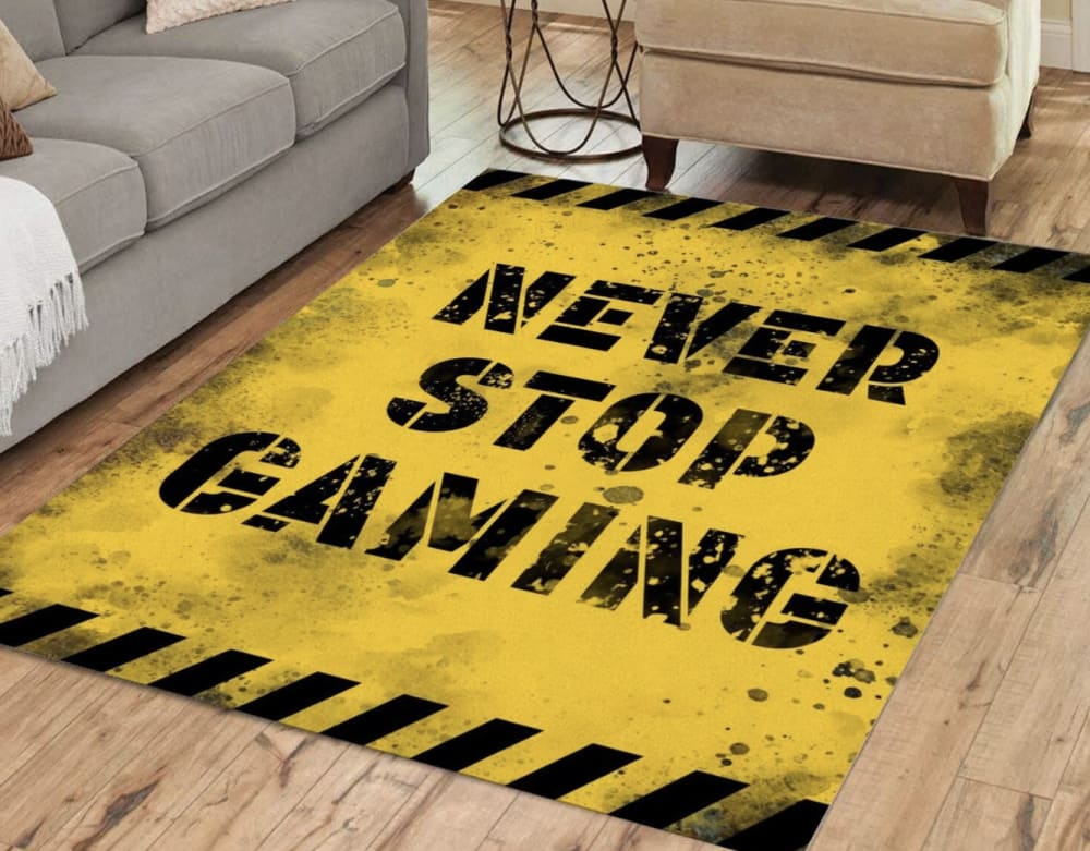
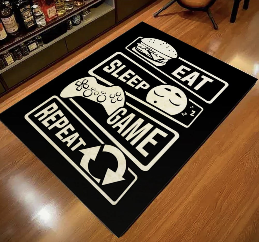
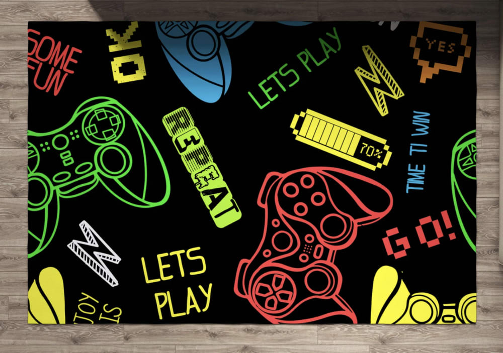
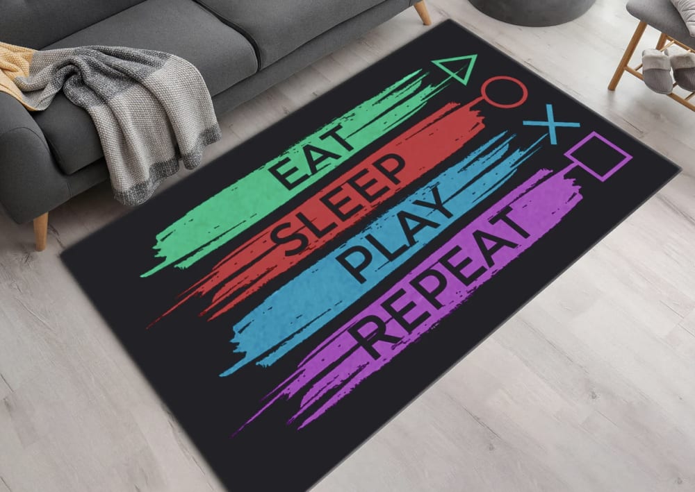
Option E won this Ranked poll with a final tally of 32 votes after 4 rounds of votes counting.
In a Ranked poll, respondents rank every option in order of preference. For example, when you test 6 options, each respondent orders their choices from first to sixth place.
PickFu requires a majority to win a Ranked poll. A majority winner differs from a plurality winner. A majority winner earns over 50% of the votes, whereas a plurality winner earns the most votes, regardless of winning percentage.
If an option does not earn a majority of votes, PickFu eliminates the option with the lowest number of votes. The votes from the eliminated option are reassigned based on each respondent’s next choice. This process continues in rounds until a majority winner emerges.
Scores reflect the percentage of total votes an option receives during the vote counting and indicate the relative preference of the respondents. If there is no majority winner, look to the scores to see how the options fared relative to one another.
| Option | Round 1 | Round 2 | Round 3 | Round 4 |
|---|---|---|---|---|
| E | 32% 16 votes | 36% 18 votes +2 | 40% 20 votes +2 | 64% 32 votes +12 |
| C | 16% 8 votes | 22% 11 votes +3 | 32% 16 votes +5 | 36% 18 votes +2 |
| D | 24% 12 votes | 24% 12 votes | 28% 14 votes +2 | Eliminated 14 votes reassigned |
| A | 16% 8 votes | 18% 9 votes +1 | Eliminated 9 votes reassigned | |
| B | 12% 6 votes | Eliminated 6 votes reassigned |
8 Responses to Option A
I like "A" the best because of the minimalism and yin-yang polarization.
Options A and E are the most appealing to me because they utilize color in an interesting way, while still retaining a nice black balance in the background. Option A is especially cool in the way it is divided into halves. Option B is my least favorite because the bright yellow is just so stark; I would rather have something more subtle.
I wouldn't buy any of them, this is the sort of product only really weird people would buy
The choice was synthesized by the greater discretion compared to other more colorful designs.
I really like option A because it's clever - not something that I would have thought of and it makes me smile. I dislike option B because it makes me think of construction, not gaming.
Option A stands out the most. The design is well done, and uses a color scheme that transitions in the right areas. It would likely fit in most environments, despite the colors not being too neutral.
Option A is the most clever theme and the orange/black color theme would fit in well with my son's room , while the other's have generic themes and are not as attractive from a color theme stand point, so A is my choice.
Wool is often considered the best choice for living room carpet , it is hardwearing qualities and softness underfoot . And the theme of the carpet is gamer . I love to play games , so I will definitely buy the one of these carpets . The option A was looking great , it will be very special to a gamer .
6 Responses to Option B
The look and message of B fits the feel of who this is for to me better.
I chose option B. I really am drawn to the yellow and black mat.
Option B seems to have the edginess that one associates with hard core gamers! The style of Option C graphics fits gamer profiles which the rest don't seem to.
They're all pretty great designs, but I'd buy the big caution traffic mat telling everyone to NEVER STOP GAMING!
Just going on what my eight year old kid would think and what he would chose. I am confident he would choice B.
I voted for option B because I think the "hazard sign" look is pretty fun.
8 Responses to Option C
this order but man they are too bright for my tastes
I like the colors on this one and the overall design better. I like how the colors are black and white. I also like the designs that are next to all of the words. I would choose E second because colors look good and remind me of the buttons on the controller which I like
I like the big words and the black background of option C. I think it is easy to read, a great saying, and has a nice color to it.
i really like choice C cause i like that it is black and white and i like the saying on it. i feel like it would go with more decor and colors considering it is just black and white.
I like the mat in option C the best. I like the art style and black and white colors.
I prefer the basic eat game sleep format of option C. It's not too loud or tacky like the other choices
Choice C is the one that I liked the best because I like the black and white design of it. It looks nice and simple color wise because of that. I like the logos to go with the wording as it adds some character to it and it makes it more fun. I also liked how it used a more generic controller as opposed to it being something associated with PlayStation. Choice D is second because I like how the colors look against the black background. It has a lot going on in it and comes off as being fun, colorful and frenzied. Choice E is third because the colors on it against the black are nice but I did not like the overt PlayStation connotations with the buttons. Choice A is fourth because it had that same issue plus I did not really like the ordinary people comparison that it was making. Choice B is last because I did not like the worn and dirty look that it had to it. It just did not really fit to me.
The darker colors look better for this type of product, all nice options though.
12 Responses to Option D
I like the collage that is used in D and do not like the gamer guy t shirts like seen in choices E A C and B so D is best
I would rather buy Choice D. I like how this design incorporates more actual gaming-related items into it rather than just phrases alluding to such. I also like the strongly colored outlines against the black background, which makes it very striking.
The top choices is the most attractive and interesting, and has the best colors.
I would buy D for someone I knew that was really into gaming over the others.
I prefer D because of the colors and design. The design reminds me of gaming and the vivid colors are perfect for any gaming space.
I prefer this on because it looks very colorful and would look great in any room in my house. I like also the size of the lettering on this one
This is the most appealing design for a child's room who loves gaming.
I love option D the most because it is the most vibrant and it is the most fun and exciting looking one.
I picked D because I think it is the most creative and the bright neon colored drawings on a black background stand out the most.
I chose Option D first because I think it's the most attractive and appealing, and I like how there's a controller on it. I chose Option A last because it looks more like a tshirt than a rug/mat, and i think a lot of people would find the design "cringy"
Prefer the more abstract designs rather than purely textual.
I think my first choice looks nice and isn't cringy. My second choice is only slightly cringy and the design is kinda neat. I don't like the rest of the options.
16 Responses to Option E
i like the colors and the design is clever
I love E I feel like it pops and has a cool saying that people would find funny.
Every gamer can relate to option E and the color scheme and design is amazing.
E and D are the only two that aren't cringe-inducing levels of cliche.
I would rather buy option E because I think that it has the most interesting and visually appealing design out of the five options.
I like the colors in my top pick, plus it represents my favorite system to game on which is playstation.
I like the bright colors of E and D, not so much the monochromatic yellow B. A is just kinda gamer-kitschy.
I like E and D the most because they are more colorful than the other options. They have more than just blacks and oranges
E was my favorite but I liked d as well
I chose in order of uniqueness and how interesting they were to my mind.
Options E and B have motivational statements to keep one going.
I like E because of the colorful nature of the design. I also like the corresponding designs of option C.
I like the quote as well as the colors used and think it would be perfect in a child or teen's room
I really like the two with the bright colors on black backgrounds. The others are all ok but not as visually exciting.
I ranked my choices based on which items were the least loud in terms of design and colors.
My rankings are based on the color choices. I hate video games like all people my age or older. Putting your own hobby on a product narrows the potential buyers to a tiny group
Explore who answered your poll
Analyze your results with demographic reports.