Poll results
Save to favorites
Add this poll to your saved list for easy reference.
Which screenshot would most help you decide whether to download this app?
10 Responses to Option A
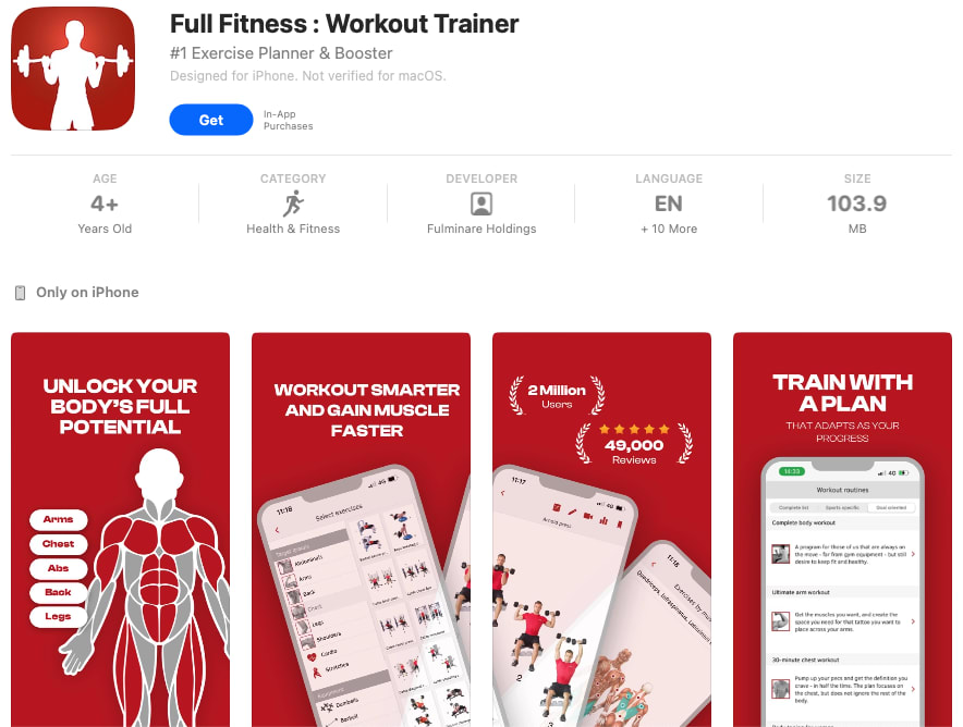
The red background of the images is more unique and memorable
I feel like the screenshots are nicer on Option A
Option A has the most attractive color scheme.
The color theme is highly visible. The rad background is strong and the white text and details pop visually.
The elements of this screenshot are more attractive and lively. I appreciate the yellow color scheme and other design aspects that make this an appealing display for the consumer.
The full red of the screenshots are very attention grabbing and would be something I look into
I like the idea of full fitness. Had a nice ring to it.
This one looks more urgent and effective. And it doesn't have weird muscle boobs highlighted.
This option is more visually pleasing. I like the bight and vibrant colors, I like the descriptive training plan.
I think the color scheme looks more appealing in A
20 Responses to Option B
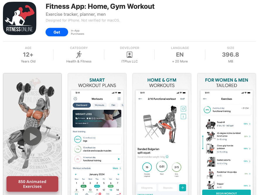
I feel like the white background and blue accents is a far better choice. The red used in Option A seems like a warning sign. It's just aggressive to use that much red, I think.
B's app I feel looks better and would be higher in quality.
I prefer B because the app looks more innovative and smart.
Option B makes me think it's really going to train me and get me into shape.
B would convince me more because it's more informative than A.
I thought the ui and icon for option B looked better. It just looked less overwhelming.
Option B caught me right away and I read more about this app.
Option B would influence me more to download the app because it has better images and more information about the app. The other app is just bright and vague.
I like being actually able to see the workouts and look at this set up as to me it would be easier to follow when trying to get into this app.
Option A has too much red. Its unsettling. Choice B is much better with its variety of colors
I would probably go with choice B because the screenshots show different exercises that I could be doing. Let me know how the app will look when I am using it.
I like Option B because it is easier to see the details of the app and the screens in it.
It seems more user friendly
Option B does a better job of showcasing the kind of guidance that I will get from the app, because I can see a demonstration of exercise techniques and a representation of which muscles they will be targeting. With Option A, by contrast, the images appear to be more academic, with less focus on the practical workout guidance.
I chose B, because I felt that it actually shows the different workouts, images of and videos of how the will look and work, and what type of data and info I can input and save. I feel that A is too simple and leaves a lot to be imagined in how it works and what it will actually look like in the app.
Option B inspires me to download the app because I like that there is a lot of detailed information shown and I like that I can see there are 850 videos that show how to do the exercises.
B does a better job showing off the fitness app and giving you an understanding as to how it works as well as how you'll interact with it.
It gives more overall information to base your decision on.
I like Option B more because it shows more information on the workout plans that are available through the app.
Option B has good contrast between the print and the drawings and the background. Especially when I am sweating, my glasses are moving around, and My eyes are tired, I need all the extra visual cues I can get.
Explore who answered your poll
Analyze your results with demographic reports.