Poll results
Save to favorites
Add this poll to your saved list for easy reference.
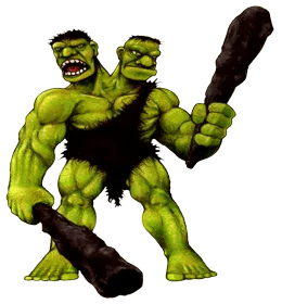
How do you feel (1-5) about the design of this character? What, if anything, could be improved or changed to make this character better?
Rating stars
Answer Attributes
Age range
App store spending habits
Console gamer
Cryptocurrency investments
Education level
Favorite mobile game genres
Gender identity
Mobile device
Mobile gaming frequency
PC gamer
Personal income range
Racial or ethnic identity
Tablet device
50 Responses
I think that the character is really cool looking and one I would play as.
I would feel that it would better if it did not look too much like the Hulk, and create a design that is more unique.
I really like the design, no big errors. Just depends story, if they are twins or if suppose to have opposite personalities
I think he looks good, but I am not a graphics designer.
the color choice is questionable maybe a different shade
I think it looks great! Like a twist between a classic two-headed monster and the Hulk.
Doing this character of three out of five because looks pretty generic for a two-headed giant. Some good ideas you could use to make this character better is like give them cooler weapons cooler armor make him look like he's been in some fights like some scars maybe maybe some fake limbs or something I don't know just switch it up a little bit because he looks pretty vanilla right now
I like the design of this two headed green monster because it looks strong and aggressive and angry. I do think the feet of this character look too stretched out and rather unrealistic based on the spacing of its toes, especially on the right foot. I also think the right hand fingers look much smaller and thinner than the right hand fingers.
I would make a nice and naughty version of it. Maybe they flip a coin and decide if the enemy lives or dies.
I think going with one head that is a bit more serious and menacing would help the overall look and feel of the design
The character design is a bit unoriginal. There are too many similarities to the Hulk, but I also think the outfit and clubs are a little plain. It is a great drawing, though.
I think that it is a very unique and interesting character design. I think that it would be cool to see a different club/weapon in each of the characters hands to reflect how each head has a different personality.
The design is much too "Hulk" rather than "Frankenstein" and quite frankly looks very generic for a fantasy monster.
It's not a bad idea at all. I always love the two-headed giant concept, it's a timeless one. Most of it looks pretty good too. The only big change I'd advise is spacing out the necks. As it is here, both kind of 'sprout' from the same spot on the collar, which makes it look both weird and implausible - as much as such a thing could be. Like they wouldn't be able to turn their heads right. Two independent necks, not conjoined at the base, would look far better to me.
I like the look and idea in general. The color reminds me of Hulk. Looks like a strong character. But where is his body? Seems like he should have a bigger upper body.
I think the character looks okay. He's definitely interesting but the art feels rather uninspiring to me.
Very cool and not like anything I have seen before. Not sure I can add much to it. Maybe just have a loin cloth like he man and show off the chest .
The character looks real and reminds me of cartoon characters I loved growing up with.
i feel like the design is really cool and looks like a caveman would but needs to have lighter skin tone
Make the graphic smoother, better colors.
I think that getting rid of the two heads makes everything better. It looks like something that is going to be more realistic and enjoyable to play.
It looks interesting, it's kind of like a two-headed caveman hulk, but maybe a more modern design and look, in design, would look better.
I'd add some war trophies to him, make him more gruesome instead of dopey looking.
The character would be more nice to look at and it will be great if it could be reshaped and given a single head not two and maintain the the other features of it which are nice to me.
I like how the character has two clubs, one for each head in a sense, but I would perhaps add some differences to each side of the character.
Needs another set of arms give them a second weapon and make them at least ten feet taller
It looks perfectly fine.
Reminds me of early super Nintendo games. Like BattleToads or the like. I dig the 90's look and design.
I like the two-head design and the green skin, but the toga and clubs could be more interesting. Add a little color to the presentation!
I feel like the design and art style of the character is very default and basic looking. This would be a picture you'd use in a little kids book. The design could be improved with a better color scheme and better attention to details and proportion. A little more personality would help as well.
He looks okay. I like that the two heads seem to have distinct personalities. I think the green color looks too much like the incredible hulk. I feel like a more original color would help
Make the character a bit less muscular as it a bit overwhelming with the use of muscles all over.
It could me made more high resolution and have more intricate clothing/accessories
Love the color theme! However, the second head looks kind of ..dazed..unlike the first head. Might wanna work on that.
It does the job of ugly ogre character well so I find it is a good fit
This character looks fascinating and appeals to my wanting to see aggressive looking characters.
The two heads are not the same is the characteristic of this character. I think the heads can be bigger to highlight this characteristic.
I feel like he design of the character tells me that he's a very strong chraacter.
It looks pretty good, but I would have liked the two heads to be more engaged with each other. It could be more menacing as well.
Love this character design. I would have the faces make different emotions to differentiate. Otherwise awesome.
I think the character looks fun, dangerous and funny at the same time.
I like the idea of a character with two heads. It really stand out and you will remember it for a long time. I wouldn't change anything about this.
Not sure if the artist is going for a scary or more of a comical appearance. The artwork is good but the faces are almost of a mixed emotion. One face looks angry and the other more confused. I think another color scheme would be better as well. People will right away draw comparisons to the incredible hulk because of the coloring.
I like this character a lot. I like that it seems pretty dynamic and it's not really clear if the character is a good or a bad guy, which is honestly kind of cool about it. One thing I would change is that I would make its features a bit more realistic.
The idea and image is well illustrated and would be a great character for a video game.
it's cute in a cheesy kind of way
One head please
I think it's a decent character. I would change the color of this character, it looks too much like a two-headed hulk. I would make it blue or red.
I feel like this is the two-headed caveman version of the Hulk. Its a great concept. I think what could be added is drool and dirt or grime. This monster is just too clean.
It is too cartoonish for me. The design of the character looks like it could fit the mold of a munk that brews beer, just put a brownish/tan robe on it. I wish the design had some more fierce features that give it more bite. It just doesn't pop
Explore who answered your poll
Analyze your results with demographic reports.