Poll results
Save to favorites
Add this poll to your saved list for easy reference.
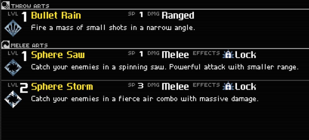
Which of these character ability menus do you prefer, and why?

Answer Attributes
Age range
Console gamer
Education level
Favorite mobile game genres
Gender identity
Options
PC gamer
Personal income range
Racial or ethnic identity
Video game player
7 Responses to Option A
I like the description for each ability, so option A is one that stands out to me .
Option A is a lot more self intuitive and easier to understand, so that is the one I would choose.
I think B looks nicer, but I chose A, because I like how easy it is to read and find the text helpful and intuitive.
Option B honestly probably looks a little bit better from a strictly visual standpoint, but I prefer the old school like and more straightforward appearance and functionality of A.
(A) looks nerdier, which games I want to play should aspire to
I like the look of the icons in B but I prefer A because it succinctly describes the spells/arts, categorizes it as ranged or melee and and shows the sp, lv, and dmg. The information is presented better.
I sort of understand A, I don't understand B at all
23 Responses to Option B
The icons is more appealing to look at. It's also more clear with less text.
Option B is brighter screen, easier to read the fonts.
The logos with the weapons are a great visual aid
B is easier to read by far. A looks outdated.
B's design is a lot more easier to read and I have a much better understanding of it.
I prefer this one. It is easier to read and look at overall. Good image here.
The text in Option A is hard to read and the margin between borders and the content is too small. Option B looks clean and is much easier to read.
easier to read and understand.
This has a cleaner style that looks clearer and easier to read
The skill logos help visualize what the skill does.
I prefer option B because it is easier to read and not as cluttered.
Option B looks really modern and attractive! Option A gives me the undertale vibe, but I wouldn't really recommend it.
B is ore pleasing to me and better detailed and easy to read through for me.
I liked the ui of option B more. I thought it looked easier to use.
I chose option B because it looks simpler and easier to see the big picture for available abilities.
The font style and black background in Option A appear outdated. I think that the brighter menu background with blue icons is much more modern looking and appealing.
I chose Option B because it is well organized, and the selections are much easier to understand. Option A is great for being dark and easier on the eyes; however, the fonts used are barbaric. I don't like the way the text appears.
I like this one because it is minimalist. The icons are spaced far part enough to allow the text next to them and for the text to be easily read. I think A has too much text and it's harder to see the progression of things.
The formatting is much cleaner in B, that combined with the color palette, it's just so much easier to process the information. White text on black with tiny font size and a lack of anti-aliasing makes it harder for me to digest what I'm reading with A.
I prefer option B because I think that it is a more visually appealing character ability menu. I think that it has better spacing and is much easier to read than option A. I think that option B is a little too cluttered. I also think that the font and text size makes option A difficult to read.
I think B is much more colorful, modern, full of character, and legible. A looks like a work in progress and is extremely bland.
This looks and feels a lot better. easier to read and navigate.
it's a lot simpler
Explore who answered your poll
Analyze your results with demographic reports.