Poll results
Save to favorites
Add this poll to your saved list for easy reference.
Which one would make you watch the film?
Option D won this Ranked poll with a final tally of 33 votes after 6 rounds of votes counting.
In a Ranked poll, respondents rank every option in order of preference. For example, when you test 6 options, each respondent orders their choices from first to sixth place.
PickFu requires a majority to win a Ranked poll. A majority winner differs from a plurality winner. A majority winner earns over 50% of the votes, whereas a plurality winner earns the most votes, regardless of winning percentage.
If an option does not earn a majority of votes, PickFu eliminates the option with the lowest number of votes. The votes from the eliminated option are reassigned based on each respondent’s next choice. This process continues in rounds until a majority winner emerges.
Scores reflect the percentage of total votes an option receives during the vote counting and indicate the relative preference of the respondents. If there is no majority winner, look to the scores to see how the options fared relative to one another.
| Option | Round 1 | Round 2 | Round 3 | Round 4 | Round 5 | Round 6 |
|---|---|---|---|---|---|---|
| D | 28% 14 votes | 30% 15 votes +1 | 32% 16 votes +1 | 36% 18 votes +2 | 48% 24 votes +6 | 66% 33 votes +9 |
| A | 12% 6 votes | 12% 6 votes | 16% 8 votes +2 | 24% 12 votes +4 | 26% 13 votes +1 | 34% 17 votes +4 |
| C | 20% 10 votes | 20% 10 votes | 22% 11 votes +1 | 22% 11 votes | 26% 13 votes +2 | Eliminated 13 votes reassigned |
| B | 14% 7 votes | 16% 8 votes +1 | 16% 8 votes | 18% 9 votes +1 | Eliminated 9 votes reassigned | |
| F | 14% 7 votes | 14% 7 votes | 14% 7 votes | Eliminated 7 votes reassigned | ||
| G | 8% 4 votes | 8% 4 votes | Eliminated 4 votes reassigned | |||
| E | 4% 2 votes | Eliminated 2 votes reassigned |
Show answers in:
6 Responses to Option A
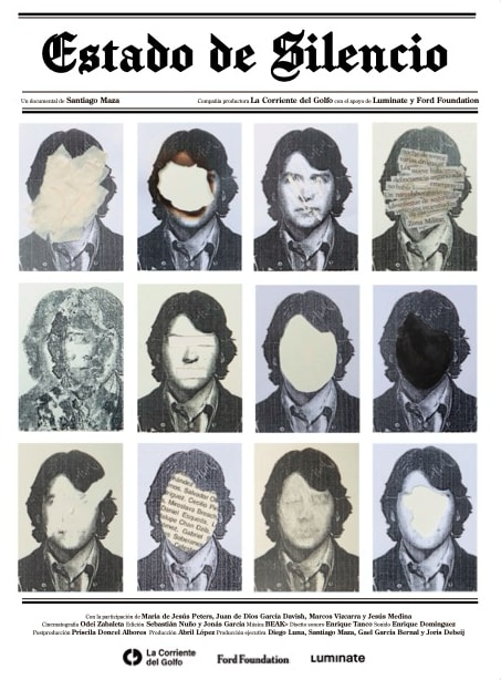
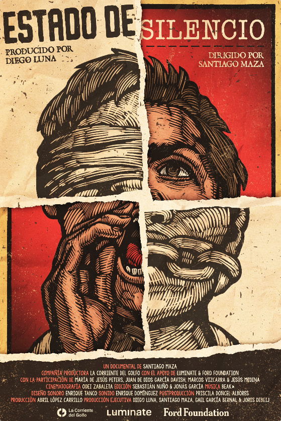
The first poster catches my attention, it looks very intriguing and intriguing as a crime, it looks to know more about the movie.
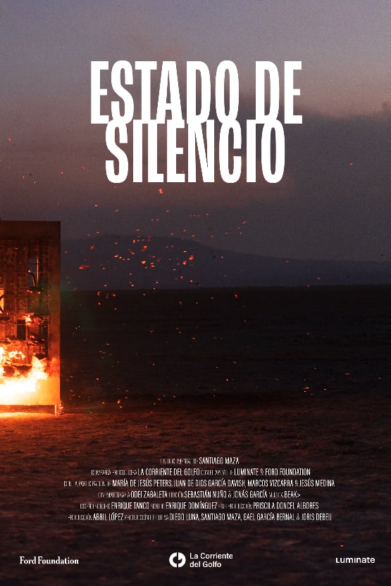
My first choice is D because it has an eye-catching cover that is quite appropriate for a film with this title.
I find the first option more intriguing as the images of the faces make me think about the plot of the movie.
The images and colors used in the poster make it more eye-catching.
The other covers do not give much information about what the film is about, but the first few choices imply that it is about politics.
The first one intrigues me to know what's going on and makes me think it's something related to the present. Some look like book covers or indie film covers.
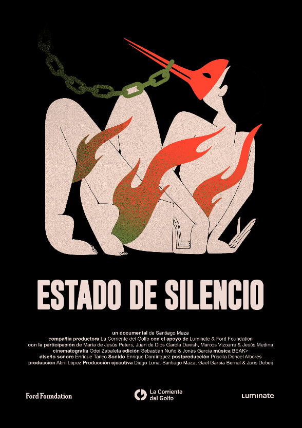
7 Responses to Option B
More eye-catching and less tragic cover art, which motivates you to want to see the film.
The first image is a bit more descriptive with a chain tied to the mouth the naked body and the flames of fire really grab me into the story
I like option 1, I feel it is a very striking, artistic choice.
In the first option I chose, I consider that the poster is a very well elaborated drawing.
The image of a tortured person makes me feel that she has no rights, that she is being violated without being able to defend herself and with the chain in her mouth that she is not free to express herself. She is in a humiliating position where someone else is in control of her actions so it makes me want to see her to understand who she is and why she is being held like this.
U The image I chose first has an impact, it is an image that shows the silence as we are tied, we are in a society that if we do not agree we are silenced, we can not raise our voices.
I find the background very good, the fire contrasts well with the black, the colors contrast well and the elements give a bit of intrigue.
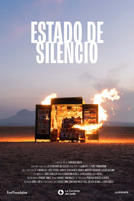
10 Responses to Option C
I ordered them in the order in which the cover shows a film of better artistic quality and not so commercial.
I like the design of the title and I think it goes with the title image.
The first one I chose is because it looks more like a movie poster in terms of photography, colors and font type, the second one is very similar but with warmer colors and it was not better than the first one.
I'm more interested in the first option, it looks interesting the fire in the trailer, I would like to think that there could be action or suspense in the movie.
the first one is the most attractive, I like the shots and they are suitable as covers.
The first option reflects to me that it is about drug trafficking and that the government hides everything, pretending not to know or say anything so that they can do their own thing while protecting their people. The second option feels more human, of how the person is affected because of something covered up. The third option reflects the same as the first but with that open space in the center of the poster I like it because it gives the feeling of emptiness that reflects part of the title.
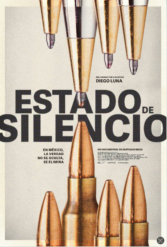
I am struck by the second cover in terms of the image of valas against I think they are feather tips as if saying that for writing, you will be attacked or killed for writing or publishing such and such information, and of course it is wrong, because it is an attack against freedom of expression that is enjoyed in these times.
because this one looks more interesting and eye-catching for the title of the movie.
I like the design of the fire and the hut. And I don't like the last ones.
I like the art of the first image I chose, as it looks interesting and destructive at the same time, a good way to attract the public's attention.
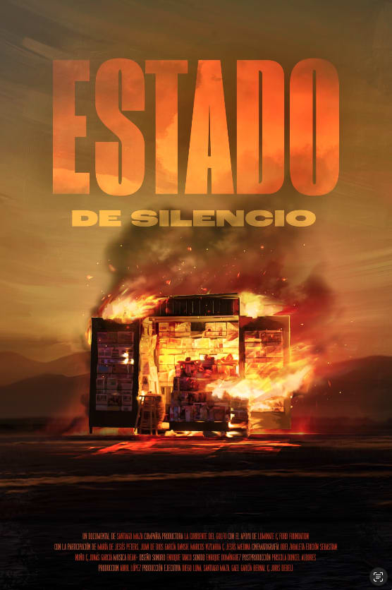
14 Responses to Option D
has a touch of suspense, arouses intrigue.
The image conveys the idea of the film better in the case of option d in my opinion.
I think the first one gives me the impression of being an intense movie, with suspense, drama is something I would like to see.
The D since the image is much more striking and provokes curiosity to see this film with much enthusiasm.
Option D was more striking to me because of the fire and the filters used, also mentioning the background.
I chose the first option because it seemed more original to me, it is the one that attracts more attention and makes you want to know more about the movie.
I haven't seen them and they look interesting. it looks like a trilogy and I like them.
IT SEEMS TO ME THAT MY FIRST OPTION IS THE ONE THAT CATCHES MY ATTENTION THE MOST, BESIDES THAT IT SUMMARIZES QUITE WELL WHAT THE MEXICAN MOVIE IS ABOUT AND THAT SURELY MANY PEOPLE WOULD SEE IT OR WOULD BE ATTRACTED TO SEE IT JUST BY LOOKING AT THE COVER, THE LAST TWO COVERS SEEMED TO ME PRACTICALLY THE SAME BUT ONLY WITH A DIFFERENT APPROACH, THAT'S WHY I PUT THEM LAST.
I chose the first option because of the way the titles are placed, plus the fluid colors it shows, they motivate you to want to watch that kind of movie, the second option was almost the same, only the titles were less striking. the third option was simpler, from there the following options did not call my attention and the last one I felt it has nothing to do.
I chose them this way because the first one catches you with the image that clearly shows the acts that happen when you want to silence someone in this country. The others also show it, for example the image where the bullets are also catches you and you know what the plot is about, and that it is just something that keeps happening in our country. The image where there are people with faces and others without, is also a clear sample of the events that we live day by day and that we cannot leave in silence.
in the first cover the colors have a lot to do to attract my attention and it looks more realistic than the others in my point of view that's why I like this cover better.
We have ingrained to silence someone with destruction, to eliminate, it is very pretentious to want to be artistic when being literal and cold is what should be expressed. So the main idea is not well understood. The fire and ashes on a home implies that destruction, that disappearance, to be left without a voice.
It has a better cover and is very appealing, as it is a bit more colorful and eye-catching.
The first option is more appealing to me and I would be interested in seeing this movie.
2 Responses to Option E
Photographs that tell a story are more engaging
I like the first one, it is the one that represents silence for me, the others are somewhat crude to my sight or somewhat violent or uncomfortable to see, for example from 4 to 7a are the ones that are a little uncomfortable to see, the second and third are more comfortable to see.
7 Responses to Option F
It has a greater visual impact in my opinion
I like my first option better because it goes more according to the title by showing a gagged man. I don't like the option I like the least because it doesn't give me an idea of what the movie is about and I don't understand the poster.
i LIKE THE FIRST COVER BECAUSE IT IS VERY CREATIVE AND I LIKE THE ART, IN ADDITION TO REFLECTING WHAT THE BOOK IS TALKING ABOUT.
The elements contained in the first poster of my choice has been very striking at first glance. The colors are just right and also, it generates a great feeling which I guess is what you are looking for. From then on, I graded the initial reaction they caused me.
I AM MORE STRUCK BY THE GRAPHIC OPTION THAT SHOWS A PERSON WITH A BLINDFOLD AND HALF OF HIS MOUTH CHAINED BECAUSE IT REFLECTS THE REALITY OF WHAT WE LIVE IN MEXICO. EITHER WE DON'T WANT TO SEE AND KNOW OR WE KNOW BUT KEEP SILENT ABOUT WHAT HAPPENS IN OUR SOCIETY.
It looks very interesting and has a good presentation
it is striking to see the figure of a person gagged and at the same time with chains on his face, indicating so much repression and silence.
4 Responses to Option G
The first option chosen makes me want to watch the movie as it implies that with the image of high ranking people in the government against bad people and makes me think that it will be interesting in terms of what is going on in the current government.
I find more striking the image that you select as number one the one with the bullets to others that I find unoriginal and that have already been seen in other movies, it is very clear that it has something to do with guns and organized crime.
The image of the pens, makes me imagine that the movie is about someone trying to silence some topic that you don't want people to have access to or useful information about.
the first option fits better with the title of the film as it implies
Explore who answered your poll
Analyze your results with demographic reports.