Poll results
Save to favorites
Add this poll to your saved list for easy reference.
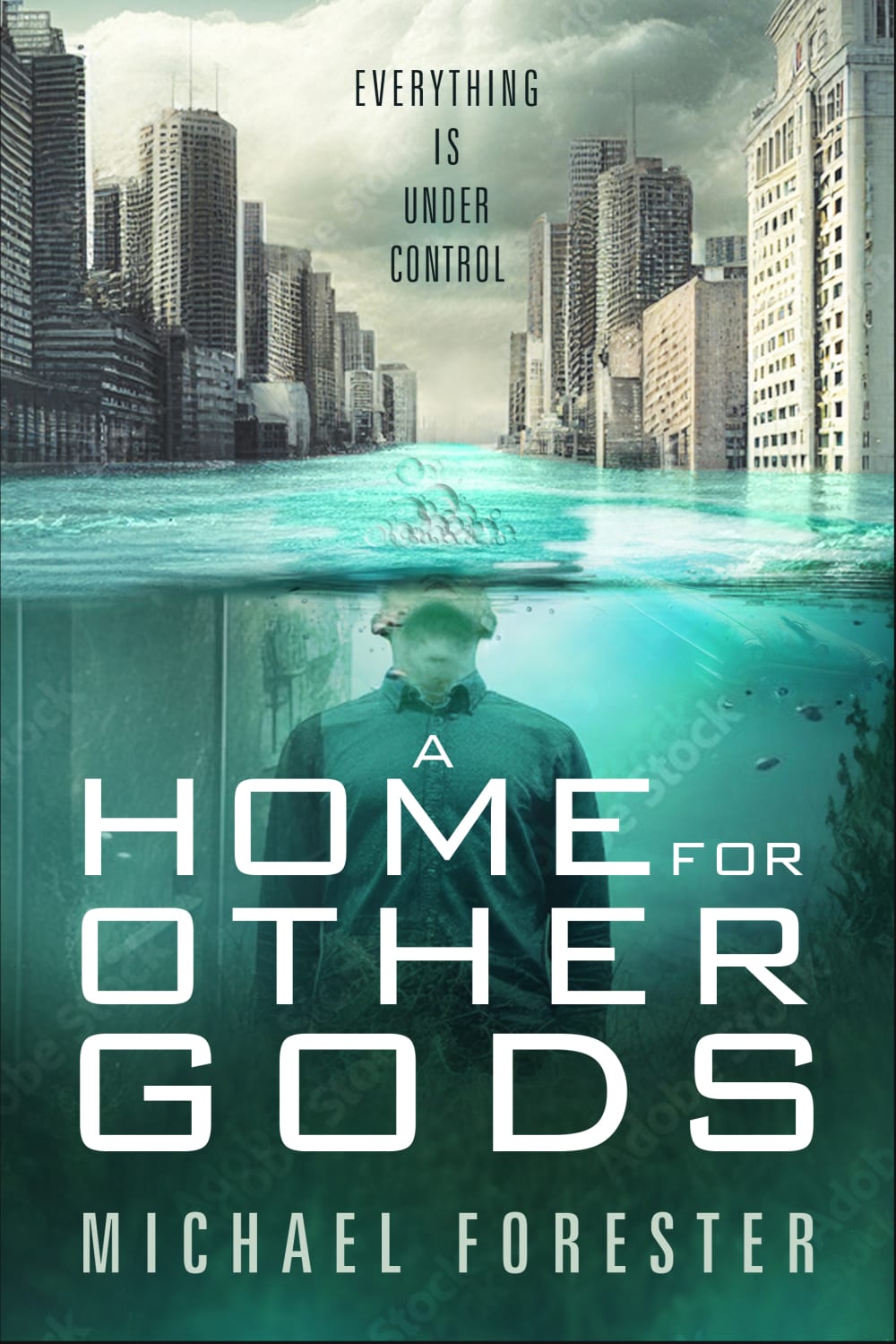
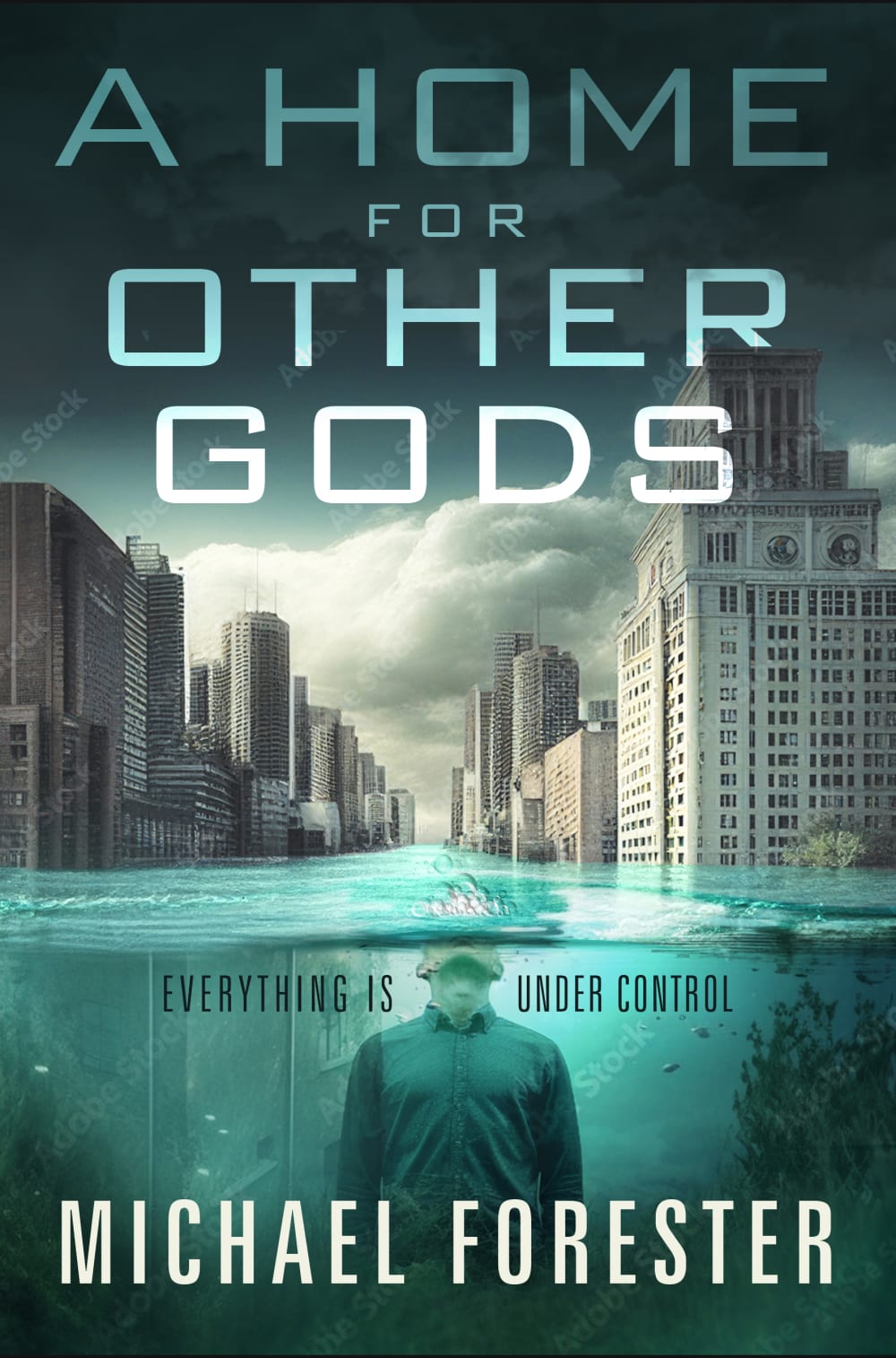
Which cover do you prefer for a short dystopian novel?


Option C won this Ranked poll with a final tally of 26 votes after 2 rounds of votes counting.
In a Ranked poll, respondents rank every option in order of preference. For example, when you test 6 options, each respondent orders their choices from first to sixth place.
PickFu requires a majority to win a Ranked poll. A majority winner differs from a plurality winner. A majority winner earns over 50% of the votes, whereas a plurality winner earns the most votes, regardless of winning percentage.
If an option does not earn a majority of votes, PickFu eliminates the option with the lowest number of votes. The votes from the eliminated option are reassigned based on each respondent’s next choice. This process continues in rounds until a majority winner emerges.
Scores reflect the percentage of total votes an option receives during the vote counting and indicate the relative preference of the respondents. If there is no majority winner, look to the scores to see how the options fared relative to one another.
| Option | Round 1 | Round 2 |
|---|---|---|
| C | 40% 20 votes | 52% 26 votes +6 |
| A | 38% 19 votes | 48% 24 votes +5 |
| B | 22% 11 votes | Eliminated 11 votes reassigned |
19 Responses to Option A
The visual appearance that catches the eye and how easy to read.
I like both the one I chose first, and the second. The design is clearer than the other one. But the first one is best as the lighter colour scheme is more aesthetically pleasing.
I feel the font hints at something quite devoid of emotion and futuristic. The colour scheme is great for dystopian story
Just spoke to me and I really liked it
Stands out more for me and i likw the picture on the cover
I think these ones are the best. Because they capture the words the most.
It has the best visual look and seems very clear.
The colour of the water is enticing. B looks old fashioned and almost like a childrens novel.
in a the figure is under water suggesting suppression, which I find intriguing, the same with c but the figure is smaller, hence second choice, and b I just don't like. Also the rain clouds in the sky in a also hints at a depressive regime
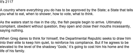
It relates more to the synopsis, lookong more dystopian. I do like option B a lot, but the words are hard to read because the title is mixed with the subtitle
Both covers A & C give more of a perilous feel to the story. They seem more intriguing.
It looks inviting and gives the best insight into what the book is about.
First choice is easier to understand and read
Looks the best with the description very dramatic and draws the eye
From the first cover, the genre is more recognizable.
Looks better and not too crowded. No crossing over of text.
I feel like the first one is more aesthetically pleasing and interesting
The writing in B isn't very clear and it can get the reader quite confused
they are all quite similar in tone so not easy to decide between them. Prefer the man submerged, the one with him in a hoody just makes him look like a youth or yob in an emergency.
11 Responses to Option B
That title is more intriguing and strikes interest. The picture is also better
I like the look of the image. I think it''s more striking than the others, and therefore stands out more. I also think the font makes the image stand out more than the other two.
the image of the man and the buildings look interesting and intriuging
It’s more eye catching. 2nd and 3rd choice is basically the same
My first choice stands out and the title fits the story line
well “B” makes it more interesting and “A” just looks more boring and just simpler , if i was to buy a book i look at the cover and see what looks more exciting.
I do not like the font on my second two choices. The first choice is easier to look at. The picture is better
The picture looks better with smaller writing than the others
I chose B as my first option because the graphics give off a more dramatic feel and also how some of the words are bigger in size to indicate how important the ‘Gods’ are. I feel like this would attract more readers and it shows them the struggle in this country and how freedom is not a thing.
The person looks more relatable when partially out of the water
I just prefer the graphics on B compared to the other 2.
20 Responses to Option C
I chose these covers be ause it shows more of a dissastor rather than a flood. The flood makes it seem boring.
First is best, dark vignette around the cover makes it look more sinister and intriguing. Third is kind of clever, but the combination of two sentences in the title could be confusing to some people, might read it as "everything a home is for other under gods control"
I don't know how to be detailed in here because the first and the second choice are similar pictures but the writing is more visible and has a clearer meaning in the first choice where "everything is under control" has been put under water and the skyscrapers are a symbol of rich god's.
The first choice is unique to me, I like the style and general look to the poster
Feels more dystopian and modern, the last one is too crowded
I like the colours and the design. The city scape is cool
The first one draws my attention more I like the look of them under water that’s why I picked number two as my second both the name stands out better too. I like the colours of the water but how dark the rest of it is. I like the buildings. The last one I’m not as keen on just looks messy. The writing on the last one everything is u set control looms a bit confusing with the main title that is written where as the first one it stands out well and makes me want to pick up the book and buy it 100% sounds really interesting and looks it too.
Clear text. Doesn’t interrupt the picture. Text matches the mood
Title and authors name was clearer. The image in my first and second choice is better than the other image.
The sky is darker on option C which gives the cover a more ominous feeling. It also moves the book title to the top which makes it more noticeable and it is in the same place as the dark sky so looks better and stands out more.
I like being able tobsee the title at thebtop of the book. The dark clouds in picture c make it seem more dystopian. I struggle to read the title in option b whichnis why that is my last choice
C has the best proportions feels balanced, a the city looks squished at the top and dont feel like the title comes across very well in b
I prefer the first 2 because you can clearly see the individual under the water as opposed to the city where the “elites” are
Option C is my first choice as it looks more symmetrical in the others. The layout of it makes more sense to me with the man in the water at the bottom, and then the title of the book, etc. at the top. B Also looks OK but not as good as option C but A I really don’t like, everything seems to be squeezed in the bottom half of the cover.
The first gives off a Nazi feel with the person on the cover…I prefer the second options scene on the cover, just not the person on it. The one I chose as first is a little dark, so I prefer the vibrancy of the second options cover.
Clearer writing on 1st choice. Too much writing on 3rd choice, covering picture up. Dont like author name coming first
Just looks more appealing and seems to jump out at you more.
1st one looks the most Appealing , visual, eye catching
The visuals of my first choice looks better. I like the large writing at the top with the gradiant writing. My third choice isn't as good as the others, I don't like the writing at the bottom as it blocks out the visual
More modern and matrix like, looks mysterious and has a dark and unique feeling to it.
Explore who answered your poll
Analyze your results with demographic reports.