Poll results
Save to favorites
Add this poll to your saved list for easy reference.
Based on the design, which product would you be more likely to buy, and why?
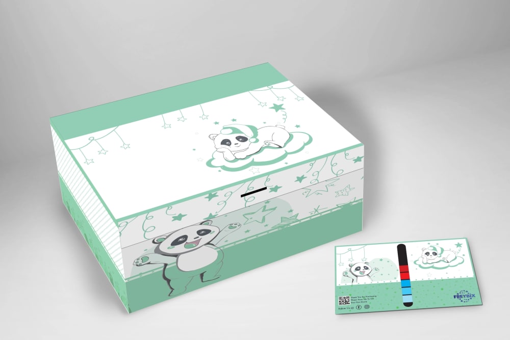
Option A won this Ranked poll with a final tally of 56 votes after 1 round of vote counting.
In a Ranked poll, respondents rank every option in order of preference. For example, when you test 6 options, each respondent orders their choices from first to sixth place.
PickFu requires a majority to win a Ranked poll. A majority winner differs from a plurality winner. A majority winner earns over 50% of the votes, whereas a plurality winner earns the most votes, regardless of winning percentage.
If an option does not earn a majority of votes, PickFu eliminates the option with the lowest number of votes. The votes from the eliminated option are reassigned based on each respondent’s next choice. This process continues in rounds until a majority winner emerges.
Scores reflect the percentage of total votes an option receives during the vote counting and indicate the relative preference of the respondents. If there is no majority winner, look to the scores to see how the options fared relative to one another.
| Option | Round 1 |
|---|---|
| A | 56% 56 votes |
| C | 22% 22 votes |
| D | 12% 12 votes |
| B | 10% 10 votes |
Answer Attributes
Age range
Amazon Prime member
Education level
Gender identity
Hobbies and interests
Homeownership
Number of kids
Online shopping marketplaces
Options
Personal income range
Pet owner
Racial or ethnic identity
U.S. geographic region
56 Responses to Option A
I love the green in option A, its different and unique, option c is also different and gender neutral. Option d and b are cute, but the other colors pop more.
Going by color alone I like the green overall as I think it stands out and has a better contrast, D and B are similar and I don't like their colors at all, C is very acceptable.
These are all super cute, but I like the brighter, more saturated colors.
I like the green. I think that's my favorite of the bunch.
I dont fully understand what this is? In any case, i think the blue is the cutest
I ranked the designs of the panda box set that I liked the most. I liked the green color of option A the most followed by the yellow design of option B then the orange and then finally the grey design of option C.
Green is by far my favorite color in general so I was drawn to A right away
I chose A because I really like the darker shades better I also really love the pretty green color a lot too. The box and pencil case looks more detailed and easier to see.
I would buy the green colored design shown in option A because I like that it makes the box and card have a nice soothing look to them.
I like A the best because the teal color is very beautiful and it is a very modern color. B is next because I like the color and it's very bright and it makes me glance at item more because of the bright color. I like C because I love the color grey but I don't really like the color grey for this cute product, it should have a brighter color like teal or yellow. D is last because I really don't like this color at all, it's too boring for me.
I went with A first as it's closest to my favorite color. Then I went with B & D as they're the brightest and look good. I didn't like C at all. It looks depressing.
I prefer this option the best from the group presented. I like the color scheme better than the others.
stands out to me as the most appealing as the colors stand out as vivid and enjoyable
i would buy the product in option A first because i like the pleasant yet neutral color of it
Option A has a nice color without being too bright for a nighttime themed thing.
I think A has the cutest colors. I also really like D and C
I like the lighter and brighter colors the most because I like them for kids and then C last because it looks the most plain.
Gray was dull and boring. Green felt the most natural and refreshing and I liked how sunny yellow was.
The light green color used in my top choice is relaxing and inviting, which is appealing. Very nice design for sure!
Option A is my favorite because of the color. I really like the mint green
I chose by options that have color and I like colors that feel calming and neutral for this product.
I think the green is the perfect color for this product, blends well with the dark outline/shading of the pandas and is quite cute/visually appealing.
I like the sea green Option A. It's easy on the eyes and easy to see. The grey in Option C is very nice as well. Option B is too bright and it's hard to see.
The green stands out. It is eye catching, attractive, and calming.
Choice A has the best look in color to me.
Green is my favorite color and I think it looks the best in these options as well, this is why I picked option A.
A is the best choice for me because of the color
I ranked them in the order of the color that I prefer. I definitely like the teal color. I like the neutral gray color next
Due to the product being the same I chose depending on color. The teal box, option A was the most appealing, soft and friendly.
I think that this color is most fitting for a panda design.
I would be most likely to buy this option because the color combination and design are most appealing and engaging.
It would really help if these ads ACTUALLY STATED WHAT THE PRODUCT IS - some sort of test, I can only guess. I like the green box, whatever it is...
I just went with my preference of colors. I dislike orange and yellow a lot, so they're last place.
I find the green and orange (A and D) both very pleasing.
I made my decision based on color A was first as green is one of my favorite colors and was the brightest. C was next as purple is my next favorite. D was next as the yellow was brighter. B was last as the yellow was really bland and mellow.
I like the teal color best and think it goes best with the design.
I prefer choice A looks visually appealing. I choose this because it stands out more.
I can't tell what the product is, but I prefer the cooler temperature colors.
l like the green color best. It's not to bright or dark.
Green is my favorite color so A first. C next because grey is my 2nd favorite color. Light yellow in B over darker yellow in D.
I like the green color the best and think it really highlights the image the best. The two yellow options are good as well but not as good as the green. The darker colored yellow is nicer and more bold. The grey color is the most boring.
The design is bright and inclusive. The packaging artwork contrasts well and is visually appealing.
I like the green shade of color in Option A, as it's very appealing. In contrast, Option C is ranked last because the grey and white color scheme is simply too plain.
I prefer Option A as my first choice. The green and white looks fresh and attractive. The shade of green is delicate but stylish. Option C with the grey and white is modern and appealing. The remaining options are perfectly fine but are not as eye catching and seem to be childish looking.
The mint green of Option A is great for being gender neutral. It has also been around for a long time representing gender neutral/unknown when baby birth gender is unknown, so it is a highly recognizable color for babies. It has a great vibe as mint green is a very soothing color.The worst option, by far, is the grey color... or no color. It is unimaginative and boring. There cant be that many parents who decorate baby rooms in shades of grey so this might be for a very limited market share.Option A is the way to go in my humble opinion.
I like image A because its a color that can go with either gender. Image C is too plain and it is not appealing for me to either gender at all
I have a penchant for cool and neutral color schemes.
I chose the colors I prefer the best
Option A is my first choice because it is the color that I like the best. The green is a sweet color. Option D is my second choice because I really like the orange and it is a close second behind Option A. Option B is my third choice because I like the yellow color, just slightly less than the others. Option C is a distant fourth because I like the gray least of all the colors.
I just based it off my favorite colors.
Not knowing what the product is, I went with the most appealing colors which were vibrant and fun.
A looks more refreshing. The color green is a soothing color and more appealing.
I chose A first because I like the green the best. Then I put them in the order of the colors that I preferred. I don't love the grey as far as the packaging goes. It doesn't stand out at all.
I love the color in this box it fits well
Option A. I think the green color looks best and is more appealing to my style.
I prefer Option A the best because I like the turquoise color the best. After that Option D is my second choice because it is bright and suggests a sunny type of product. Option B is my third choice because the yellow is happy although a little faded. Option C is the most drab and boring so my last choice.
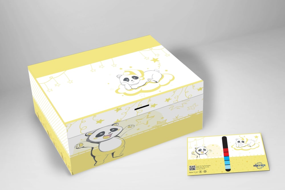
10 Responses to Option B
B has bright, happy colors, D is less bright but I like it second bestD is cute with the blue color but not as cheerful as B and DC is too dull
I like option B, it's a nice color yellow and it's not too bright. Option A is a pretty color, it's like a pale orange. Option A is okay for a green color but I don't really like option C, I don't think that the gray looks as nice as the other colors.
I like the bold color of yellow and orange. This items seems to also be made for younger people so the color would really bring out the youthfulness of the product. Both colors are gender neutral which I like.
I love the light yellow and gray; the are super neutral. I don't prefer the bright yellow or the green.
The color scheme of my top choice definitely stuck out at me at 1st glance
The color of the product package were considered when making choice, how well they look beautiful and presentable.
This looks very good in yellow - makes me want to try it.
B, D and A are cheerful, gender neutral and eye catching. C is plain and unoriginal.
The brighter, the better when seeing the item directly in a photo that will make sense to purchase it.
Yellow and peach are very happy colors, which I think fits in well with this type of product.
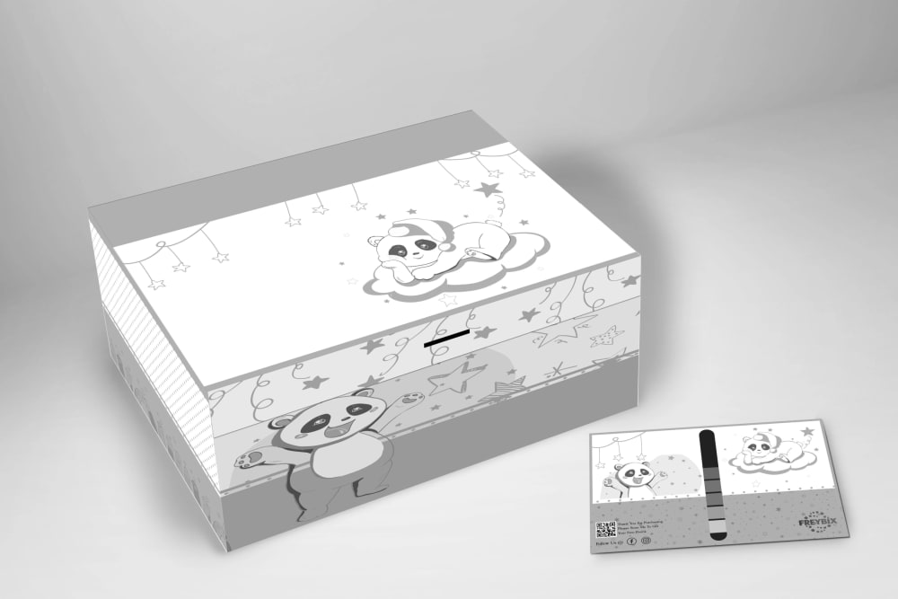
22 Responses to Option C
I picked option C because I like its classic, more neutral gray tones.
It’s a panda on the box, so all the colored options look weird. My favorite would be the grey in C. That makes the most sense to me
This looks closer to a more natural color for a panda.
Option C: I prefer a blander box over a stark-colored one.
I would choose choices C and A first because I love the color choices of the two packages which are really nice to look at as compared to choices B and D which have a less attractive nature to it because of the color choice which is yellow and the least attractive to me .
i prefer the grey color tone because it can more easily match with different rooms and different patterns.
I love the gray color because it can go with anything.
Option c is the most neutral eith silver and white. The other colors are unappealing
I feel that the plain grey and white compliment the panda on the box best.
I really like the grey and white version. Colors tend to get outdated quickly and people tend to keep baby colored things for many years.
I like the neutral color of option C. The other colors cheapen the product in my opinion
I like C the most. I think that C is good because I like how neutral it is. It is not geared towards one gender or the other
The more calming colors in C and A seem to go better with the bedtime theme of the box than bright colors. I'd buy C or A.
I prefer choice C for the more gender neutral color.
I like the neutral colors of C.
I like choice C, gray, because there's a sense of serene with the box and looks so pleasant and I feel gray is very neutral and fits.
My eyes went exclusively to the muted colors first. It is more pleasing to me and much calmer looking
I chose option C because I like that the colors are not bright and they are just black, gray, and white. I think the lack of colors makes it stand out to me and makes me want to click on it more than the other 3 options.
Options C and D are the best colors that definitely fit my style and taste.
The grey one would be the only one, the tone matches the starry look and the Sleepy looking pandas.
I chose C first because I like gray and it is understated. I chose B next as I like the lighter color yellow instead of orange. I chose D 3rd because I like orange only slightly more than my last choice which is green my least favorite
C because it looks like it can be colored, like a coloring book. A is a nice color.
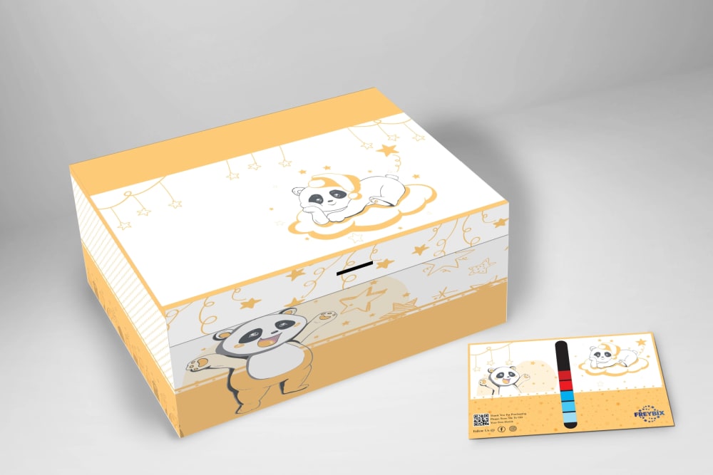
12 Responses to Option D
The orange/yellow/gold color really stands out. The gray is blahhhhh
Option D is preferred. Product color is more vibrant, interesting, attractive.
I prefer the brightness and warmth of the yellower colors.
I think choice D's colorway is bright and neutral for any kid.
I like this color it stands out and has a boldness about that I like ,I feel it is very pleasing to the eyes
I thought the brighter colors were nicer and looked more vibrant and caught your attention the most.
The orange and the teal colors of these boxes are my favorite they're just more fun colors than the yellow and the gray
I would definitely want to purchase option D because of the color combination and graphics.
I like the light colors the most even though they are quite similar, D is presented the best with the best shade of color.
I absolutely love this soft orange color. It's the best of all of these in my opinion.
I prefer the color in option d
This color just makes the pandas stand out better than all the other options.
Explore who answered your poll
Analyze your results with demographic reports.