A wine label design might look delicate, pretty, or eye-catching, but it has a lot of heavy lifting to do. It’s the first point of contact between the wine and its potential customer. It has to satisfy the legal requirements for what information must appear on a wine label. And it must also tell a story about the product inside.
Whether it’s on a bottle of Bordeaux, a crisp Chardonnay, or a special vintage made for a wedding or birthday, a well-designed wine label directly impacts your sales.
In this guide, you’ll learn how to create high-quality, custom wine labels your customers will adore.
The goal?
To make sure your bottles stand out among the countless other wines on the market – whether you’re selling them on a digital shelf or in-store.
What should appear on a wine label design?
There’s a lot to think about when you sit down to design a wine label, and it can be overwhelming to tackle everything at once. So let’s break down each component of retail packaging design for wine:
- Front label: The front label is the most visible, and it’s where sellers use different design and branding elements to catch the eye of potential buyers. You’ll include the wine’s name, the winery’s logo, and usually an artistic element.
- Back label: This part of the label gives customers everything they need to know about the wine. It’s where you’ll include its origin, grape varietal, alcoholic content, and tasting notes. Some winemakers also put food pairing suggestions here.
- Neck label: These are less common but can be used for additional branding or specific information, like awards or certifications.
- Key elements: The key elements of a wine label include mandatory information required by law. Think things like the alcohol content, country of origin, and net contents. In the United States, you must include:
- Appellation of origin
- Brand name
- Class or type designation (aka, the type of wine)
- Percentage of foreign wine, if relevant
- Alcohol content
- Color ingredient disclosures, if relevant
- Country of origin
- Health warning statement
- Name and address
- Net contents
- Sulfite declaration
- Optional information: If you want to, you can include things like the American Viticulture Area (AVA) the wine comes from, gluten and allergen labels, and nutrient contents.
A great starting point is the U.S. Department of the Treasury’s Alcohol and Tobacco Tax and Trade Bureau (TTB) wine label template tool. Called the Anatomy of a Wine Template tool, it’s an interactive feature to show you where the information usually goes.
If you click on a specific area, you’ll learn whether the information is mandatory and where it must appear.
One super important point to remember is that all areas of your label should flow, design-wise. You’ll want to use typography, fonts, and styles that align with your brand and look good together.
Tips for creating custom wine bottle labels
If you’re crafty and love design, you can create custom labels yourself.
Otherwise, you can work with a designer on a tool like Fiverr or 99designs to put together the perfect wine label.
If you’re making the label on your own, look for tools specifically made for designing wine labels. Adobe has one. Stoney Creek Wine Press does too. Canva’s wine label templates are tasteful, as well.
They’ll give you plenty of templates and editing tools that are easy to use – even if you’re not exactly a design expert.
Here are a few basic graphic design tips to keep in mind as you work:
- Pick the design thoughtfully. Use fonts, colors, and illustrations that work well together and fit the style of your wine. For example, you might pick elegant fonts and colors for a classic Bordeaux or Cabernet Sauvignon. Or fun, bright designs for a birthday rosé or Chardonnay. Think about what type of label fits both your personality as a brand… and the personality of your wine. (Yes, wine has a personality. We swear.)
- Consider personalized touches. Are you creating personalized wine bottle labels for a special occasion rather than to sell? Plenty of people do this for events like weddings, birthdays, and anniversaries. Add personal touches, like the name of the birthday person. Or the name and date of a couple’s wedding. These personal touches can make your label and the wine it holds incredibly special.
- Choose the label material carefully. The material of your label matters more than you think. Whether you use a matte or glossy finish can impact the whole look of your label. Matte might look more elegant and refined, while glossy could make the colors pop. Try different methods, like using die-cutting tools to create unique shapes for your labels. Experimentation is your friend here. Think of how the design will boost digital shelf optimization as well as the way your wine looks on a store shelf.
As you work with your design tool of choice, you’ll also want to think about how you’ll print your labels.
A note on printing
There are two main ways most winemakers print their labels: digital or traditional printing. Here’s a quick overview of both to help you decide which one works best for you:
- Digital printing: With this method, labels are printed directly from a digital file onto the printing surface – usually a special sticker. Digital printing gives you high-quality prints, and you can choose from a wide range of colors and styles. This flexibility makes it ideal for small to medium runs, custom designs, and personalized wedding wine labels. It’s also easy to adjust and re-print labels if something doesn’t look quite right.
- Traditional printing: Also known as flexographic label printing, the traditional way of printing wine labels uses special plates to transfer ink onto the printing surface. This method is better for large volume runs – ie, for established winemakers with the means to afford it. There’s a big setup cost here, and it takes a lot of time to prepare the plates. But once everything’s in place, traditional printing can produce scads of labels at a relatively low cost per unit.
Before you rush to print your wine labels, though, it’s time to test them to a target audience who can give you honest feedback.
Wine label validation and testing
It’s nerve-wracking to commit to a wine label and pay for printing. Especially if you don’t know if people in your target audience will even like the label. You can skip this stress by using a tool like PickFu to split-test your labels before you finalize them.
(Hint: you can use PickFu to test all sorts of labels and designs. We get lots of sellers who test everything from coffee packaging designs to supplement label designs to tea packaging designs.)
To show you how this works, we ran two different polls.
Poll #1: Testing three unique labels in a Ranked poll
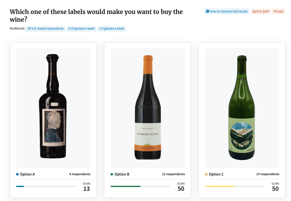
In the first poll, we asked a group of 30 wine drinkers which of three labels would make them purchase a bottle of wine.
Option A is kind of scary and shows a person with a hood over their head like they’re about to head to the guillotine. Option B is minimalistic, with elegant fonts and little to no art. And Option C includes an illustration of a nature scene.

Not many wine drinkers liked Option A. The rest of the votes were split between Options B and C.
Here’s a snapshot of what our target audience had to say:
- “I like the simplicity of the label and the shape of the wine bottle in Option B. I’ve never bought wine in a green bottle before, so Option C is a little weird to me, despite it being on brand with the scenery on the label. I really dislike the shape of the bottle in option A, not to mention how unsettling the label is.”
- “I would buy [Option C] because I really love the outdoor scenery featuring the snow capped mountains with the pine tree forest in the valley below.”
- “I prefer [Option B]. Based on the shape and color of the bottle, it’s most likely to contain white wine which I prefer. Option A looks like it would be really an intense red wine (like port) and [Option C] would be an overly sweet German white like Riesling.
- “[Option B] is the classiest looking choice. I’m not too sure what is going on with A.”
Notice how everything from the label and the shape and color of the bottle made such a huge difference? It’s fascinating to see how the outer presentation can deeply influence a person’s perception of the wine inside.
If we were to do this poll for an actual wine label (not for three wines that already exist) we’d choose one type of wine with the same color and bottle shape. Like a red wine with a classic shape and a hue that showcases the color of the wine. Then we’d put three different label ideas on it and ask the group of wine-drinkers which one they’d pick.
This type of brand market research isn’t hard to do, and it delivers crucial insights.
Poll #2: Gathering insights with an Open-Ended poll
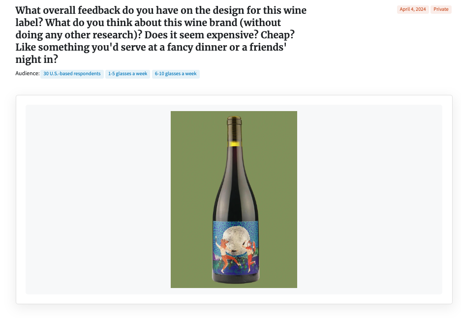
In our second poll, we asked an open-ended question to see what feedback we’d get about a design.
The wine label in question features two humanoid foxes dancing under a full moon.

We asked the respondents, “What overall feedback do you have on the design for this wine label? What do you think about this wine brand (without doing any other research)? Does it seem expensive? Cheap? Like something you’d serve at a fancy dinner or a friend’s night in?”
Here’s an overview of what our 30 U.S.-based wine-enjoyers said:
- “I don’t know anything about this wine, but judging by the childlike illustration on the label, I would imagine this would be one of the more affordable wines. It seems like a young vineyard is trying to make an impression by standing out with a wacky label. This would be a wine I brought with me to a birthday party (so I don’t show up empty-handed) but I would not serve it with a fancy dinner.”
- “Off the top of my head, it looks expensive to me. But then again, all wine is expensive to me. I think it could be served at a night with friends, but maybe not at an expensive dinner. The label looks too lighthearted and fun for a fancy dinner party.”
- “This brand seems very cheap given the inelegant label. I like that the label is colorful and that the bottle is a bit elongated at the top. I don’t like there is no clear branding, vintage, and other info shown. Despite nice colors, I would strongly prefer a wine where it focuses on the important aspects of wine as mentioned, also including origin and notes. When I see a bottle like this, instead I think it is a cheap wine that is best for binge drinking and not much else.”
- “The label looks really cheap, like someone made the wine in their bathtub and bottled it there. Sorry.”
You gotta love the honesty these respondents bring to the table.
Of the 30 respondents, 15 specifically said they’d only serve the wine at a friends’ night in – not at a fancy party. Only two respondents said they’d serve it at a more upscale gathering.
The other respondents had mixed feelings about it, and some wouldn’t serve it anywhere. The lack of branding and vital information on the label seems to have really thrown people off, too.
If we were this company, we might reimagine the label a bit – and then exclusively target it to an audience of younger adults needing wine to bring to game nights and other fun events.
Key takeaways
When it comes to designing the perfect wine label, remember these three key points:
- Labels attract buyers. A wine label’s job is to grab attention and tell what’s special about the wine. It must also showcase your branding and follow specific laws and rules to comply with federal law.
- Take your time with the design. Put thought into your wine label design process. Use colors, fonts, and images that match your wine’s personality—and your brand. This helps your wine stand out in a sea of other bottles, whether that’s in-store or online.
- Don’t skip the testing stage. Before printing a million labels, test the style with potential buyers on PickFu. And pay attention to what your target audience is saying! Make those changes and re-test until the majority of respondents love your style. This helps make sure your wine hits the market with a splash – not a flop.
Testing your wine label is quick and easy with PickFu. You can upload your designs with our easy-to-use dashboard and get honest feedback today.
And if you’re not sure whether to sell your wine online or just in brick-and-mortar stores, check out our post “Is e-commerce worth it?” to help you decide.
FAQs
What size are wine labels?
Wine labels come in various sizes, but one common size is 3 inches wide by 4 inches tall. This dimension can vary depending on the bottle shape and the design elements you end up including. You can also choose wrap-around labels for more detailed storytelling or to include artistic designs.
Can AI design my wine label?
AI can help you design your wine label, but you shouldn’t necessarily depend on it to do all the work. It’s tempting, because you can input preferences for style, color, and imagery, and the AI can generate designs that line up with them. But AI lacks a human touch, which is why we recommend using other design tools along with AI packaging design to create a truly unique label.
Can I create my own wine label template?
With graphic design software or online label-making platforms, just about anyone can create a wine label template. You can customize dimensions, layout, and artistic elements to match your vision. Just make sure you get other people to look at your design before you hit print. There’s nothing more valuable than having your target audience’s feedback in your pocket as you work.


