Designing a mystery cover can be tricky. You want to capture the mystery of your book without giving the reader too much information.
In other words, you want a mystery book to appear… mysterious.
The problem is, if you make a cover too mysterious, you can stump readers. With few clues on what a book is about, an individual can have little enthusiasm to buy the book.
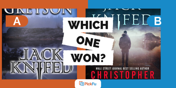
We observed this phenomenon in a recent PickFu poll. A novelist asked the panel which book cover they preferred and provided two different options.
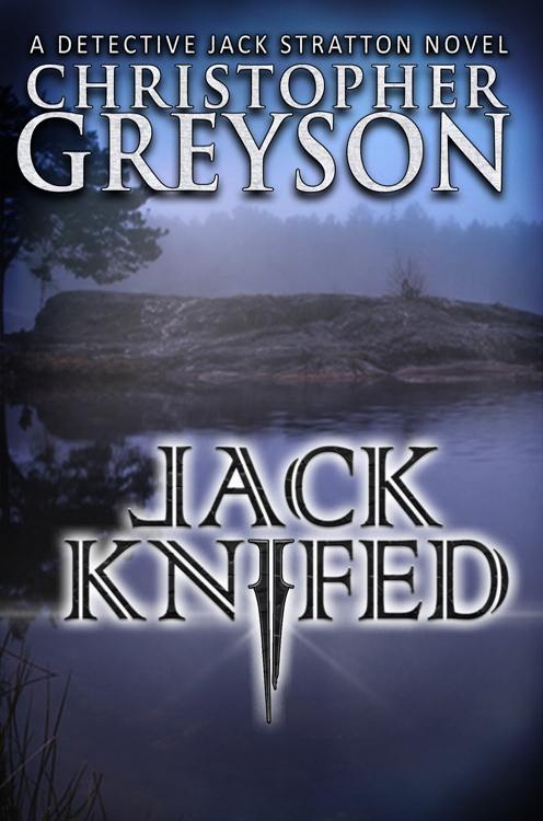
Option A shows an island surrounded by water, backdropped by an eerie grey fog. The author’s name and book title are in grey, black, and white fonts.
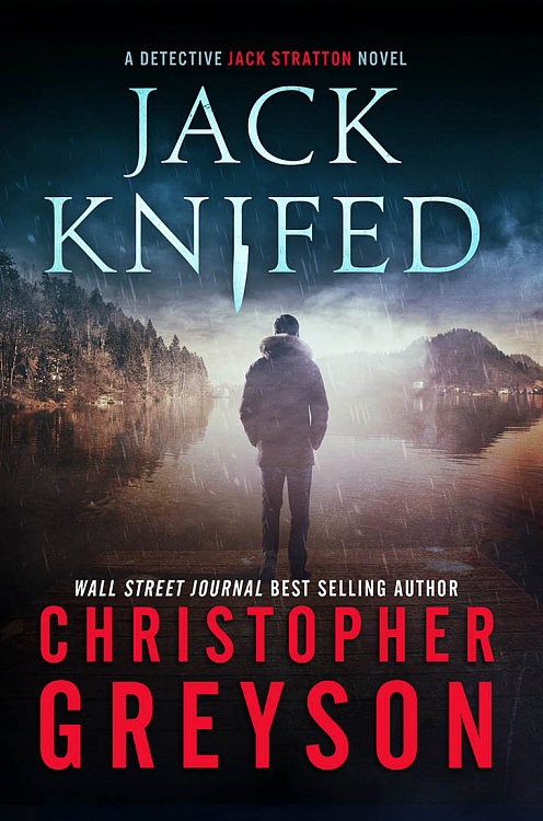
Option B shows the back of a man who is looking out at a lake as it is raining. The author’s name and book title are in blue, white, and red fonts, along with an accolade, “Wall Street Journal Best Selling Author.”
Can you guess which one won?
Option B dominated the polls, earning a score of 80, whereas Option A only earned a score of 20. These scores were consistent regardless of age range or gender.
Give a Personal Touch
Many test panel participants stated that they felt drawn to Option B because it had a person on the cover. One person noted that it gave the cover “a human connection.”
Another stated, “I prefer B since it has a person on the cover. I’d imagine that’s Jack Stratton and draws me more into wanting to read the book.”
Poll respondents also noted that the man looked mysterious, mostly because his back is to the camera. We’ve seen this before with poll results for book covers. People feel that book covers that don’t show the entire face are more mysterious and draw them into wanting to read the book.
Show (A Little) of the Story
The inclusion of the man also provided panel participants with enough information to know that this must be a mystery novel. One respondent writes:
“The cover with the person on it immediately gives the reader clues about the book. You know there is a male character and you know there is a mystery or suspense involved–not simply because it’s a detective novel, but because of the use of rain and light. The cover I did not choose, Cover A, is undistinguished, visually ‘blah,’ and offers no clues about the content of the book.”
This respondent took in visual clues from the cover in order to conclude what the novel could be about. Other respondents made similar observations, making comments such as:
“Choice B gives the best impression of the story and the genre overall. I like the image of the man overlooking the water. This type of cover fits very well with the style of book.”
And another writes, “It gives me more of a hint as to what the book is about.”
The word hint is key here. The author included just enough detail on the cover to give readers a sense of what the book is about, while still maintaining a level of mystery and intrigue.
Your Takeaway
As you create a book cover for a mystery novel, considering adding elements that tell a part of your story. When including individuals, try not to reveal their faces so that you can maintain a level of mystery.
Once you have a few designs prepared, conduct a split test by creating a PickFu poll to see which option your target audience prefers.


