For many authors, one of the most exciting parts of seeing their novels travel the road to publication is watching the creation of a book cover. In traditional publishing, the author rarely has any say in what the cover looks like. But that’s not true in self-publishing. And with PickFu, you can make sure the cover you choose for your book resonates with your target audience.
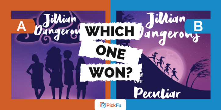
Take the case of a recent PickFu poll, in which an author tested covers for a time travel book aimed at tween girls. The poll asked a group of parents who are Christian and between the ages of 18 and 44 which fantasy book cover they prefer.
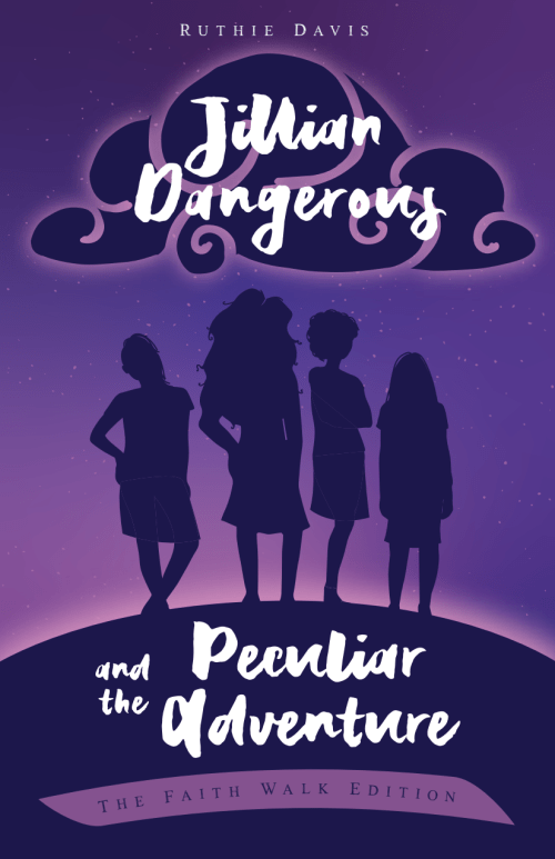
Option A shows the silhouettes of four girls striking a fierce pose.
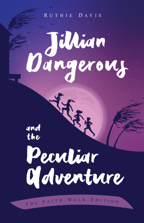
Option B takes a more action-oriented angle with the four girls trekking up a mountain.
Can you guess which one won?
And the winner is…Option B! With a whopping 86 points to Option A’s 14, there’s no question which cover the author should go with.
But why?
Girls love adventure
While some respondents thought Option A’s cover better captured the essence of tween girldom, attitudes and all, most argued that girls of that age absolutely still love a good adventure.
One mother said, “My daughter would like the one of the kids running up the hill much better.”
A father added, “I like the fact that [Option B] shows the girls running and doing activities that are adventurous, which girls need to see more.”
Yet another argued that “the cover for [Option B] is more appealing for that age range. The girls running up the hill look like joyful kids. The girls on cover A seem like teen divas.”
Put simply, girls aged 13 and under are still just that: girls. They love a thrilling adventure as much as any other kid, and Option B’s cover sweeps the potential girl reader into the adventure before she even turns to the first page.
Make sure the cover evokes the setting
Both covers feature a stunning shade of purple. But only one cover hints at the book’s setting in Vietnam, and that’s Option B.
With windblown palm trees and a hill leading to a small building, Option B’s cover has a clear sense of place.
On the other hand, Option A features a nondescript hill. No palm trees, no building, and no bright, beautiful moon.
Respondents thought this cover better evoked the setting of Vietnam, further drawing potential readers into the adventure just by glancing at the cover.
Always make sure your middle-grade novel cover (or any cover for that matter) hints at the sense of place locked within the pages of the book.
Key takeaways
Would an adventure book aimed at tween boys feature a group of boys standing haughtily on a nondescript hill? No. So why should a book for tween girls? Instead of making assumptions based on gender, make your adventure novel cover pop with action.
And remember to weave hints about the setting into the cover illustration, too.
But most importantly of all, make sure to read every single comment in your PickFu poll. Some commenters liked Option B but found that the title font in both covers was hard to read.
Designers, take note!
Do you have a middle-grade novel cover you need to test? Choose an audience of parents for the most relevant results and create a poll on PickFu today.


