While podcasts are designed to please the ear, they have important visual elements as well. Think about it. When you scroll through your phone, it’s probably the podcast cover art, not the description or the title alone, that makes you stop and want to know (and hear) more.
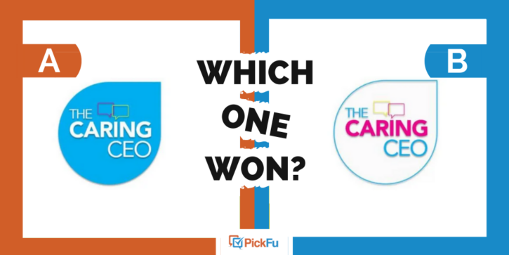
In this PickFu poll, the user asked a targeted audience of 50 podcast listeners — who better to ask? — to choose between two cover art logos for a podcast called “The Caring CEO.”
In both designs, the words The Caring CEO and a pair of speech bubbles appear inside a teardrop shape. The fonts are the same, but the use of colors and shading are markedly different.
Can you guess which one won?
And the winner is…Option B, but only with 27 of 50 votes and a score of 54. This poll could’ve have gone either way. Let’s find out why.
In the background
While respondents liked how the white background in Option B made the words and colors stand out, just as many preferred the bold blue background of Option A for the same reason.
Here’s some of what those in favor of Option A — we’ll call them Team Blue — had to say:
- “I like Option A because the white text stands out best and makes it easy to read.”
- “I prefer higher contrast and fewer colors overall, so my vote goes for Option A, which I consider to be more pleasing to the eye. Option B just has too many colors on a white background, and it looks too busy and unfocused to me.”
- “Like the bolder color in [Option] A. It just looks better overall and is more noticeable to me.”
And here’s a sampling of comments in favor of Option B:
- “I like [Option] B more. The white background of the logo just looks cleaner and more professional.”
- “I like that this option features colors that stand out more, since the hot pink, neon yellow and blue are more prominent against a white background than a blue one.”
- “The different colors with white background looks nice. The blue is overwhelming in [Option] A.”
Easy-to-read text
It wasn’t just the vibrant mix of colors that appealed to respondents who voted for Option B. They also found the text easy to read against the white background.
“I think the color pops more off the white than off the blue. I find the font that is colored to be easiest to read than the white font on the blue in [Option] A,” one person wrote.
Another called Option B design more “artistic, captivating, and riveting.”
All in all, Option B had a professional look that appealed more than Option A’s overwhelmingly blue palette.
Key takeaways for podcast cover art
Podcasting is a booming industry. With so much competition at our fingertips, colorful (but not too colorful) podcast cover art is one way to catch the eye of potential listeners.
In this case, respondents liked the bright blue boldness of Option A, but Option B’s clean design and white background made the title of the podcast pop more.
If you need feedback on your cover art or logo, this article on how to test logos in PickFu poll will help.


