Humor is one of the hardest book genres to write. What an author finds funny, the reader may not. That goes for what’s on a humor book cover.
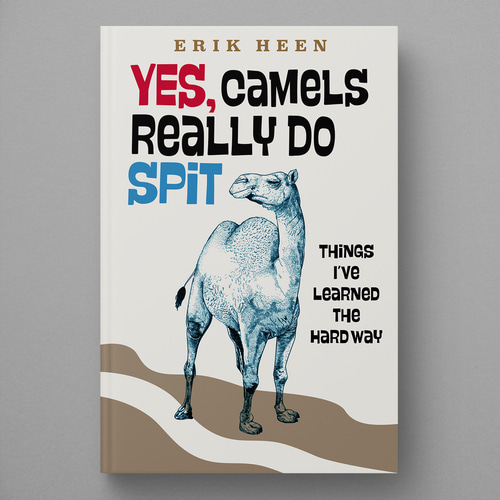
No matter the genre, every author knows how important a book cover is. Which is why this author took to PickFu to test two covers for his humor book, Yes, Camels Really Do Spit: Things I’ve Learned the Hard Way.
And yes, camel spit plays a role in the cover art.
Can you guess which one won?
The author chose a target audience of people who read books in the humor and entertainment category. Option A’s illustration depicts a sly-looking camel and a man with drenched hair. Option B shows a camel drawn more realistically — but with a smug look on its face.
And the winner is…Option A, with a whopping 40 out of 50 votes and a score of 80. Respondents clearly favored the image of a person presumably covered in camel spit.
Let’s see what respondents had to say.
Clever title, catchy image
Option A captured the hilarity of the title, respondents said. “I like that the guy is being spit on,” said one respondent.
Another person called the title “clever” and said the image in Option A “is in line with that title and will get folks to pick up the book immediately — that won’t happen with Option B.”
“The situation as described is a little ridiculous, so the picture on the cover of A is more appropriate. It’s funnier and catches the eye like a cartoon. [Option B] is more realistic, but [Option A] is more fun,” one respondent wrote.
Color scheme that pops
Many respondents found Option B’s color scheme dull. They preferred the charming, cartoonish quality of Option A.
“I chose [Option] A because the colors really make this book cover pop out,” one wrote. “There is too much blank space and lack of color on [Option] B. Plus, the black text also makes for a pretty boring appearance.”
Here’s more of what respondents had to say:
- “Option A is much more visually appealing overall. Moreover, the graphics are also more attention-grabbing and the colors used are more eye-catching.”
- “I like the cartoon nature of the cover for Option A. It really appeals to me and would definitely make me likely to check the book out.”
- “I like both of these covers, but I like Option A better because the artwork reminds me of older-styled cartoons, which are more colorful.”
Option A had it all: a cartoony style, red title font, and a puddle of camel spit.
Key takeaways: humor book cover
A humor book cover should be as provocative and clever as the title — and the two should complement each other.
Humor is an exaggerated and unique way of looking at the world. The color scheme of the book cover should be just as bold.
Do you have two or more book covers to split test? Choose a target audience of readers, as this author did, and create a poll today.


