SPLASH!
I’m sure you’ve been there — that gut-wrenching moment when your phone fell from your hands and into water.
You try the rescue tactics: blowing on it. Sticking it in a bowl of dry rice. Then you wait and hope that your phone somehow survives.
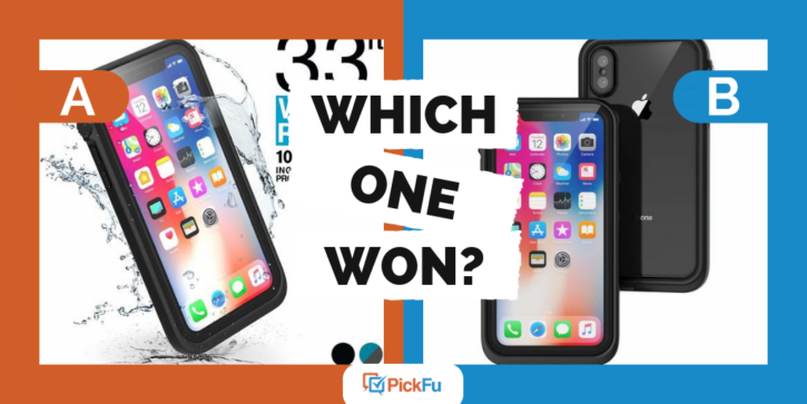
One phone case company targeted this pain point by split testing its ecommerce photos of product with PickFu. The company asked the panel, “Which design is more usable for a first Amazon listing image?“
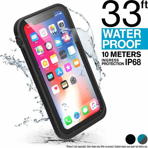
Option A shows a phone at an angle (as if having fallen) with water splashing around it. In large text is information about the kind of protection that the case offers.
Clear Product Description
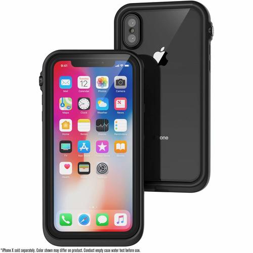
Test panel participants liked that Option A had more text on the photo. It offered more information, as opposed to Option B, which had no text (except for a small disclaimer that a phone wasn’t included with the case).
But it is worth noting that several respondents felt confused by the product description. They liked that they had more information in Option A, but they didn’t know what it meant.
When creating your own eCommerce photo, using large text to highlight features is helpful. But be sure to include language that your target audience understands. You could always test this out by creating a PickFu poll to split test different text options.
Showing the Product In Action
Many respondents who chose Option A also noted that they liked seeing the water effect on the phone. One respondent wrote,
“I chose image A due to its more appealing sense of advertising, the water shows dynamics.”
Another respondent also used the word dynamic to describe Option A and added that “Image A appears to pop out of the photo.”
This dynamic splashing of the water made the benefit of the product clear to the audience.
Many test panel participants also observed that Option B looked like every other cell phone case advertisement. They felt drawn to Option A because it was unique.
Split Test Your Design
Since you can’t fully anticipate how your audience will react to the text and dynamic content of your online ecommerce photos, we recommend that you optimize your product pages. To do this, create a PickFu poll and get results in minutes.


