Can a book about Doberman pinschers, a dog breed with a reputation for being aggressive, give readers the warm fuzzies? It can with the right cover, according to this PickFu poll.
The poll asked 50 dog owners to rank three cover designs for a book titled, The Complete Guide to Doberman Pinschers, from most to least appealing. Options A and C feature a single dog, while Option B shows three Dobermans lying down and looking the camera. All of the images are outdoors.
Can you guess which one won?
And the winner is…Option B, with a score of 62! Option A ranked second with a score of 38, while Option C scored 24. Let’s find out why.
Calm, cool, collected
Respondents liked the happy-looking Doberman in Option A, but not as much as the calm trio in Option B. For a book positioned as the guide for a regal-looking breed with a certain reputation, this image sends the right message, respondents said.
“I love that the dogs are just chilling on the cover of the book,” one person wrote. “Too many people think [Doberman pinschers] are aggressive and this makes them look friendly.”
Meanwhile, the dog in Option C got mixed reactions ranging from “majestic and proud” to “distracted.”
The more dogs, the merrier
Respondents also preferred seeing more than one Doberman on the cover, though one person pointed out the dogs’ reddish brown coat in Option B is “not the most popular color of the breed.”
“If multiple dogs were going to be used, I would like to have seen multiple colors from the breed,” the respondent wrote. (Remember, these are dog owners talking. They know their stuff.)
The background colors of each cover didn’t go unnoticed either. Some liked Option C’s lively green. Others commented on the contrast between the blue sky and white lettering in Option A.
In the end, the autumnal warmth of Option B won out.
Other highlights
- More male than female respondents used the word cute to describe their cover choice
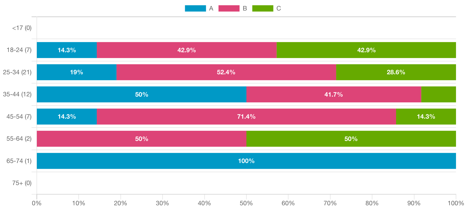
- Among 45-to-54-year-old respondents, Option B was the overwhelming favorite; the group was evenly split between the other options
What they said
“I liked Option B the most because the image is the most eye-catching and cutest.”
“The doberman with his ears up and tongue hanging out is adorable! It gives a good image to the breed to see him playful like that, so [Option] A is my top choice. [Option] B is my second as the three beautiful dobermans together highlight the breed’s social nature. The lovely single doberman is great too, but doesn’t highlight any specific attribute of the dog (playfulness or socialness).“
“I like the overall design [of Option B] with the warm coloring and the three dogs. I find this book to be more inviting than the other ones.”
“[Option] A makes me feel that the picture of the dog is smiling, which feels happy. I like that the cover pulls me in and makes me want to learn more and interact with the dogs.”
“Option C is the most compelling because the dog has the best pose and stance. Option A and B aren’t as convincing or persuasive in my opinion.“
Key takeaways
A book for dog lovers that focuses on one breed — in this case, the often-misunderstood Doberman — needs a cover that’s authoritative but approachable. Option B is that times three.
Want to dive deeper?
See responses by commonly used words:
See responses by gender (there were no non-binary respondents in this poll):
Want to make sure the images for your book cover will resonate with readers? See our guide to DIY product photography.


