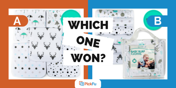
What’s the right balance of text to photo on an Amazon listing? Do users prefer seeing the product packaging on a listing? These were some of the questions addressed in a recent PickFu Poll.
Here’s how this Amazon split test was set up. A company asked a test panel of men and women, ages 18-44, “Which design do you like most and why? Would you leave 5-pack circle on or not? Why?”
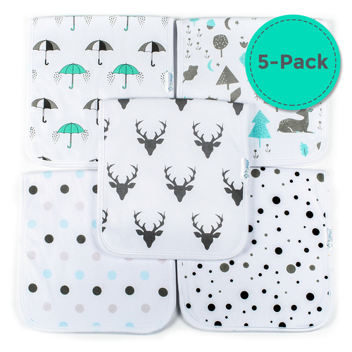
Option A shows five different burp cloths laid out, giving consumers a view of the pattern on each cloth.
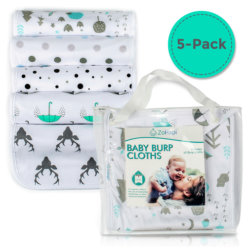
Option B shows each cloth rolled up with a picture of the cloths in the packaging on the side.
On both images is a large teal-colored circle that reads “5-Pack.”
Can you guess which one won?
And the winner is… Option A! Option A received a score of 58, whereas Option B received a score of 42. These results were consistent among the majority of test panel participants, regardless of demographic.
Let’s take a look at what made Option A the winner…
Better View of the Product
Respondents preferred Option A, for the most part, stating that they had a better view of the product. Since the cloths were rolled up in Option B, panelists said that they didn’t get as good of a view of the cloths as they did in Option A. One participant stated, “This one better shows each pattern and helps me visualize all of the cloths.”
Another individual made a similar observation, stating, “[Option] A lets you see the patterns of each burp cloth more clearly.”
Not only did it offer a better view of the pattern, but some noted that it gave a better view of the product itself. One individual stated that the “closer picture of the designs accentuates the softness of the material.”
Focus on Content over Packaging
Panelists also preferred Option A because they felt that the inclusion of the packaging in Option B was unnecessary. One respondent stated, “I don’t really need to know the packaging if it takes up space for displaying the actual design I am buying.” Another stated, “The packaging is just a distraction.”
Of those who said they preferred Option B, they actually liked that they could see the packaging because it gave them a better understanding of what the product was, but most respondents cared much less about the packaging and would prefer a better view of the product.
5-Pack Circle
Not only did the company want to know which photo worked best, but it also wanted feedback on the inclusion of the large “5-pack” text. Most of the respondents liked the text because it gave them a better understanding of what they will get.
One respondent stated, “Even though each picture shows them all it is always nice to have the clarity and assurance it is indeed a 5-pack.” The large text also made some feel like they were getting a good deal.
However, this poll is an example of a double-barreled question. A double-barreled question asks two questions, but only provides for a single answer. Because double-barreled questions skew results, the 5-pack issue would have been better addressed in a standalone poll.
Key Takeaways
When creating your own e-commerce photo, it’s helpful to take into account how visible your actual product is. Consumers want to know what they are buying far more than they want to see a package.
Key text components, like what we saw with “5-pack,” can give people helpful information to know what they are getting when they purchase the product.
We also recommend that you split test different options on an audience that matches your customer profile. This can help you identify which images might produce the best sales. For instance, this poll may have gotten more insightful results had it polled respondents based on their parental status rather than their age. You can always split test your images and text by creating your own PickFu poll and receive responses within minutes.
