Is there a secret to creating a book cover that attracts both well-worn travelers and those who love the occasional adventure?
This Ranked poll asked 50 frequent and occasional travelers to choose the cover they found most appealing for a book about finding greater meaning in travel. The title of the book is Hidden Travel: The Secret to Extraordinary Trips.
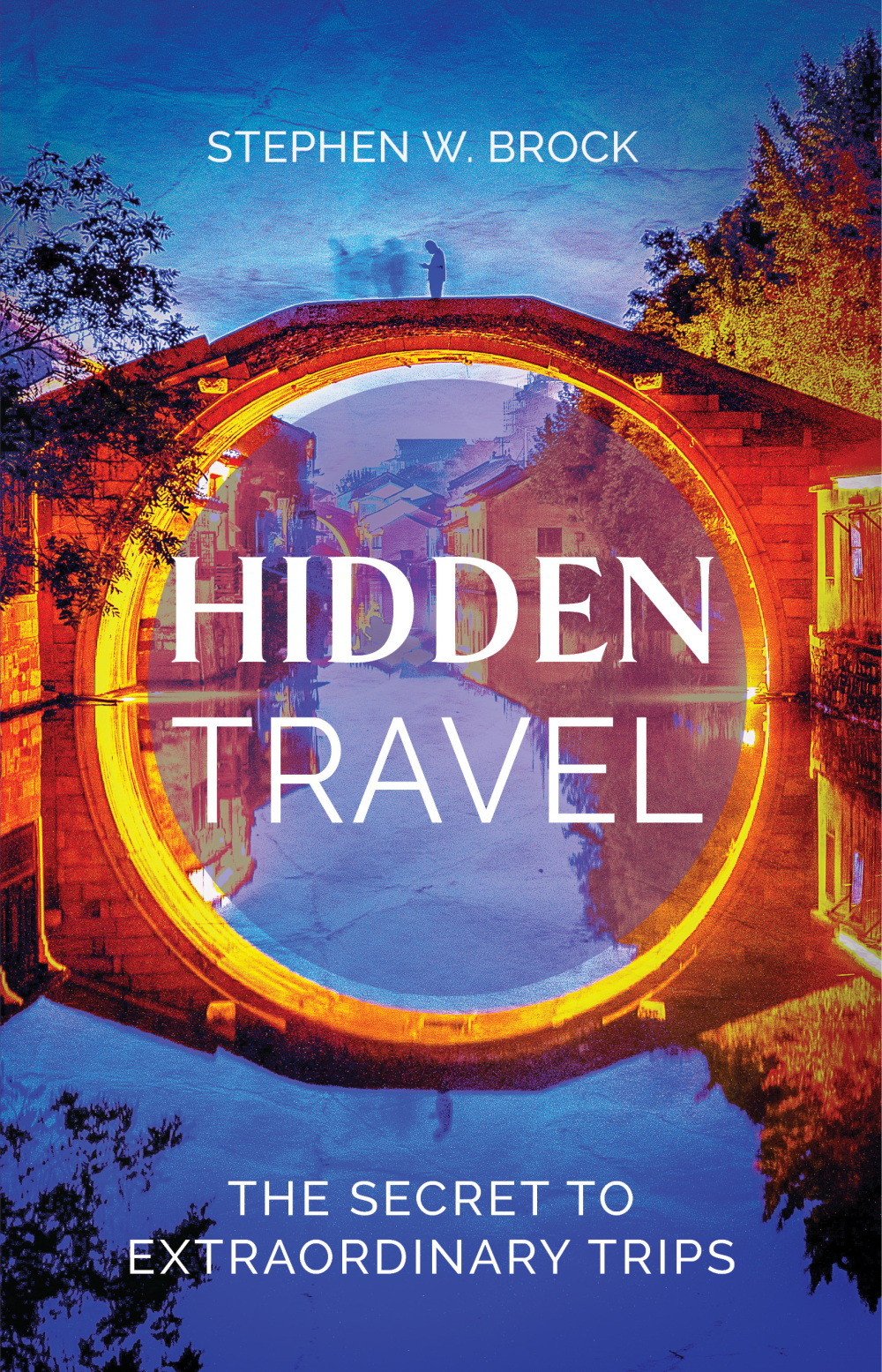
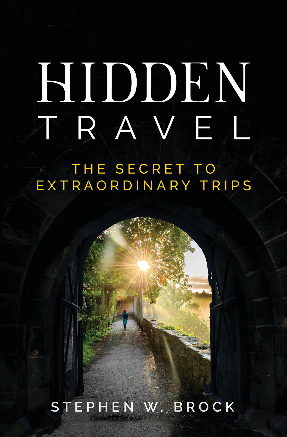
Options A and D are scene-based covers. Options B and C feature a black background and a tunnel leading to adventure.
Can you guess which one won?
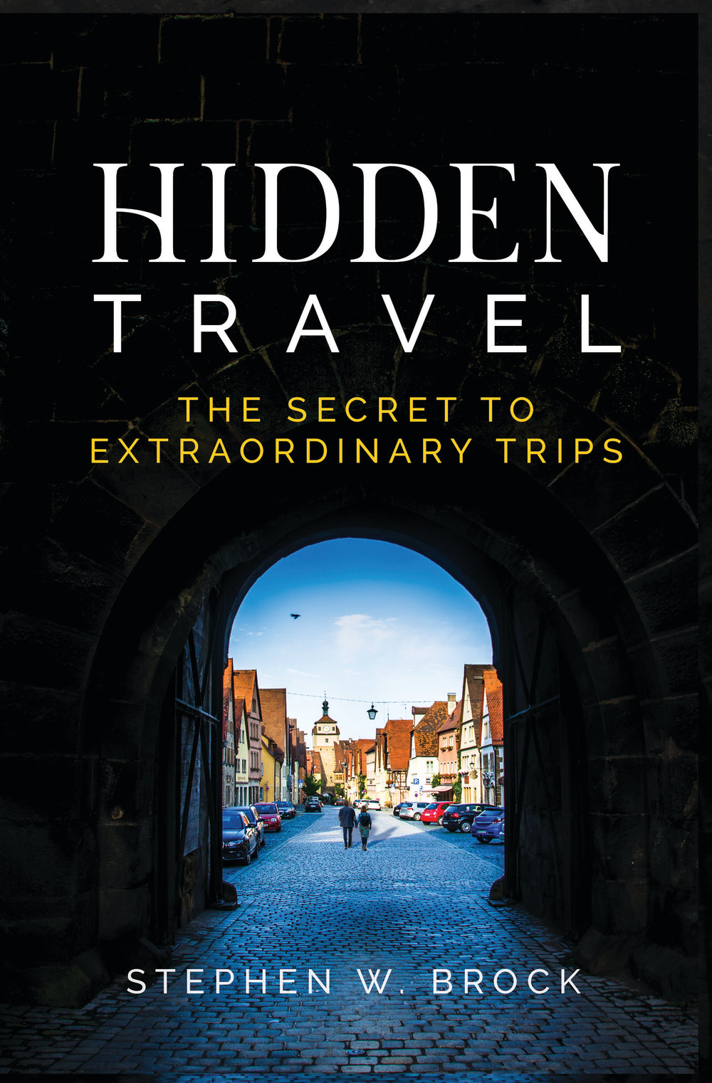
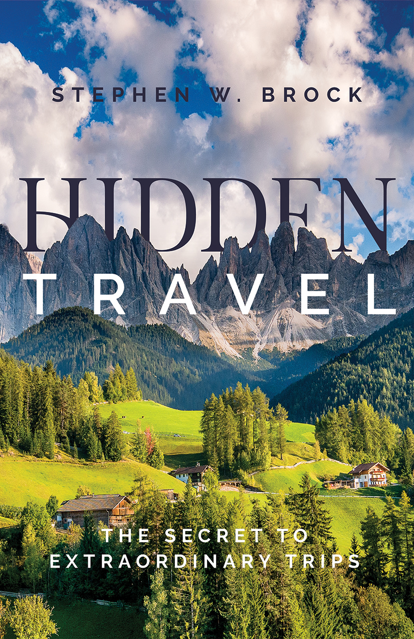
And the winner is…Option C, but just barely, with a score of 52. Option D was close behind with 48, followed by Option A (26) and Option B (16). Let’s dig into the results.
Tunnel vision
The view from the tunnel in Options B and C got high marks from respondents, who said it fits the title of the book.
“For a book called Hidden Travel, I like [Options B and C] since it looks like an entryway to a secret place,” one person said.
But why the score gap between these two similar covers? The beckoning sunlight in Option C made the difference.
“All of them are very good but Option C has a
Still, respondents had a lot of good things to say about the runner-up Option D, from its lush scenery to the clever placement of the word Hidden, tucked behind the mountains.
And while none of the panel explicitly said they preferred the green color scheme of Options C and D over the blues in Options A and B, their votes said otherwise.
Other highlights
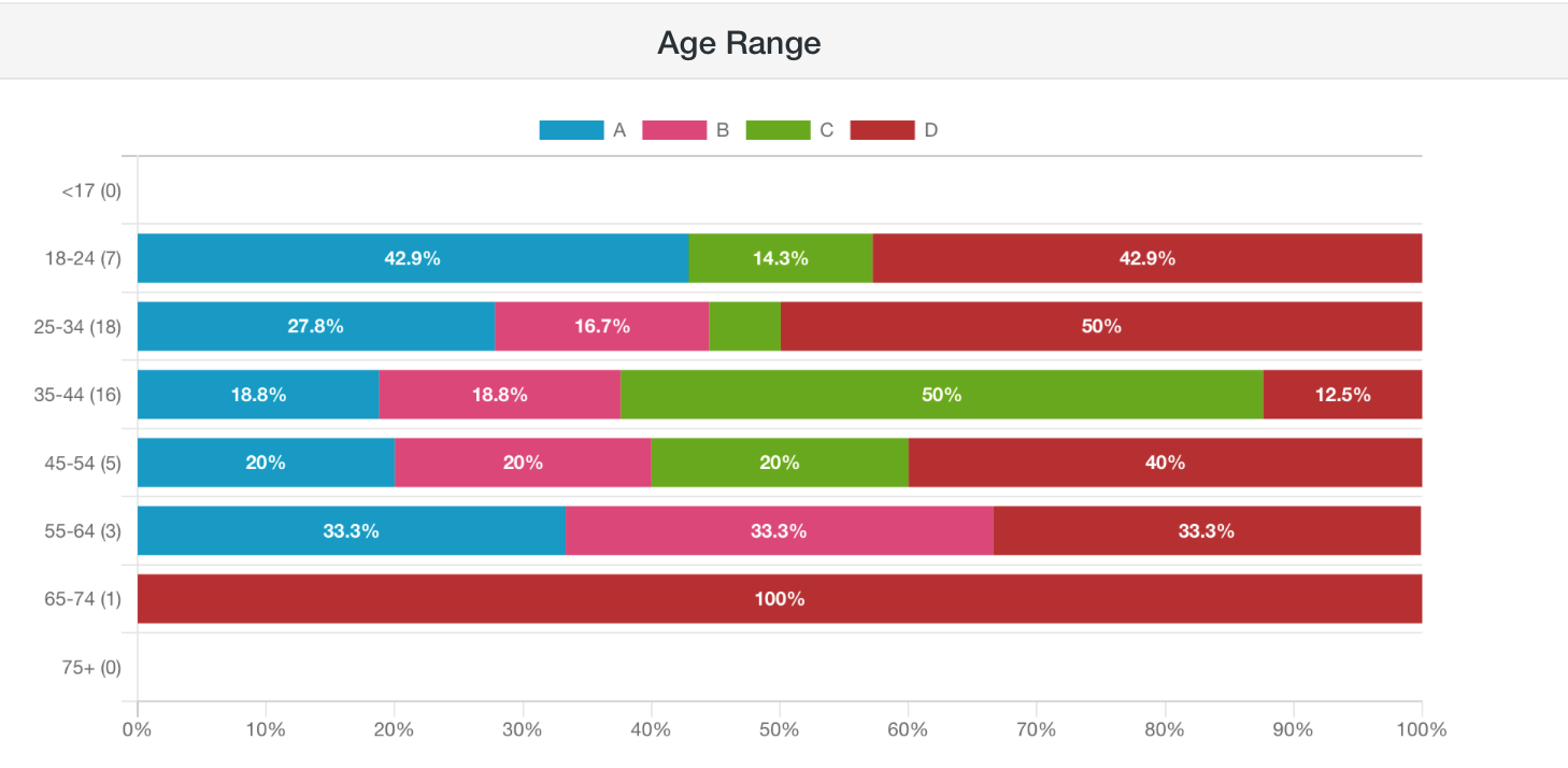
- Respondents between ages 18-24 and 25-34 liked Option C the least, giving it 14.3% and less than 1% of the vote, respectively — worth noting if the author wants to attract college-aged and young adult travelers
- Half of 25-to-34-year-olds favored Option D
- Those in the 55-64 age group were evenly split between Options A, B, and D; none voted for Option C
What they said
“[Option D] has a lot of great imagery. It has a little of everything: roads, grass, beautiful skies, and mountains. It has everything for travel.”
“None are bad but I think [Option] C and [Option] B have a more appealing look because the text stands out the most over the backgrounds. I worry [Option] A and [Option] D might have a bit too much going on that it could be off-putting.”
“I really like [Option] C and [Option] B because I think they really emphasize finding something hidden, unique, and special about traveling, [Option] C slightly more than [Option] B. While [Option] A and [Option] D are both attractive, I don’t think the images quite fit the book title as well as [Option] C and [Option] B do.”
“I liked [Option] A the best since the cover looks enchanting and grabs my interest right away. [Option] A reminds me of a portal being opened which relates to the title of the book.”
“The expanse of land in Option D makes it look like a wider land of opportunities.”
Key takeaways
For a book about hidden travel, a cover image that hints at adventure, as Option C does, makes sense.
But as the feedback in this poll shows, travel-loving readers of all ages also appreciate nature scenes: expansive mountains, winding roads, blue skies.
In a twist, it appears the author took this to heart — choosing Option D, not C, as the final cover for the book.
Want to dive deeper?
Responses by commonly used words:
Responses filtered by gender (there were no non-binary respondents in this poll):
Is your book cover targeting the right audience? Read our ultimate guide to split testing.