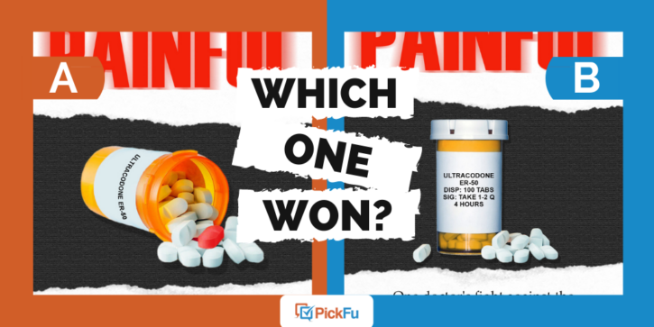
When you’ve narrowed a book cover down to two nearly identical designs, how do you choose the final version? In the case of this author’s PickFu poll, small details made all the difference.
For a book titled Painful: One doctor’s fight against the Opioid Epidemic and Big Pharma, the author asked an audience of mystery and crime readers the question, “Which book cover is more appealing?”
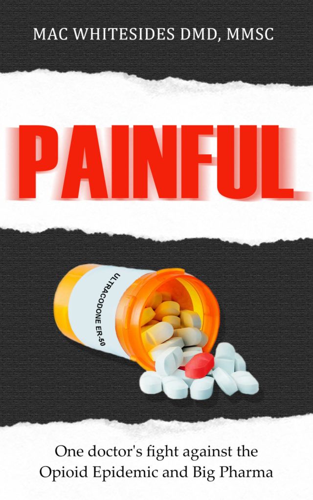
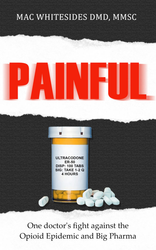
Both covers feature an image of a pill bottle. In Option A, the bottle is on its side and the pills are spilling out. In Option B, the bottle is upright, with the pills gathered neatly around.
Can you guess which one won?
And the winner is…Option A. With 41 out of 50 votes, readers clearly favored the spilled pill bottle. Let’s find out why.
Powerful metaphor
For many respondents, the fallen pill bottle was an apt metaphor for the drug epidemic.
“The cover that depicts the prescription bottle spilled over and spewing out these pills better conveys just how bad the epidemic is,” wrote one respondent.
“The added effect of [the pills] being poured out makes the difference,” said another.
Others were curious about the one brightly colored pill amid the white ones.
“The picture with the pills pouring out of the bottle as if out of control with the central bright orange pill really appeals to me for this book,” wrote one respondent. “It really shows how out of control things are.”
Others agreed:
- “The tipped image gives a visual shorthand for the ‘epidemic.’ ”
- “I really like the symbolism of the fallen bottle and spilled pills.”
- “Option A is more appealing because the picture is more emotional and makes me feel more convinced to buy the book.”
Trim the text
In Option A, there’s less text on the label, which respondents preferred.
“I prefer the less detailed drug label [on Option A] because it’s succinct and better gets the point across instead of the overly or unnecessarily detailed Rx label on [Option B],” said one respondent.
Another person wrote, “Aside from the bad photoshopping, it’s also better to have less text on the pill bottle — not so much competition for the title and tagline. The upright option also has way too much info on the label — no need to have the dispensing instructions included.”
Still, respondents saw opportunities to improve Option A. The color of the bottle and pills could use “dulling and/or shadow,” said one. Another pointed out that the text on the bottle “needs to be fixed to match the curve more correctly.”
Any text on a book cover that isn’t part of the title or subtitle is going to compete with both. It’s best to whittle that text down as much as possible.
Key takeaways
The smallest design elements can add or detract from the emotion that a book cover conveys. In this case, respondents found the toppled prescription bottle more dramatic.
No matter what type of book you’re working on, take a moment to look closely at the cover. Then, consider whether there are any changes you can make.
If, like this author, you’re deciding between book covers, run a PickFu split test on your target audience. You’ll get written feedback back quickly to help you decide on a design and tweak it until it’s perfect — and powerful.
