Viewers can draw strong conclusions from the tiny app icons in an app store. In that split second that they view the icon, they determine not only what type of app it is, but if they want to download it.
We saw this play out recently with a PickFu poll.
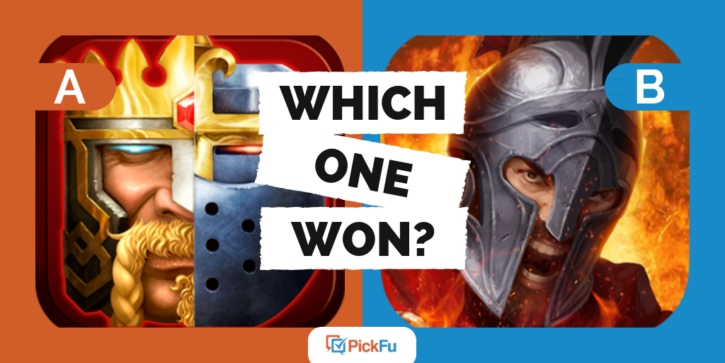
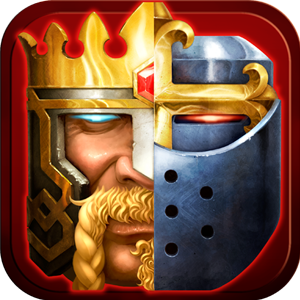
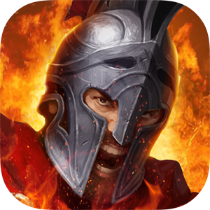
A company tested out two app icons and asked the panel, “Which icon is more appealing to you for a mobile strategy war game? Why?”
Option A showed a man with glowing eyes. The left half of his face is the face of a king and the right side of his face is a knight.
Option B displayed a knight looking intensely and shouting, with flames surrounding him.
Can you guess which one won?
Out of 100 responses, 54 preferred Option B. It is worth noting, however, that those ages 65 and up preferred Option B.
A clear game type
The majority of the test panel preferred Option B because it felt more clear on what type of game it was. When looking at Option A, users often used the word confusing, indicating that they had no idea what type of game it could be. One thought it was a chess game, another speculated that it was a puzzle, and another said cards.
One respondent didn’t even try to guess, but said, “A is way too disjointed a picture so it doesn’t look very good. I’m not even sure what it’s supposed to be.”
When looking at Option B, most of the panel concluded that it was a war game. One respondent wrote:
“The warrior depicted in Icon B feels more appropriate to the type of game.”
The responses to this survey hint at the expectations people have of different app icons.
Realistic vs. unrealistic design
One of the reasons why respondents felt Option B was more appropriate for a war game is because of its more realistic design.
When describing the icon for Option A, respondents used words such as cheesy, fake, silly, weird, cartoonish.
But when describing the icon for Option B, they used words such as fierce, exciting, dynamic, intense.
One participant observed, “Option B is more appealing because of how realistic the icon looks. It looks like a real man screaming versus the very two-dimensional look of option A.”
Respondents also felt that Option B was a better depiction of a war game because it showed more action. For example, one person said, “Option B is more intense. He is a warrior going into battle. That mirrors my role in the game, and I like that.”
Designing your own game app icon
When designing your own game app icon, it’s important to consider the genre that your game is in. The app icon for a puzzle game differs from an icon for a war game. Users have certain expectations for what each icon style looks like. As they are surfing through an app store, they might gloss over your icon if it doesn’t depict the game type they are looking for.
Once you’ve created some icon designs that you feel
Free download: PickFu/Utopia Analytics report on
toxic behavior in online gaming
