Have you heard the quip about how no one can take anything written in Comic Sans seriously?
While Comic Sans memes and manifestos are generally in good fun, they highlight an important point: font sets the tone for, well, everything.
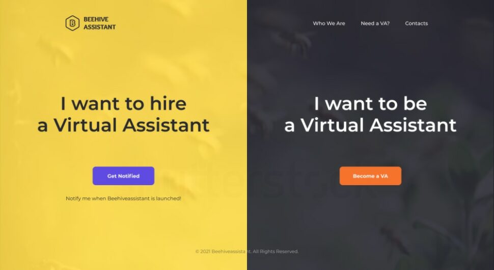
That’s what one PickFu user discovered after testing four web page designs for a virtual assistant service with an audience of 50 small business owners and side hustlers.
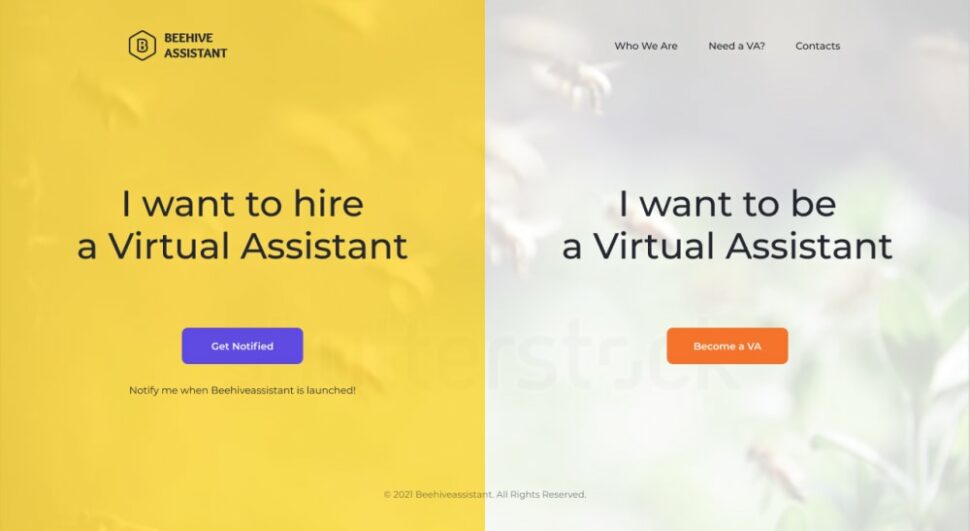
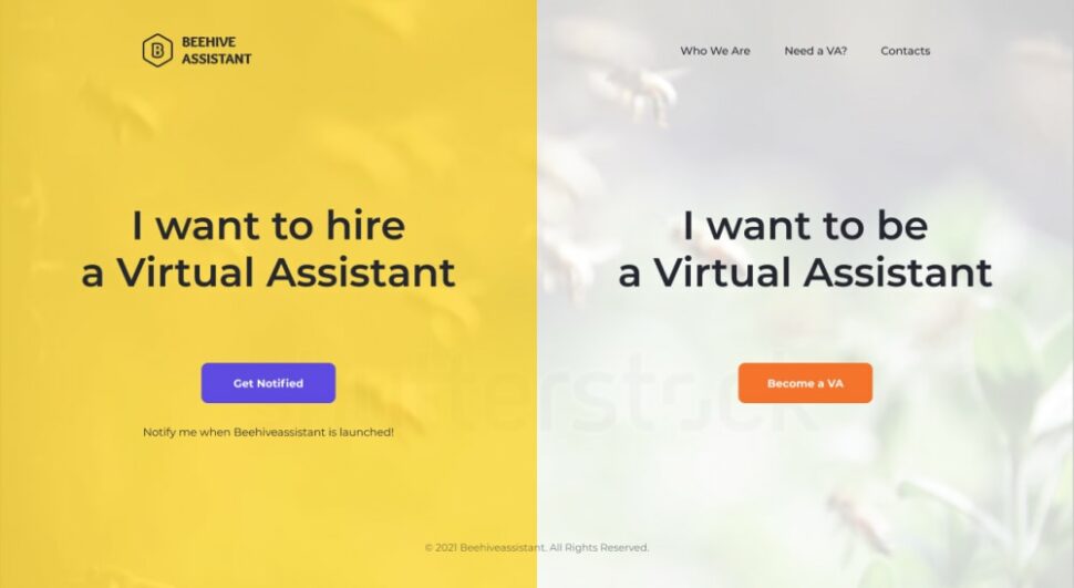
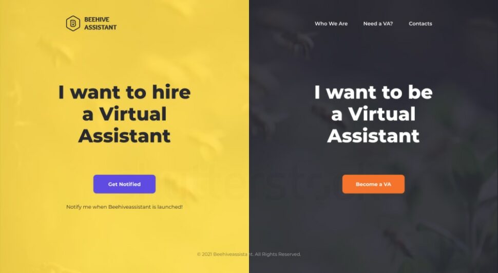
Options A and B are yellow and white designs, with a semi-bold font for Option B. Options C and D swap the white for black, with bold and semi-bold font, respectively.
Can you guess which one won?
And the winner of this Ranked poll is…Option C, with a score of 54! Options A and D both scored 18, while Option B scored 10.
Let’s find out why respondents preferred Option C.
Bolder is better
The yellow and black design of Options C and D is a nod to the name of the business, Beehive Assistant. Only two respondents noted the bumblebee reference — and neither ranked Option C or D first.
The bigger reason why respondents voted for these two options is that they liked how the black font stands out again the yellow. The color contrast does a good job of showing the two options available to visitors of this website, they said.
What gave Option C the edge? Credit the extra bold font, which makes the words pop off the page.
“I like the font on Option C best and with the background, it stands out well, like the old ’80s ads,” one person wrote.
There was one other detail that made a difference. In Option C, the main text is broken into three lines instead of two, again making clear to the viewer that they have two options on the site: hire a virtual assistant or become one.
One respondent summed it up this way: “Option C is the best by a long shot. The rest are hard for my Grandma to read and it needs to grasp the user’s attention.”
Other highlights
- Male respondents overwhelmingly preferred Option C. Among female respondents, 43.8% liked Option C, 31% liked Option D, and the rest were split between the two other options.
- The majority of respondents ages 45 and up and 25 and younger voted for Option C. The votes were more dispersed among the other age groups.
What they said
“I like the black and yellow options, preferably the bolder font. Same with the white. The font should be bold. It’s easier to read.” — Female respondent, age 45-54
“I think the black and yellow designs would be best. The colors help to see the difference in where to sign up.” — Female respondent, age 25-34
“Should I be interested in a virtual assistant, I would be drawn to the darker background rather than the lighter versions, which are less visible overall.” — Male respondent, age 25-34
“I like the color scheme in C and D better. I feel like it is more impactful and clear. I also think it’s more aesthetic to have fewer words per line, even if it means breaking up the phrase ‘Virtual Assistant.’ — Male respondent, age 25-34
Key takeaways
What do consumers like to see on a website landing page? Text that pops in a professional, easy-to-read, bold font, according to the feedback from this poll. Even better if the colors match the brand’s name and logo.
This user was smart to test four options for their web page, each with subtle yet distinct differences in color and font. To learn more about how to split test effectively, check out our ultimate guide to split testing.
Want to dive deeper?
Results by commonly used words:
Results by gender identity (there were no non-binary respondents in this poll):
