It takes only 50 milliseconds — .05 seconds — for visitors to decide whether or not they like your website. That’s pretty much a split-second judgment call, so you better make sure your website design is flawless.
That was the goal of this PickFu Ranked poll testing five website layouts for Keto Vitals, an electrolyte supplement company. The brand asked 50 people between the ages of 18 and 54 which design they thought was “most visually appealing in terms of layout and the branding style.”
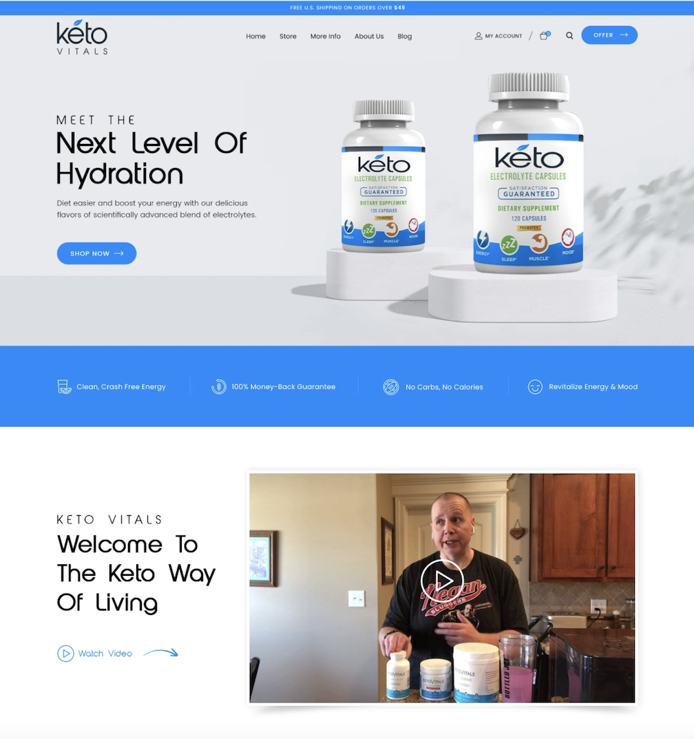
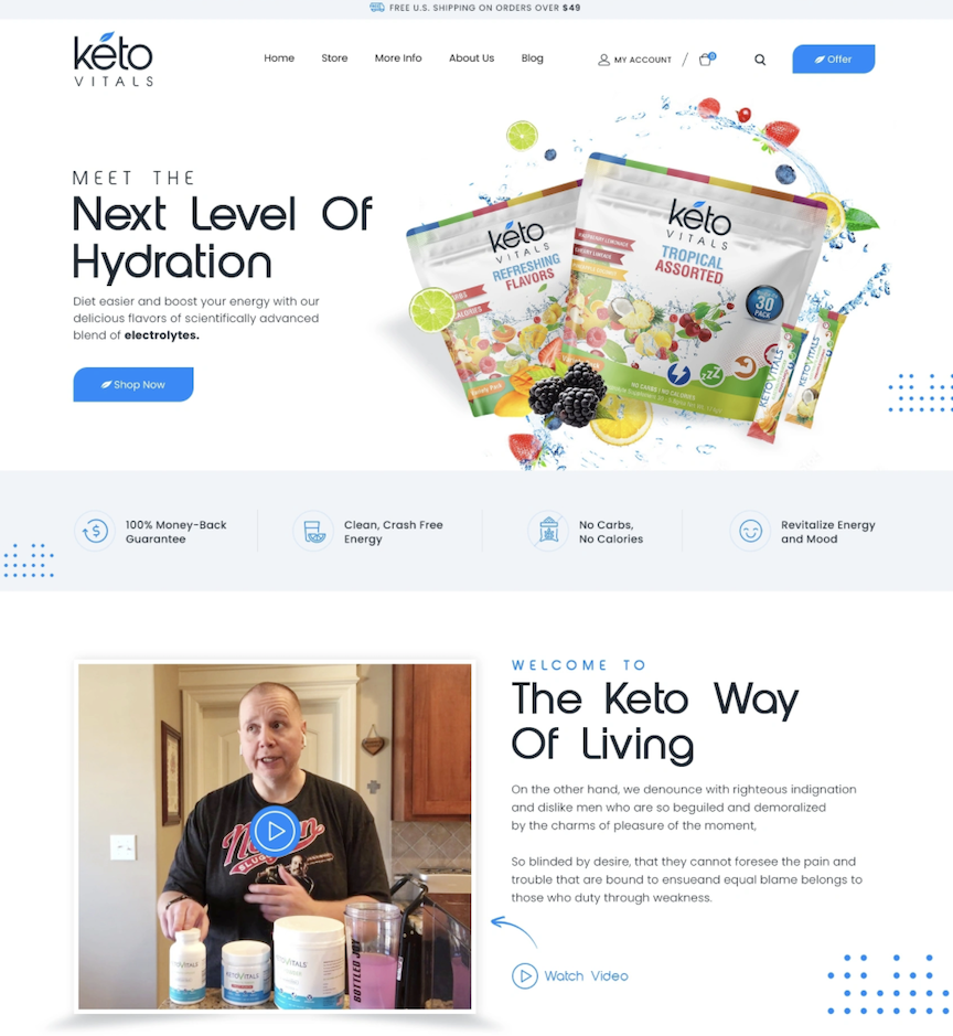
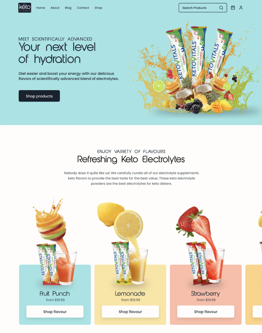
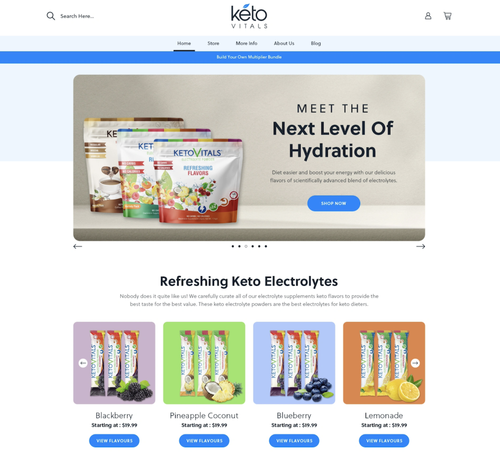
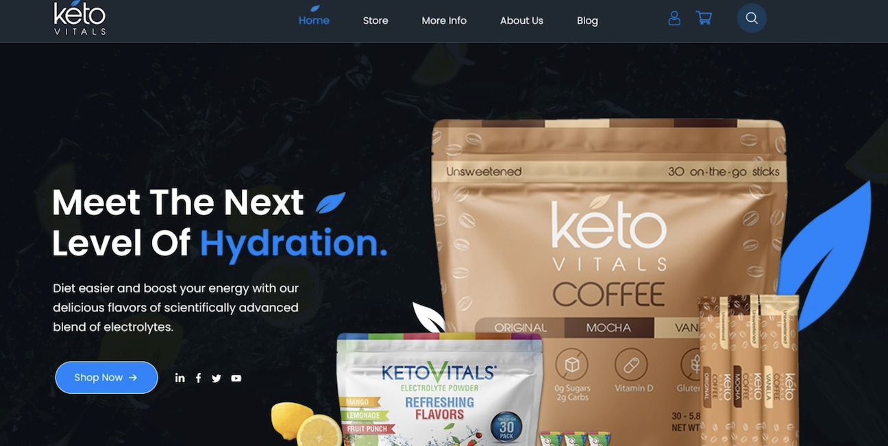
There’s a lot going on in each of the five options, from the hero images and graphics to the flow of information on the page. Options A, B, C, and E use the same shade of electric blue as an accent color, while Option D mixes it up with light orange and aqua hues.
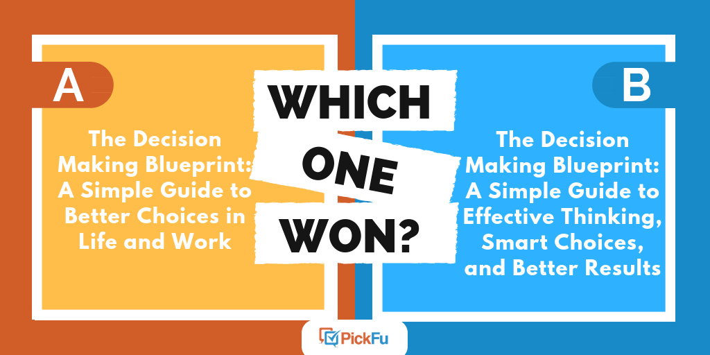
Can you guess which one won?
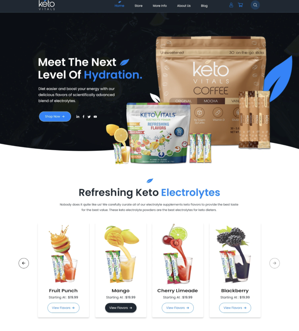
And the winner is…Option D with a score of 56, more than double that of Option C, which came in second.
It was a decisive victory for the most colorful option. What worked about Option B’s design, and why did people like it? Let’s take a look.
Pass with flying colors
Each option uses differently tinted backgrounds to separate sections as the user scrolls down. This is an old web designer trick to improve the visual flow and keep the user’s attention.
Option D takes it to the next level with its pastel color scheme.
“I really like [Option] D, the info all flows really well with the colors and designs,” said one respondent. “I think it looks the best. [Option] A is very boring and bland and it isn’t that interesting to look at. I like having a little bit more images to go on.”
In fact, most respondents who ranked Option D first mentioned the colors. They’re eye-catching and “make you think of light, sweet, fruity flavors,” one person wrote. Others said the colors made the product seem more attractive.
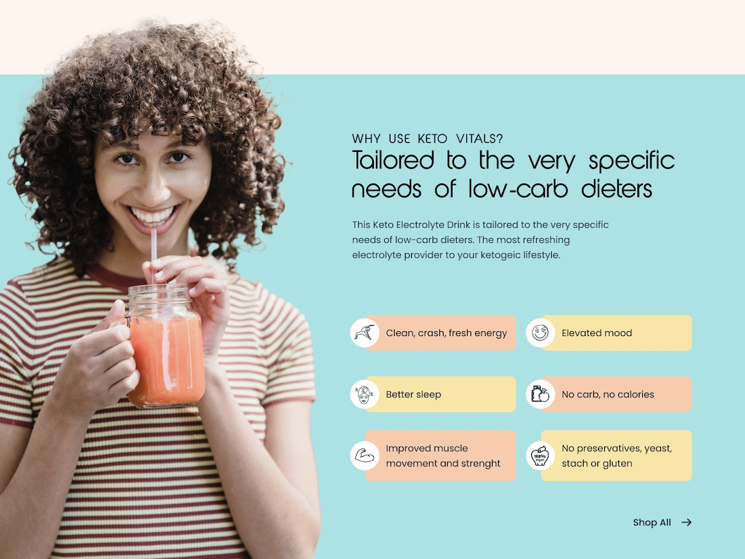
Several people also commented favorably on the model in Option D.
“I really like the pictures of the female on the cover as well, which gives the product some personality to it,” one person wrote.
What about Option C, which came in second, also by a wide margin? Respondents liked the jet-black background at the top of the site, which adds contrast to the page and, as one person put it, looks “more professional.”
Other highlights
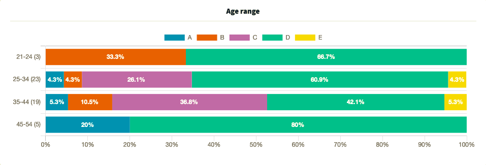
- Option D was the clear favorite among 21-to-34-year olds and those in the 45-54 age group, but votes were dispersed among the five options in the 35-44 age group
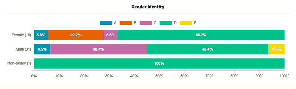
- Male respondents divided their support between Option D (48.4%), Option C (38.7%) and Options A and E (6.5% each), while female respondents and the lone non-binary respondent favored Option D
Try PickFu for free and get feedback on your website design.
What respondents said
“I like the versions with some more color in them, and especially the darker ones. I think most people prefer darker pages these days, and most things run in dark mode as it is.”
“They are all good designs. Option D is my favorite though. The first thing I see when looking at Option D is the 100% money back guarantee and the free hoodie that I can get if I spend $100. I feel like that would really encourage people to shop. Option D also seems to be less cluttered with small things. I like Options C and E as well, though not as much. I do not care for the video preview in Options A and B, which is more a personal preference.”
“I like [Option] D because the person in that layout seems nice and trustworthy.”
“I like [Option] C because of the black background at the top, [Options] C and D because of the drink selection in the page. [Option] A is last because it looks the most medicinal.”
“I think the way that people scroll, nowadays, being able to engage them right off the bat is the most important thing and to then make them -want- to scroll with purpose. So I think [Options] D and A capture this the best; they give you a lot of content to focus on, and to really carry the viewer down the page.”
Key takeaway
Comparing the options side by side, it’s clear that Option D makes the best use of color, an important aspect of any website design.
Don’t underestimate the color scheme or any of the other details of your web design. Layout, graphics, and even the model in your photography can have a profound impact on how visitors interpret your site and brand as a whole. Use these subtleties to design a site that brings out the best in your product.
Want to dive deeper?
Results by commonly used words:
Results by gender identity:
Results by age range:
Results by education level:
Results by income range:
Need help choosing the logo for your website?
Read our guide to testing logo designs.