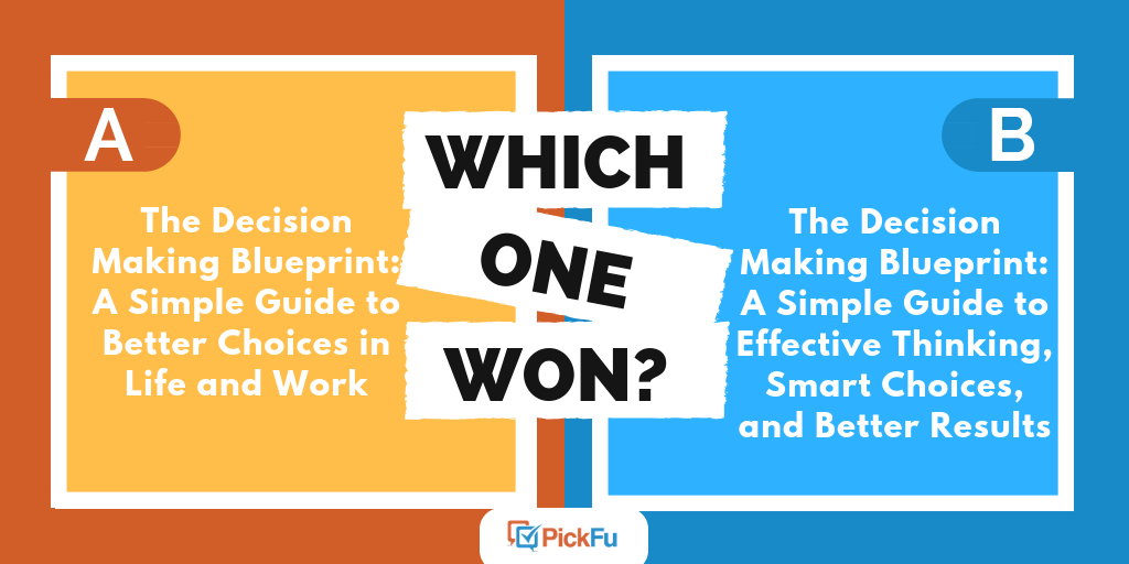
You can use split testing to optimize any part of your business: your website design, logo, tagline — you name it. This PickFu poll is a good reminder of just how wide that range can be.
The public relations firm Otter PR needed to choose a backdrop for its booth at a B2B conference, so it ran a poll asking 50 small-business owners which of two designs they preferred.
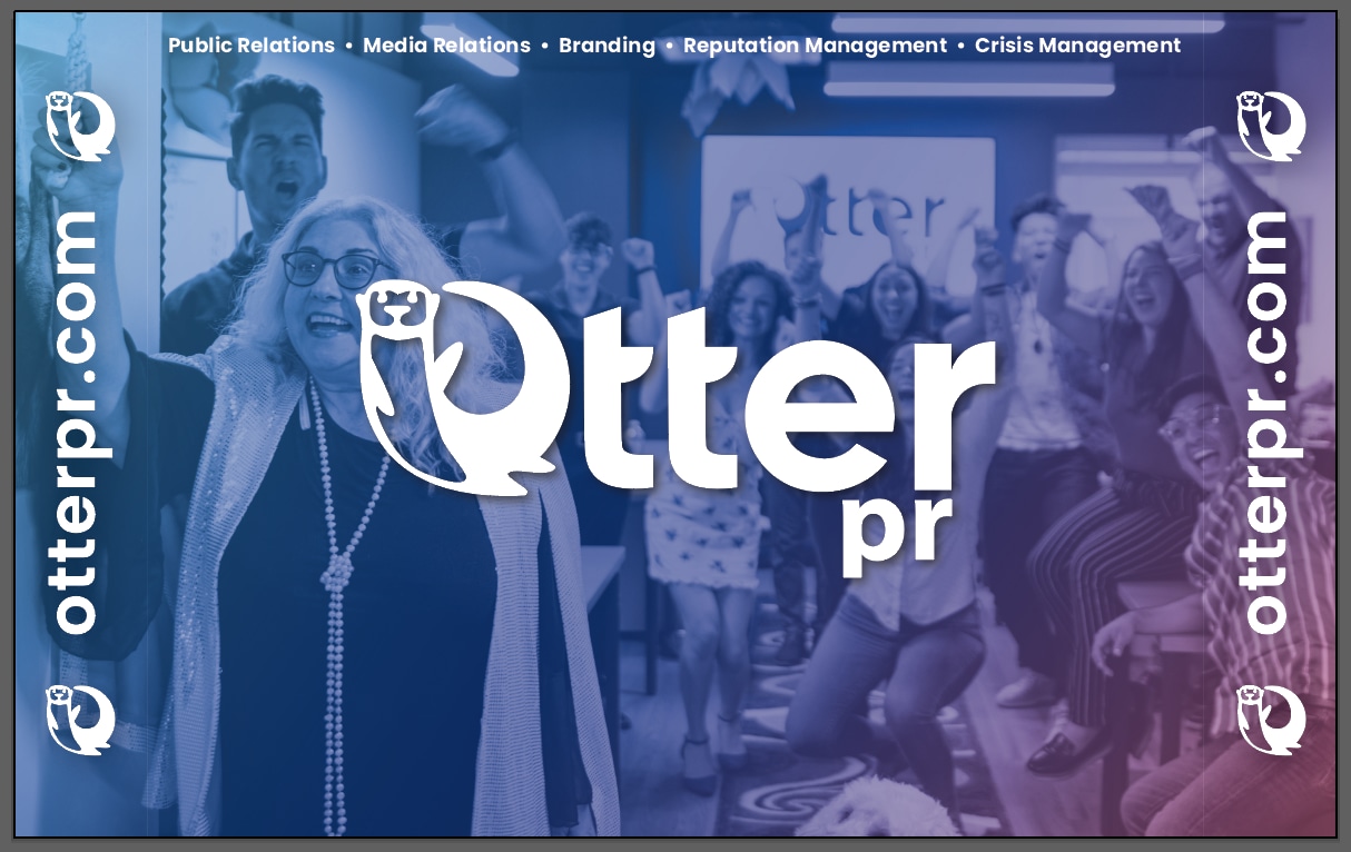
Option A shows a background image of people cheering and smiling, with the Otter PR name and logo front and center. Option B is more conventional. It repeats the logo in a wallpaper pattern on a blue background.
The results came back in just 31 minutes. Can you guess which one won?

The winner, with nearly three-quarters of the votes, was Option A! It scored 72 to Option B’s 28.
Why did Option A resonate with small-business owners? Let’s dive into what they said.
You know it when you see it
Respondents cited a wide range of reasons for liking Option A. Seeing real people‘s smiling faces in the image makes the company seem friendlier, some said.
“I like [Option A] because it feels more personal… and gives a sense of togetherness,” said one respondent. “I like this one because it shows the company as a team having a great time,” another wrote.
Others focused on more practical matters, such as how the larger logo in Option A does a better job of grabbing your attention than Option B.
“This promotes your business name front and direct — I think this is more appealing to show at a show,” a respondent said.
Still other respondents said Option A looks “less cluttered” than Option B. And some voted for Option A simply because they disliked Option B. Four respondents used the words too busy to describe Option B.
So what did fans of Option B have to say? Although their reasons were just as scattered, a few commented that Option B was “less distracting” and that Option A was “tacky and out of place.”
Interestingly, respondents on both sides said their pick was “more professional” than the other.
Test your designs with PickFu — try it for free.
Other highlights
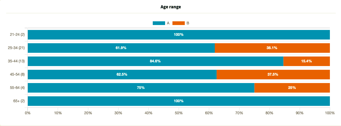
- Respondents were generally in agreement about Option A, regardless of age
- Among the few respondents in the 21-24 and 65+ age groups, none voted for Option B
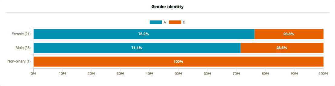
- Female and male respondents voted similiarly in favor of Option A, while the lone non-binary respondent voted for Option B
What they said
“Option B is way too busy in terms of design. Someone could also have a hard time making out the words due to reduction issues. Plus, Option A is best since it is clear and includes the components and web address.”
“I choose Option A for the background for a B2B business conference because the large fonts draw attention right away and the background will keep attention trying to figure out what is going on in the background.”
“[Option] B is gross and almost makes me dizzy. [Option] A is easier to look at.”
“[Option A] looks more inviting than the other one. [Option B] is too plain and looks like one of those fake websites on Facebook. It would get more people to look at it if it was more personal in a warming, welcoming way.”
“I like [Option] B more as the repetition in the name’s logo could make people remember it better. I also just prefer it overall.”
Key takeaway
Split-testing data alone won’t tell you why people like or dislike something, but the qualitative results of a PickFu poll like this will.
Respondents preferred Option A for a variety of reasons, from the size of the font to the image of real people. Even so, some respondents had suggestions for improving it.
It just goes to show the importance of testing your mockup or design with a target audience — and taking every piece of feedback seriously — before presenting it to clients or unveiling it on a trade show floor.
Looking to outsource your graphic design projects? Read our guide to the freelancing platform 99designs to find out if it’s right for you.
Want to dive deeper?
Results by commonly used words:
Responses by age range:
Responses by gender identity:
Try PickFu for free and get feedback on your trade show collateral.