If you’re an entrepreneur, you know the importance of a strong logo. It sticks in your target audience’s mind, sets you apart from the competition, and encourages brand loyalty. It tells the world who you are. But what if you mess it up? What are the top logo mistakes to watch out for?
In this article, we’ll look at logos that flopped and where they went wrong. We’ll also talk about how to avoid making logo design mistakes.
Let’s lo-go!
What makes a logo bad in the first place?
Hands down, the worst logos are the ones that make unintended sexual innuendos. There are scores of examples out there, some of them downright horrifying.
When you’re creating a logo, the top logo mistake to avoid is including anything unintentionally sexual or harmful to a group of people.
If it’s offensive, people will notice.
Take a look at the London 2012 Olympics logo:
Some people found this logo confusing. It’s supposed to spell out 2012, but you have to squint to see the numbers.
According to this 2007 ABC News article — the year the logo was revealed — “[Some] complained that the ‘abstract’ attempt was too much like a ‘1980s hangover.’ “
Even worse: other people saw a swastika, which is definitely not what the International Olympic Committee was going for. Still others saw two characters from the animated TV series “The Simpsons” engaging in a sexual act. (It’s a stretch, but still, not one to ignore.)
The logo came with an $800,000 price tag, people hated it, and they were loud about it. Which brings us to this key point: if your target audience thinks your logo is bad, then it probably is.
We’ll talk more about how to find out what your target audience thinks. But first, let’s look at a few more examples of bad logos and what you can learn from them.
What are some famous logo mistakes?
Here are three more funny logo mistakes or rather, not-so-funny mistakes.
Gapgate
From 1986 to 2010, the blue square with elegant white letters was synonymous with Gap, the clothing retailer. But after a few years of low sales due to the 2008 recession, the brand decided to redo its logo.
On October 6, 2010, Gap revealed this drab new logo to an immediate uproar.
“Within just 24 hours, one online blog had generated 2,000 negative comments, a protesting Twitter account (@GapLogo) gathered 5,000 followers, and a ‘Make your own Gap logo’ site went viral, collating almost 14,000 parody logo redesigns,” The Guardian reported at the time.
Within days, the company reverted to its old logo. In 2016, it updated the logo once again, but this time it kept the elegant serif font lettering that’s familiar to Gap lovers around the world.
This story illustrates the power of a recognizable, longstanding logo. If it’s a good one, it becomes one with your brand. If you want to change it, be careful.
Office of Government Commerce
This logo looks fine…until you turn it vertically. And then it’s not so fine after all.
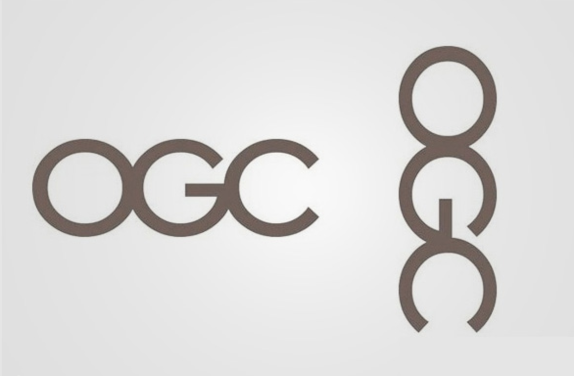
Avoid making a logo mistake like this one by looking at your logo from all possible angles.
Arlington Pediatric Center
Here’s another top logo mistake.
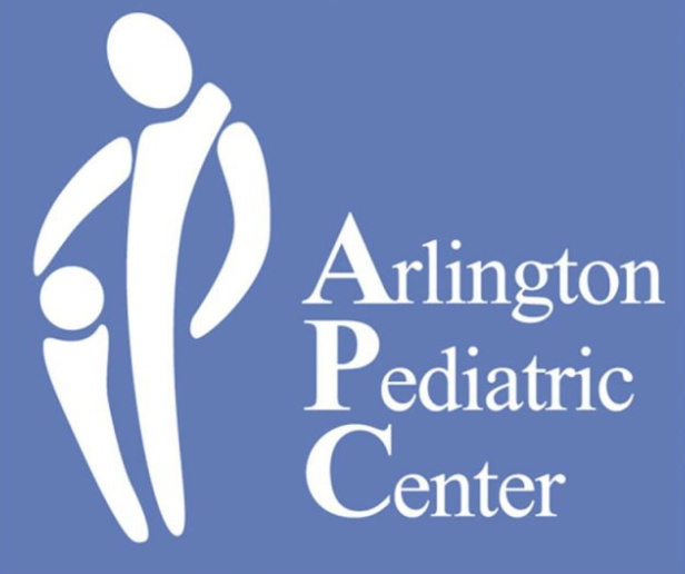
There’s really nothing to say about this one, other than that it should never have made it past the owners or doctors or anyone with a sound mind at this pediatric center.
And yet it did, and it’s now one of the most infamous logos, ever.
Try PickFu for free and get feedback on your logo.
6 top logo design mistakes to avoid
Innuendos aside, here are six mistakes to avoid making when designing your logo.
1. Images that don’t match the brand
Have you ever looked at a logo and spent several minutes trying to figure out the connection between the image and the brand itself? This is a common mistake, especially among logos made for free online.
Here’s a logo for a pretend candy shop that we drafted on a free site.
It’s not bad per se, but it doesn’t have much to do with candy. It could be cuter and more attractive to potential customers.
When you’re creating a logo, make sure the images you use are relevant to your brand.
2. An overly complicated design
If a logo is so detailed that it’s hard to tell what it says or depicts, it’s time to simplify it. An overly complicated logo can turn potential customers away.
Believe it or not, the image below is Apple’s original logo. Designed in the 1970s by Apple co-founder Ronald Wayne, this logo looks nothing like the internationally recognized bitten apple we know today.
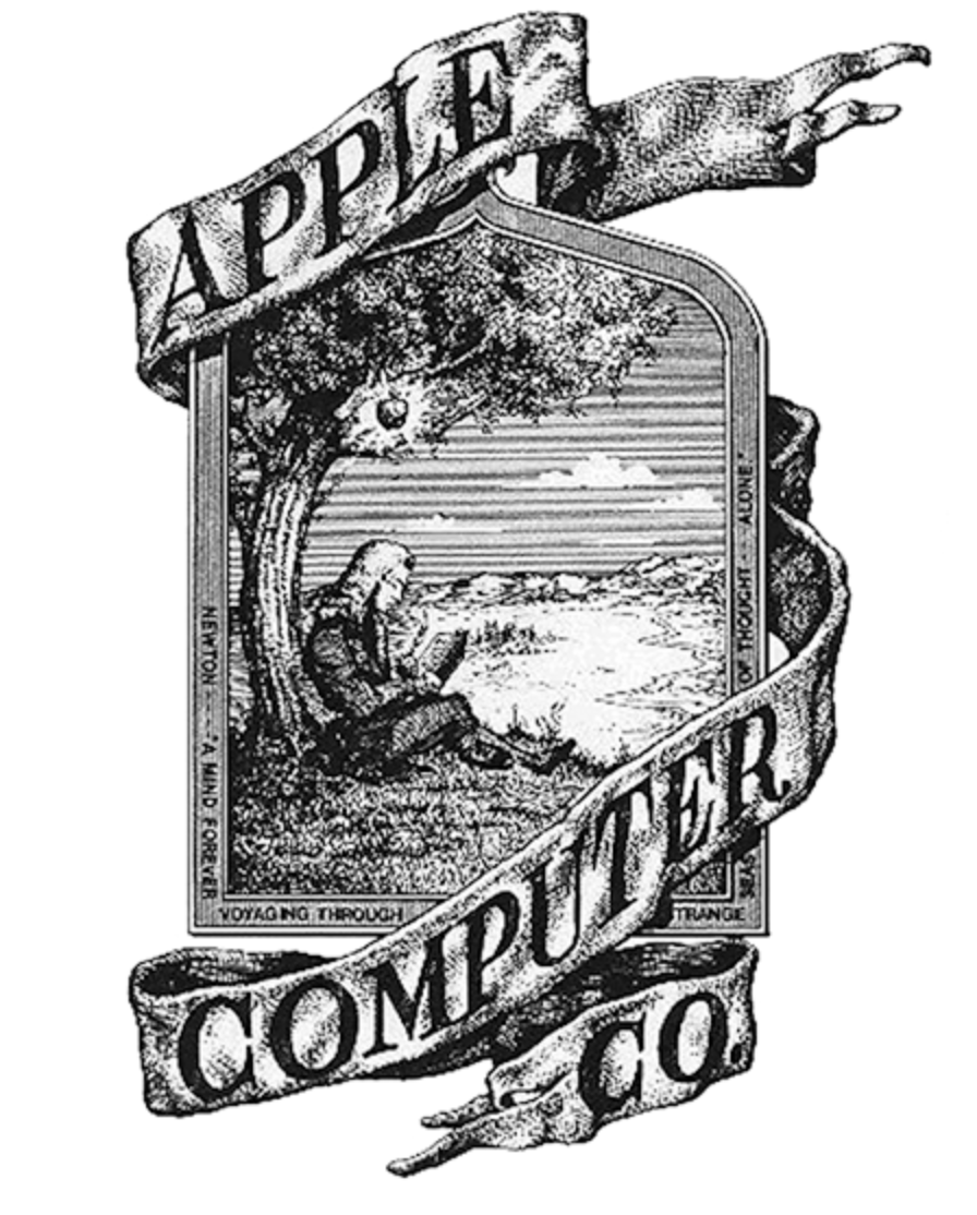
Many viewers see a man sitting under a tree. “What does that have to do with anything?” some might think. Ronald Wayne would say it’s Isaac Newton sitting under a falling apple — the one that helped him figure out the laws of gravity.
But who would know that just by looking at the logo? And what, exactly, does it have to do with computers?
While this illustration is pretty, it’s not a functional logo, which is why Apple abandoned it after only one year for a new logo, a variation of the bitten apple design the brand is known for.
It’s tempting to include all the themes, styles, and words that you love in a logo, but you need to pare down the design. Make sure that viewers can easily tell what your logo represents.
Your customers, and your bottom line, will thank you.
3. An overly vague, simple, or abstract design
You want to avoid overcomplicating your logo, it’s true. But don’t veer so far in the opposite direction that your logo is hard to decipher and has an unclear intention. It still needs to convey who you are and what you offer to the world.
There are a few logos that are famous enough that they don’t need much detail: the Nike swoosh, for example.
But many well-known logos started with more detail and gradually pared down as design trends changed and the brands became more famous.
Sometime between 1992 and 2011, Starbucks became so synonymous with coffee, and the siren in the logo so synonymous with Starbucks, that the lettering was no longer necessary.
Here’s how fans reacted to the change, according to this 2011 article for Delish:
“Hundreds of people have expressed their displeasure with the new design, posting comments such as ‘Who’s the bonehead in your marketing department that removed the world-famous name of Starbucks Coffee from your new logo?’ and ‘HATE the new logo’ [and] ‘The release of the new logo will mark the start of the company’s downfall.’ “
Obviously, none of this came to fruition and the Starbucks logo is as recognizable as ever. But sometimes, public outcry after a change or simplification in design is enough to cause a company to think twice.
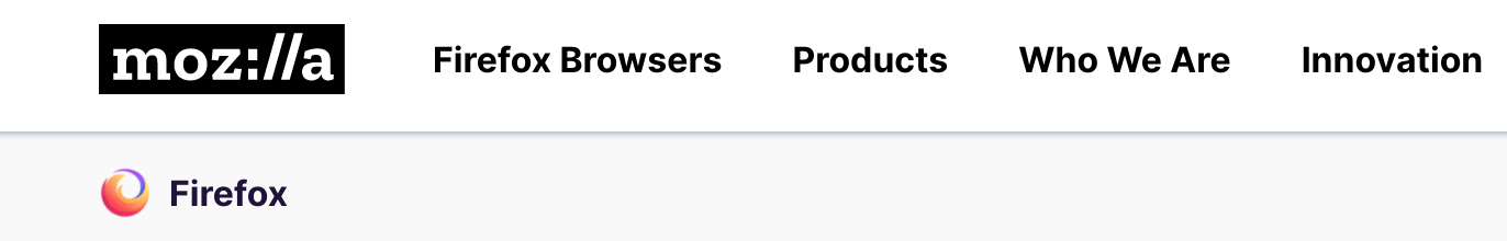
We’ll talk more about that. For now, let’s take a look at the Firefox logo and a Twitter thread about it that went viral.
In the above image, you can see the Firefox logo getting less fiery and foxy. The logo on the bottom right-hand corner is a mere shadow of the first logo.
This Twitter post went viral, prompting this response from the company:
“That bottom middle image with the fox curled around the purple globe is our current Firefox browser logo. The bottom right image of the fiery marble is our parent brand logo, which represents the family of Firefox products we make outside of just the Firefox browser…It’s not an icon you’re going to see on a dock, phone’s home screen or desktop, though.
“We didn’t get rid of the fox then and have no plans to do so now, or ever.”
This is still confusing. According to Firefox, the bottom right-hand logo is its logo, but not the logo it uses for its web browser.
If you log on to Firefox’s website, you’ll see the super-minimalistic, non-fiery, non-foxy logo.
Scroll down a bit and you’ll find the fox, along with three other logos that fall under the overarching Firefox logo umbrella.
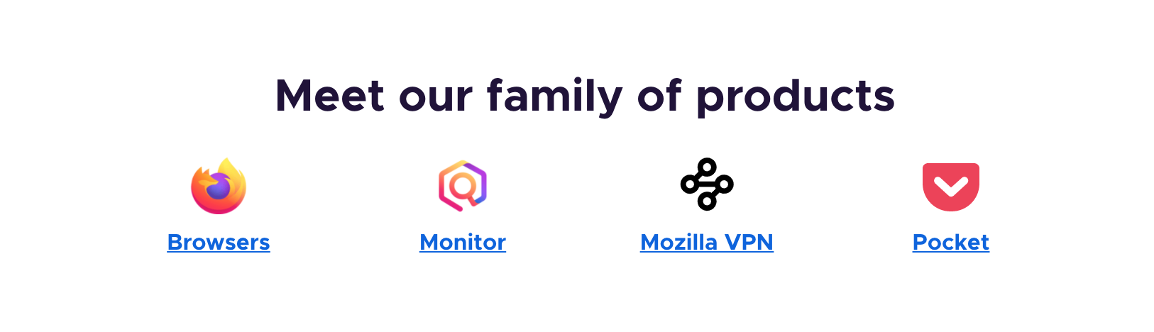
The logos don’t quite go together, and there’s probably a good amount of explanation needed to decipher the meaning behind them.
In short, minimalism is (was?) a trend, but scaling too far down has its drawbacks. It’s one of the top logo mistakes you can make. If you aren’t already a well-known brand, using an extremely minimalist logo can leave customers in the dark about who you are and what you do.
If you can find a balance between a detailed and simple or abstract design, you’ll be on the way to a quality logo.
4. Copycat logos
It’s important to stay in the know about current best practices in the design world. However, you should always aim to create something fresh and unique, not a repeat of a popular trend.
Trends die out quickly, meaning your logo could get stale fast. Worse, similar-looking logos can be confusing to consumers.
Ditch the trends and try something new. You’ll stand out from the crowd in the best way.
5. Stock imagery in logos
Three words: don’t do it. Stock photography is accessible to everyone, everywhere. But it’s almost always illegal to use in a logo, even if you modify a stock image to make it look different.
And even if it were legal, using a stock photo or vector in your logo is just a bad idea, period. If you use a stock image as part of your logo, people may also see it in a random blog post or article. This makes your brand seem amateurish and far from unique.
It’s always worth it to make room in your budget for a custom-designed logo.
6. Rasterized logos
Steer clear of rasterized logos, which are composed of pixels. Opt for vector graphics instead. Rasterized images do not scale well, which can leave you with a blurry image when you need a crisp, clean one.
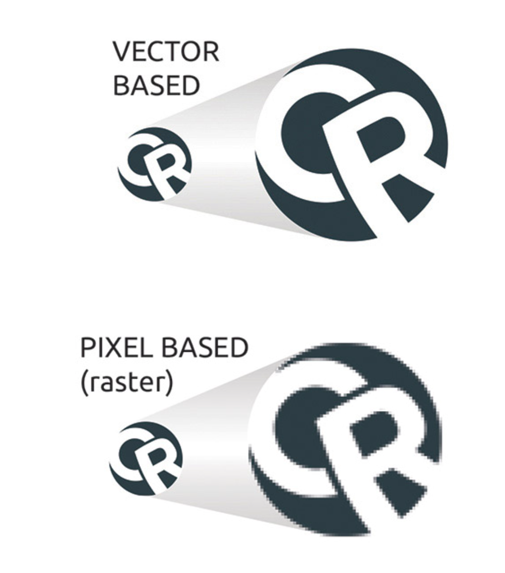
Whether you’re creating a logo yourself or hiring a designer, make sure you use a non-rasterized logo. Top designers typically use Adobe Illustrator. Explore other logo-designing software here.
How can you correct a mistake in a logo?
Take heart! If you do end up making a logo mistake, you can always fix it. It’ll take time and cost money, but it’s worth the effort to apologize, fix it, and move on.
You can avoid making mistakes altogether by split testing your logo ideas on PickFu and using the feedback to choose the best one.
Logo design testing is one of the most popular uses of our online polling platform; we even used it to choose the PickFu logo.
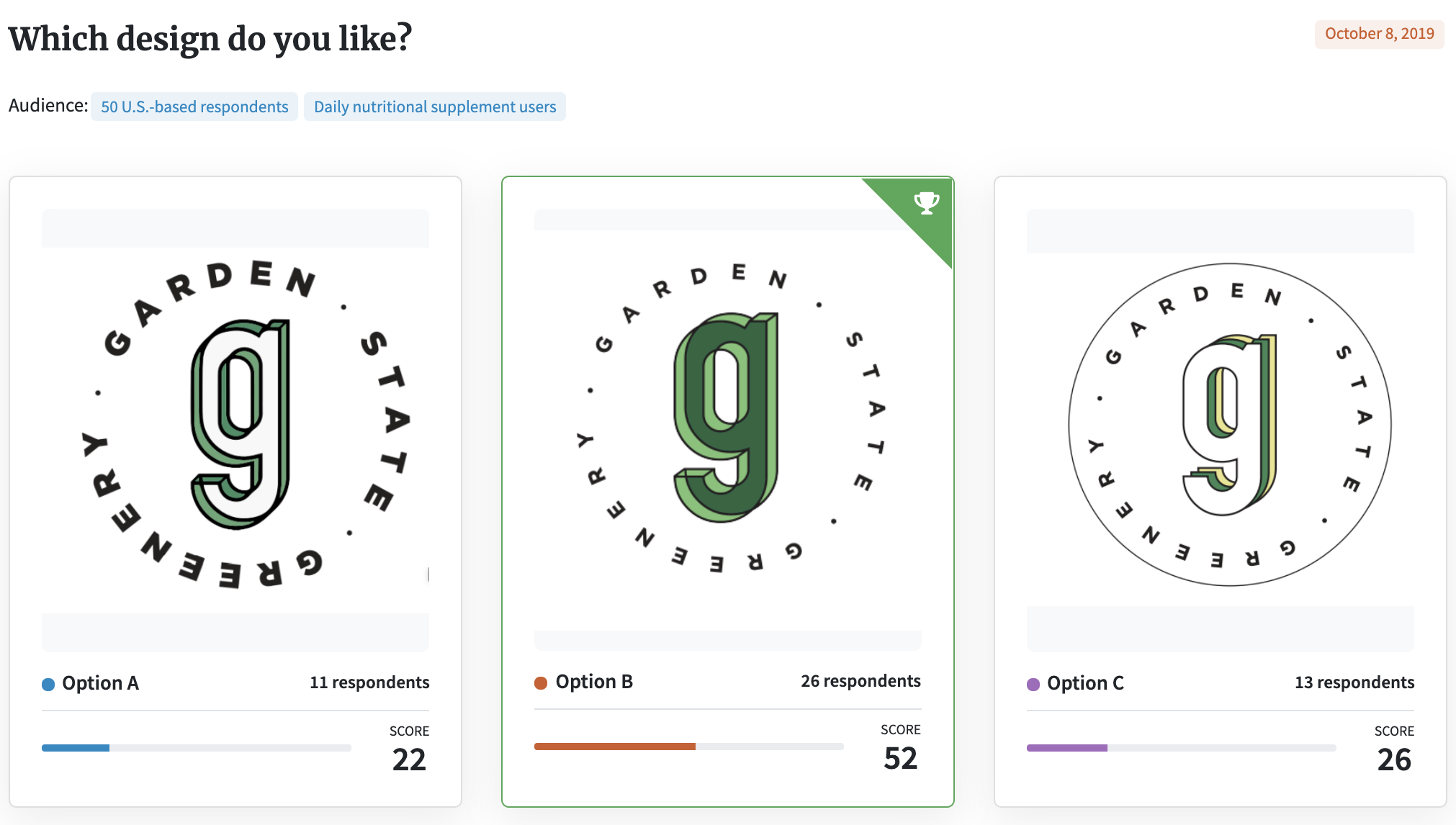
Here’s an example of a three-option Ranked poll targeting people who take nutritional supplements:
You can also run an Open-ended poll to see how your target audience feels about your design.
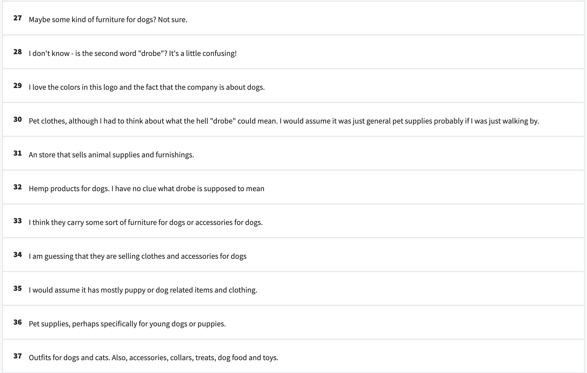
In this Open-ended poll below, the user showed respondents a logo for a business called Puppy Drobe and asked, “What products do you think a store with this logo is selling?”
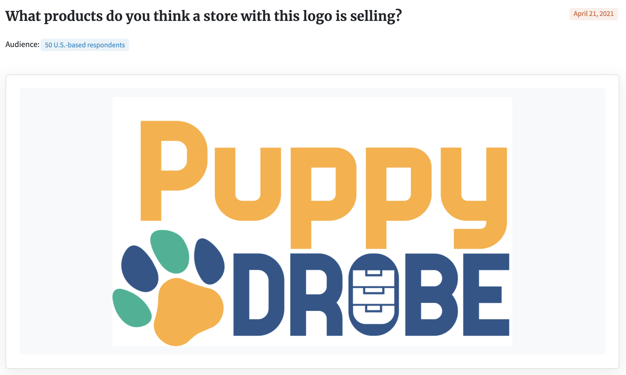
Here’s a sampling of respondents’ comments. As you can see, running a poll like this will likely surface questions or issues you hadn’t thought of, which you can then use to improve your logo design.
A lot of effort and resources go into designing a logo. Avoid making logo mistakes that could be costly to your brand by testing your logo designs first with your target audience.
This will save you time and money and help you create a logo that appeals to the people who matter most — your customers.
Check out our poll gallery to see more examples of logo tests, which might give you inspiration for running your own.
Test your logo designs with PickFu. Try it for free.