Sam Bass, designer of popular logos such as AT&T, Warner Brothers, and United Airlines, once said, “Logos are a graphic extension of the internal realities of a company.”
That puts a lot of pressure on a company to create the perfect logo.
Many companies use PickFu polls to help them test and see how effectively their logos and identity systems depict their mission to their audience. One company recently created a PickFu poll to test two different logos. It asked the test panel, “Which logo evokes a sense of luxury and appeal?”
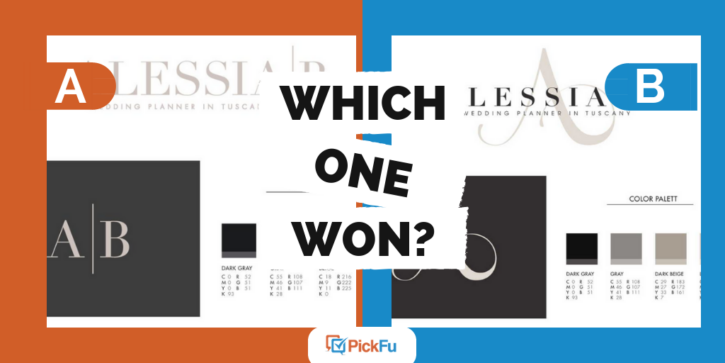
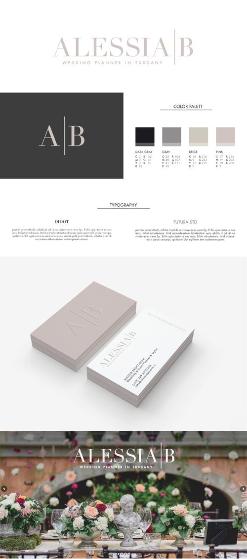
Option A showed the text “Alessia | B” in a light beige font. An abbreviated logo featured “A|B” in the same beige text against a dark grey background. The color palette is muted and the main font is Didot, a serif font. Companies often use these serif fonts because they are considered easier to read than sans-serif, like the secondary font in the identity package, Futura.
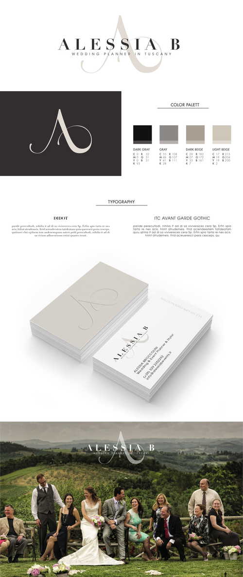
Option B showed the text “Alessia B”, but in this case, it is dark grey and behind the text is a beige A in swirling calligraphy. The abbreviated logo is the decorative A in light beige against a dark grey background.
Can you guess which one won?
And the winner is….. Option B.
Out of 50 respondents, 36 preferred Option B, whereas only 14 preferred Option A.
But let’s look a little closer at their responses and identify some helpful takeaways for designing a powerful logo.
Luxury = Ornate Text
Many respondents felt that the elegant A made Option B stand out. One individual commented, “The logo has a more formal calligraphy lettering for its logo which gives it a more formal elegant look of style. This gives the logo a more classy upscale presentation over the logo option in block letters.” Others echoed these feelings, using words such as exotic, interesting, sophisticated, and fancy.
One panelist stated, “There’s no contest that it is B! It is so elegant-looking and it kind of reminded me of a chandelier.” In contrast, the panelist noted that “A actually looks like a few other big logos so not only is it not appealing, but it looks like a ripoff.”
Is Luxury Dependent on Context?
Comments from test panelists helped to bring up an interesting point: is luxury depicted differently in varying company types? For example, would luxury for a hotel company look different from luxury for an investing company?
We saw this when one panelist contrasted Option B and Option A, stating, “I think Option A is cleaner looking and more favorable in my opinion, but the logo in B has the fancier appeal.” Another panelist gave us more insight into the clean vs. elegant appeal, noting that Option A is more “business luxury” and Option B is more “wedding luxury.” This is a concept worth noting: is luxury depicted differently based on the company type?
Testing Logos
As you create your own design, it is important to note what you want your logo to depict. This should connect directly to the heart of your company. Is it luxury? Fun? Boldness? Once you determine that, you can then consider the context of your design. Does it fit with that business type? For example, if you are wanting to show fun, it would look different if you are a video game company versus a resort.
Not sure if your logo depicts exactly what you are aiming for? That’s where PickFu polls are key. Test several designs on a target audience by creating a poll and get results in minutes. For help with testing your logo, check out
