PickFu polls are popular among mobile app companies, self-publishing authors, and e-commerce businesses. But these pollsters may be missing out on a helpful strategy: testing creative in context.
What does it mean to test something in context?
In a previous life, I worked in an ad agency. Whenever we pitched an idea for a billboard, we would Photoshop the creative onto a billboard. If we were creating a website layout, we would show the layout in a web browser. Sometimes when we pitched a TV commercial, we would even take a frame from the storyboard and Photoshop it onto a screen.
The same principle applies when you take a creative option, such an app icon, a book cover, or a featured photo, and test it using PickFu. You show that option in the context it will appear to the user, such as on a mobile device, on Amazon, or in a browser.
Why contextual testing works
The respondents to your PickFu poll are real-live human beings. Helping them visualize what you are testing means they can more effectively judge how your options will look when completed.
Think about it: When you look at a recipe, you don’t generally see the finished dish floating in white space. You see it in a table setting. When you shop for a product, you often see a lifestyle image of that product in use — for example, a lamp sitting on a desk, a t-shirt worn on a body, or a car being driven on a road. These images help you visualize eating the food or using the products, and make you more likely to give it careful consideration.
Testing in Context: Mobile Apps
When testing possible mobile app icons, consider contextualizing your icon against on a home screen, or against competitors in your category. Doing so helps users picture the icons on their own phones.
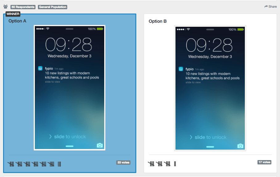
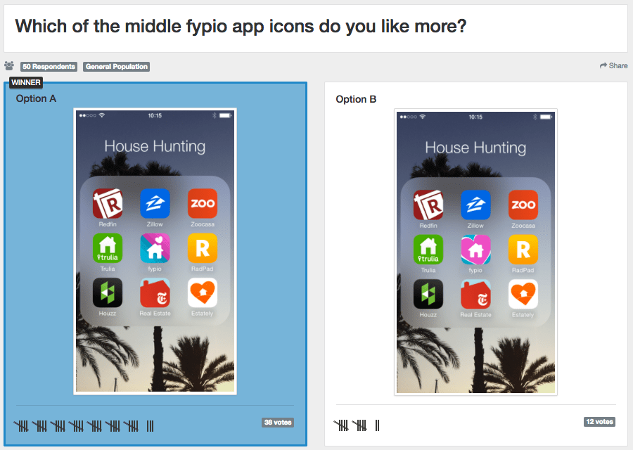
Fypio, a real estate app, used PickFu to test its icons. It placed the icon ideas on the iPhone lock screen and in a folder among similar apps. You can click the images below to see full poll results, including respondent comments and demographic breakdown.
A gaming company also used PickFu to test its mobile app icon in context and included a larger shot of the icon itself alongside the home screen.
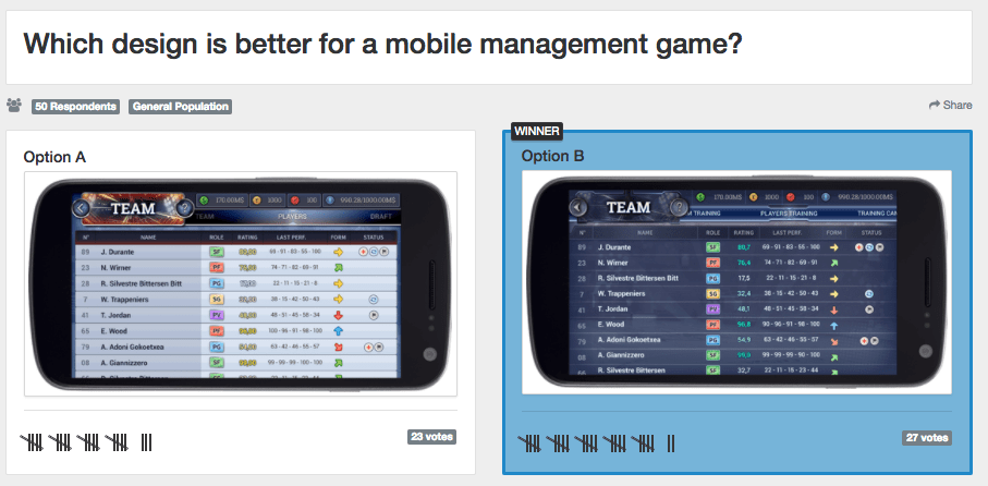
Mobile apps aren’t limited to testing icons, however. This game wanted to see how users felt about two UI options, so it contextualized those options on a phone.
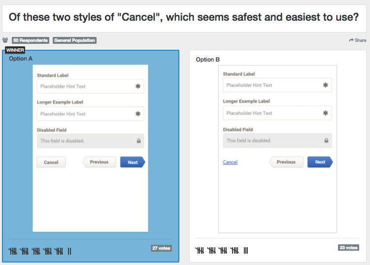
These two mobile companies wanted to test a button design, so they placed them in the context of their other buttons so that users could judge the icons and buttons as a set.
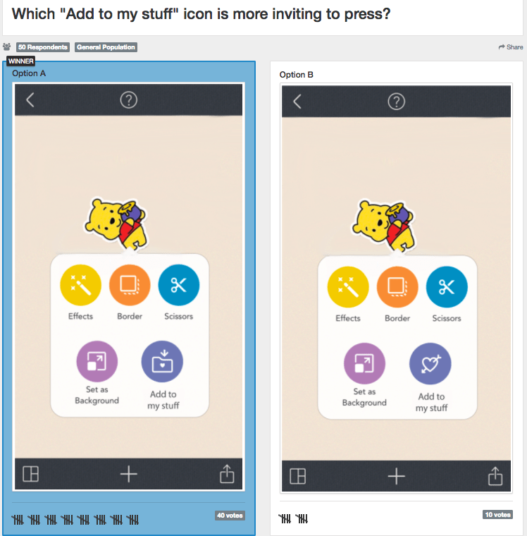
Testing in Context in a Set of Buttons
In all these examples, poll respondents are better able to visualize how mobile app designs will look on a device. This may help yield even better insights on how to iterate and proceed.
Testing in Context: Books
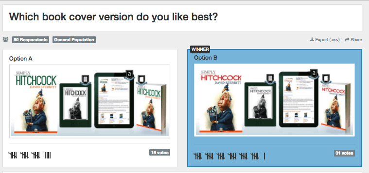
Authors often use PickFu to test book covers. Displaying the cover designs in multiple formats, as the author below did, may help readers think about your designs where they’ll live – on an e-reader or in an Amazon store.
Since authors want to know what images seem most clickable, another idea is to test cover options among competitors in their Kindle categories.

You could also mock up your cover designs to display how they might look in an Amazon listing.

Testing in Context: Websites and E-commerce Stores
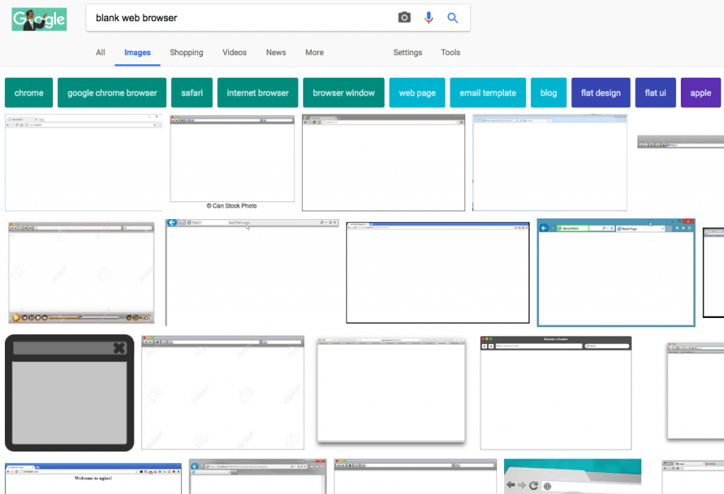
Websites and e-commerce stores can also benefit from testing in context. Show interface designs in a web browser to help respondents visualize. Want proof that it’s a good idea? I googled “blank web browser” and came up with tons of image results from stock photo companies. Grab one for yourself the next time you test a layout.
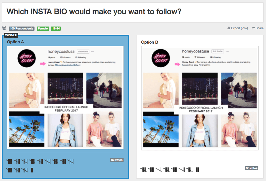
You can also test social media profiles in context, as this PickFu user did for an Instagram bio. By placing the bios in the context of its Instagram images, respondents can better judge what they like. Just remember that you should always only test one thing at a time, as this user did. By keeping the imagery the same, the only variable is the text of the bio.
Summary
Testing in context helps users visualize your creative options as they will truly be seen, whether it’s online, on a mobile device, or among other images.
Just like a recipe uses a table setting or a lifestyle image show a product in use, testing images in their context creates a more holistic experience for a poll respondent than an isolated image might.
Mobile apps have a variety of ways to test images in context. It might mean showing a UI on a phone or displaying an icon on a home screen. You could also test icons or buttons in a set, such as in a file folder or among your already existing buttons.
Self-publishing authors can test in context as well. Think about settings such as your Kindle listing or in related results to ensure your book cover truly stands out.
Websites, e-commerce stores, and social media profiles can also be tested in context. Doing so gives the respondents helpful cues to understand your designs as they will ultimately be seen.
One last thing
I used PickFu because I couldn’t decide how to title this blog post. In less than 15 minutes, I knew what to do. Find out what respondents had to say about why the title “Why Testing Your Creative in Context Is a Smart Move” was the best of the bunch!
